https://pan.baidu.com/s/1TLC1hivzOEygOli5Sc4rHQ&pwd=9987
阶段目标:掌握HTML、CSS常用布局技巧,能够独立制作网页。
day01:HTML 基础
目标:掌握标签基本语法,能够独立布局文章页。
01-今日课程介绍
今日目标:掌握标签基本语法,能够独立布局文章页。
核心技术点
网页组成
排版标签
多媒体标签及属性
综合案例一 - 个人简介

综合案例二 - Vue 简介
02-标签语法
HTML 超文本标记语言——HyperText Markup Language。
标签结构
- 标签要成对出现,中间包裹内容
- <>里面放英文字母(标签名)
- 结束标签比开始标签多 /
- 标签分类:双标签和单标签
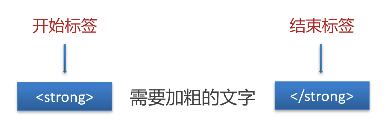
<strong>需要加粗的文字<strong>
<br>
<hr>
|
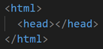
03-HTML骨架
- html:整个网页
- head:网页头部,用来存放给浏览器看的信息,例如 CSS
- body:网页主体,用来存放给用户看的信息,例如图片、文字
<html>
  <head>
    <title>网页标题</title>
  </head>
  <body>
    网页主体
  </body>
</html>
|
提示
VS Code 可以快速生成骨架:在 HTML 文件(.html)中,!(英文)配合 Enter / Tab 键
04-标签的关系
作用:明确标签的书写位置,让代码格式更整齐
05-注释
概念:注释是对代码的解释和说明,能够提高程序的可读性,方便理解、查找代码。
注释不会再浏览器中显示。
在 VS Code 中,添加 / 删除注释的快捷键:Ctrl + /
06-标题标签
一般用在新闻标题、文章标题、网页区域名称、产品名称等等。
<h1>一级标题</h1>
<h2>二级标题</h2>
<h3>三级标题</h3>
<h4>四级标题</h4>
<h5>五级标题</h5>
<h6>六级标题</h6>
|
显示特点:
经验
- h1 标签在一个网页中只能用一次,用来放新闻标题或网页的 logo
- h2 ~ h6 没有使用次数的限制
07-段落标签
一般用在新闻段落、文章段落、产品描述信息等等。
显示特点:
08-换行和水平线
09-文本格式化标签
作用:为文本添加特殊格式,以突出重点。常见的文本格式:加粗、倾斜、下划线、删除线等。
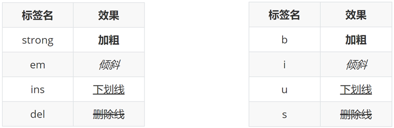
提示:strong、em、ins、del 标签自带强调含义(语义)。
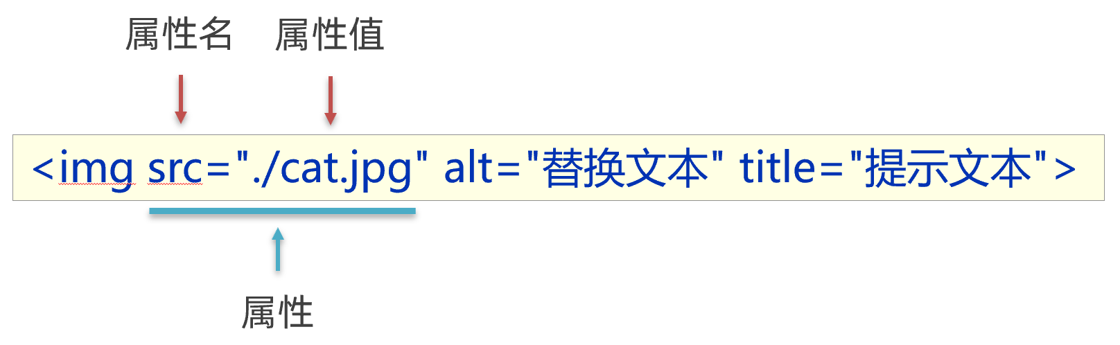
10-图像标签
作用:在网页中插入图片
src用于指定图像的位置和名称,是 ![]() 的必须属性。
的必须属性。
图像属性
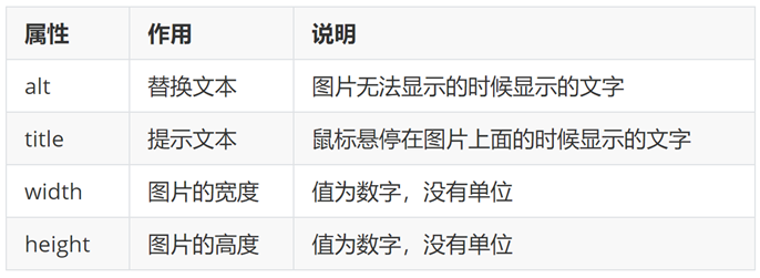
属性语法
- 属性名=”属性值”
- 属性写在尖括号里面,标签名后面,标签名和属性之间用空格隔开,不区分先后顺序
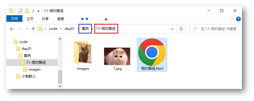
11-路径
概念:路径指的是查找文件时,从起点到终点经历的路线。
路径分类:
- 相对路径:从当前文件位置出发查找目标文件
- 绝对路径:从盘符出发查找目标文件
- Windows 电脑从盘符出发
- Mac 电脑从根目录出发
相对路径
查找方式:从当前文件位置出发查找目标文件
特殊符号:
- / 表示进入某个文件夹里面 → 文件夹名/
- **. ** 表示当前文件所在文件夹 → ./
- .. 表示当前文件的上一级文件夹 → ../
绝对路径
查找方式:Windows 电脑从盘符出发;Mac 电脑从根目录(/)出发
<img src="C:\images\mao.jpg">
|
提示
- Windows 默认是 \ ,其他系统是 /,建议统一写为 /
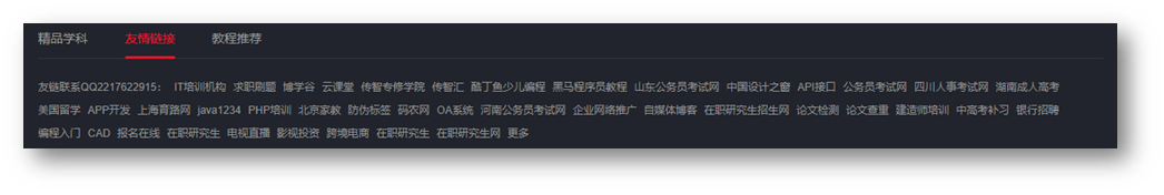
- 特殊的绝对路径 → 文件的在线网址:https://www.itheima.com/images/logo.png “,应用场景:网页底部友情链接
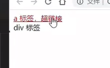
12-超链接标签
作用:点击跳转到其他页面。
<a href="https://www.baidu.com">跳转到百度</a>
|
href 属性值是跳转地址,是超链接的必须属性。
超链接默认是在当前窗口跳转页面,添加 target=”_blank” 实现新窗口打开页面。
拓展:开发初期,不确定跳转地址,则 href 属性值写为 #,表示空链接,页面不会跳转,在当前页面刷新一次。
<a href="https://www.baidu.com/">跳转到百度</a>
<a href="./01-标签的写法.html" target="_blank">跳转到01-标签的写法</a>
<a href="#">空链接</a>
|
13-音频
<audio src="音频的 URL"></audio>
|
常用属性
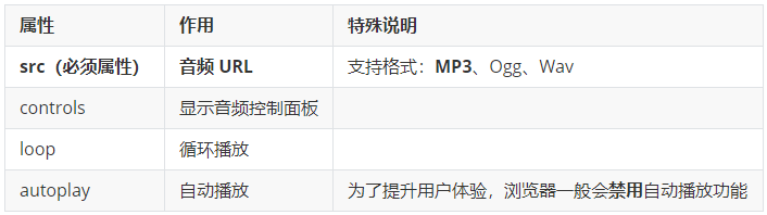
拓展:书写 HTML5 属性时,如果属性名和属性值相同,可以简写为一个单词。
<audio src="./media/music.mp3" controls loop autoplay></audio>
|
14-视频
<video src="视频的 URL"></video>
|
常用属性
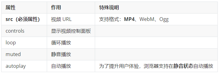
<video src="./media/vue.mp4" controls loop muted autoplay></video>
|
15-综合案例一-个人简介
网页制作思路:从上到下,先整体再局部,逐步分析制作
分析内容 → 写代码 → 保存 → 刷新浏览器,看效果
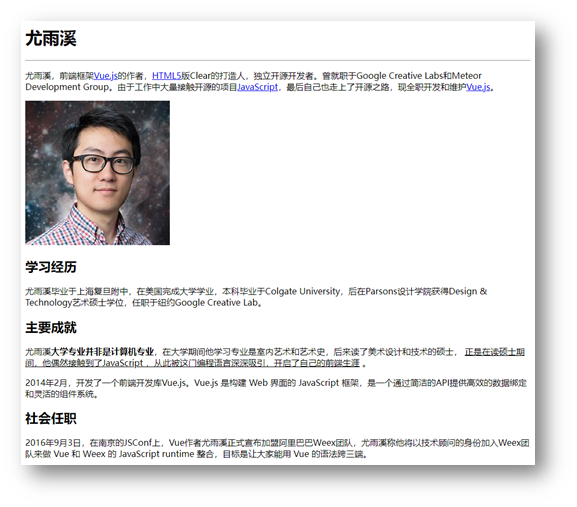
<h1>尤雨溪</h1>
<hr>
<p>尤雨溪,前端框架<a href="../17-综合案例二/vue简介.html">Vue.js</a>的作者,<a href="#">HTML5</a>版Clear的打造人,独立开源开发者。曾就职于Google Creative Labs和Meteor Development Group。由于工作中大量接触开源的项目<a href="#">JavaScript</a>,最后自己也走上了开源之路,现全职开发和维护<a href="#">Vue.js</a>。

</p>
<img src="./photo.jpg" alt="尤雨溪的照片" title="尤雨溪">
<h2>学习经历</h2>
<p>尤雨溪毕业于上海复旦附中,在美国完成大学学业,本科毕业于Colgate University,后在Parsons设计学院获得Design & Technology艺术硕士学位,任职于纽约Google Creative Lab。</p>
<h2>主要成就</h2>
<p>尤雨溪<strong>大学专业并非是计算机专业</strong>,在大学期间他学习专业是室内艺术和艺术史,后来读了美术设计和技术的硕士, <ins>正是在读硕士期间,他偶然接触到了JavaScript ,从此被这门编程语言深深吸引,开启了自己的前端生涯</ins> 。</p>
<p>2014年2月,开发了一个前端开发库Vue.js。Vue.js 是构建 Web 界面的 JavaScript 框架,是一个通过简洁的API提供高效的数据绑定和灵活的组件系统。</p>
<h2>社会任职</h2>
<p>2016年9月3日,在南京的JSConf上,Vue作者尤雨溪正式宣布加盟阿里巴巴Weex团队,尤雨溪称他将以技术顾问的身份加入Weex团队来做 Vue 和 Weex 的 JavaScript runtime 整合,目标是让大家能用 Vue 的语法跨三端。</p>
|
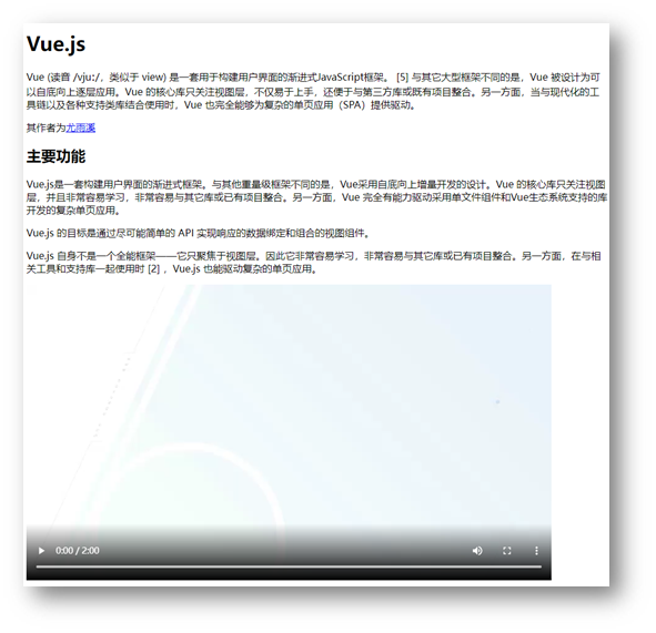
16-综合案例二-Vue简介

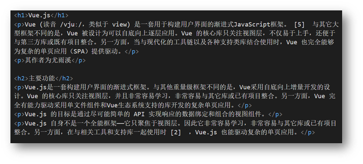
<h1>Vue.js</h1>
<p>Vue (读音 /vjuː/,类似于 view) 是一套用于构建用户界面的渐进式JavaScript框架。 [5] 与其它大型框架不同的是,Vue 被设计为可以自底向上逐层应用。Vue 的核心库只关注视图层,不仅易于上手,还便于与第三方库或既有项目整合。另一方面,当与现代化的工具链以及各种支持类库结合使用时,Vue 也完全能够为复杂的单页应用(SPA)提供驱动。</p>
<p>其作者为<a href="../16-综合案例一/个人简介.html" target="_blank">尤雨溪</a></p>
<h2>主要功能</h2>
<p>Vue.js是一套构建用户界面的渐进式框架。与其他重量级框架不同的是,Vue采用自底向上增量开发的设计。Vue 的核心库只关注视图层,并且非常容易学习,非常容易与其它库或已有项目整合。另一方面,Vue 完全有能力驱动采用单文件组件和Vue生态系统支持的库开发的复杂单页应用。</p>
<p>Vue.js 的目标是通过尽可能简单的 API 实现响应的数据绑定和组合的视图组件。</p>
<p>Vue.js 自身不是一个全能框架——它只聚焦于视图层。因此它非常容易学习,非常容易与其它库或已有项目整合。另一方面,在与相关工具和支持库一起使用时 [2] ,Vue.js 也能驱动复杂的单页应用。</p>
<video src="../media/vue.mp4" controls></video>
|
day02:列表、表格、表单
目标:掌握嵌套关系标签的写法,使用列表标签布局网页
01-列表
作用:布局内容排列整齐的区域。
列表分类:无序列表、有序列表、定义列表。
无序列表
作用:布局排列整齐的不需要规定顺序的区域。
标签:ul 嵌套 li,ul 是无序列表,li 是列表条目。
<ul>
  <li>第一项</li>
  <li>第二项</li>
  <li>第三项</li>
  ……
</ul>
|
注意事项:
- ul 标签里面只能包裹 li 标签
- li 标签里面可以包裹任何内容
有序列表
作用:布局排列整齐的需要规定顺序的区域。
标签:ol 嵌套 li,ol 是有序列表,li 是列表条目。
<ol>
  <li>第一项</li>
  <li>第二项</li>
  <li>第三项</li>
  ……
</ol>
|
注意事项:
- ol 标签里面只能包裹 li 标签
- li 标签里面可以包裹任何内容
定义列表
标签:dl 嵌套 dt 和 dd,dl 是定义列表,dt 是定义列表的标题,dd 是定义列表的描述 / 详情。
<dl>
  <dt>列表标题</dt>
  <dd>列表描述 / 详情</dd>
   ……
</dl>
|
注意事项:
- dl 里面只能包含dt 和 dd
- dt 和 dd 里面可以包含任何内容
02-表格
网页中的表格与 Excel 表格类似,用来展示数据。
基本使用
标签:table 嵌套 tr,tr 嵌套 td / th。
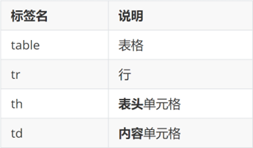
提示:在网页中,表格默认没有边框线,使用 border 属性可以为表格添加边框线。
<table border="1">
  <tr>
    <th>姓名</th>
    <th>语文</th>
    <th>数学</th>
    <th>总分</th>
  </tr>
  <tr>
    <td>张三</td>
    <td>99</td>
    <td>100</td>
    <td>199</td>
  </tr>
  <tr>
    <td>李四</td>
    <td>98</td>
    <td>100</td>
    <td>198</td>
  </tr>
  <tr>
    <td>总结</td>
    <td>全市第一</td>
    <td>全市第一</td>
    <td>全市第一</td>
  </tr>
</table>
|
表格结构标签-了解
作用:用表格结构标签把内容划分区域,让表格结构更清晰,语义更清晰。
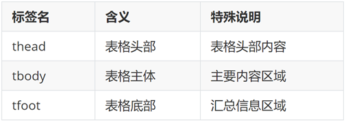
提示:表格结构标签可以省略。
合并单元格
作用:将多个单元格合并成一个单元格,以合并同类信息。
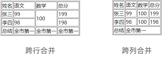
合并单元格的步骤:
- 明确合并的目标
- 保留最左最上的单元格,添加属性(取值是数字,表示需要合并的单元格数量)
- 跨行合并,保留最上单元格,添加属性 rowspan
- 跨列合并,保留最左单元格,添加属性 colspan
- 删除其他单元格
<table border="1">
<thead>
<tr>
<th>姓名</th>
<th>语文</th>
<th>数学</th>
<th>总分</th>
</tr>
</thead>
<tbody>
<tr>
<td>张三</td>
<td>99</td>
<td rowspan="2">100</td>
<td>199</td>
</tr>
<tr>
<td>李四</td>
<td>98</td>
<td>198</td>
</tr>
</tbody>
<tfoot>
<tr>
<td>总结</td>
<td colspan="3">全市第一</td>
</tr>
</tfoot>
</table>
|
注意:不能跨表格结构标签合并单元格(thead、tbody、tfoot)。
03-表单
作用:收集用户信息。
使用场景:
input 标签 type 属性值不同,则功能不同。
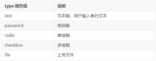
占位文本:提示信息,文本框和密码框都可以使用。
<input type="..." placeholder="提示信息">
|
单选框
常用属性
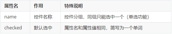
<input type="radio" name="gender" checked> 男
<input type="radio" name="gender"> 女
|
提示:name 属性值自定义。
上传文件
默认情况下,文件上传表单控件只能上传一个文件,添加 multiple 属性可以实现文件多选功能。
<input type="file" multiple>
|
多选框
多选框也叫复选框,默认选中:checked。
<input type="checkbox" checked> 敲前端代码
|
下拉菜单
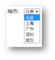
标签:select 嵌套 option,select 是下拉菜单整体,option是下拉菜单的每一项。
<select>
  <option>北京</option>
  <option>上海</option>
  <option>广州</option>
  <option>深圳</option>
  <option selected>武汉</option>
</select>
|
默认显示第一项,selected 属性实现默认选中功能。
文本域
作用:多行输入文本的表单控件。
<textarea>默认提示文字</textarea>
|
注意点:
- 实际开发中,使用 CSS 设置 文本域的尺寸
- 实际开发中,一般禁用右下角的拖拽功能
label 标签
作用:网页中,某个标签的说明文本。
经验:用 label 标签绑定文字和表单控件的关系,增大表单控件的点击范围。(点男女字体就能选中)
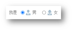
- 写法一
- label 标签只包裹内容,不包裹表单控件
- 设置 label 标签的 for 属性值 和表单控件的 id 属性值相同
<input type="radio" id="man">
<label for="man">男</label>
|
- 写法二:使用 label 标签包裹文字和表单控件,不需要属性
<label><input type="radio"> 女</label>
|
提示:支持 label 标签增大点击范围的表单控件:文本框、密码框、上传文件、单选框、多选框、下拉菜单、文本域等等。
按钮
<button type="">按钮</button>
|
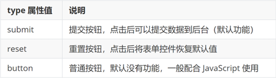
<form action="">
用户名:<input type="text">
<br><br>
密码:<input type="password">
<br><br>
<button type="submit">提交</button>
<button type="reset">重置</button>
<button type="button">普通按钮</button>
</form>
|
提示:按钮需配合 form 标签(表单区域)才能实现对应的功能。
04-语义化
无语义的布局标签
作用:布局网页(划分网页区域,摆放内容)
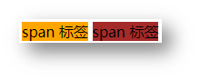
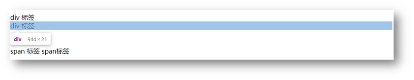
<div>div 标签,独占一行</div>     大盒子
<span>span 标签,不换行</span>    小盒子
|
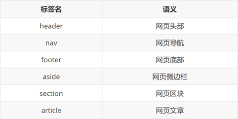
有语义的布局标签
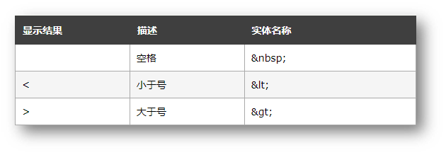
05-字符实体
如果在代码中敲键盘的空格,网页只能识别为一个,这个是html的特性
因为html把<和>做成了标签的标识,所以用字符实体可以代替这些
06-综合案例一-体育新闻列表
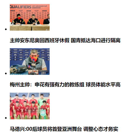
<ul>
  <li>
    <img src="./images/1.jpg" alt="">
    <h3>主帅安东尼奥回西班牙休假 国青抵达海口进行隔离</h3>
  </li>
  <li>
    <img src="./images/2.jpg" alt="">
    <h3>梅州主帅:申花有强有力的教练组 球员体能水平高</h3>
  </li>
  <li>
    <img src="./images/3.jpg" alt="">
    <h3>马德兴:00后球员将首登亚洲舞台 调整心态才务实</h3>
  </li>
</ul>
|
07-综合案例二-注册信息
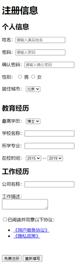
<h1>注册信息</h1>
<form action="">
<h2>个人信息</h2>
<label>姓名:</label><input type="text" placeholder="请输入真实姓名">
<br><br>
<label>密码:</label><input type="password" placeholder="请输入密码">
<br><br>
<label>确认密码:</label><input type="password" placeholder="请输入确认密码">
<br><br>
<label>性别:</label>
<label><input type="radio" name="gender"> 男</label>
<label><input type="radio" name="gender" checked> 女</label>
<br><br>
<label>居住城市:</label>
<select>
<option>北京</option>
<option>上海</option>
<option>广州</option>
<option>深圳</option>
<option>武汉</option>
</select>
<h2>教育经历</h2>
<label>最高学历:</label>
<select>
<option>博士</option>
<option>硕士</option>
<option>本科</option>
<option>大专</option>
</select>
<br><br>
<label>学校名称:</label><input type="text">
<br><br>
<label>所学专业:</label><input type="text">
<br><br>
<label>在校时间:</label>
<select>
<option>2015</option>
<option>2016</option>
<option>2017</option>
<option>2018</option>
</select>
--
<select>
<option>2019</option>
<option>2020</option>
<option>2021</option>
<option>2022</option>
</select>
<h2>工作经历</h2>
<label>公司名称:</label><input type="text">
<br><br>
<label>工作描述:</label>
<br>
<textarea></textarea>
<br><br>
<input type="checkbox"><label>已阅读并同意以下协议:</label>
<ul>
<li><a href="#">《用户服务协议》</a></li>
<li><a href="#">《隐私政策》</a></li>
</ul>
<br><br>
<button>免费注册</button>
<button type="reset">重新填写</button>
</form>
|
day03-CSS基础
目标:掌握 CSS 属性基本写法,能够使用文字相关属性美化文章页。
01-CSS初体验
层叠样式表 (Cascading Style Sheets,缩写为 CSS),是一种 样式表 语言,用来描述 HTML 文档的呈现(美化内容)。
书写位置:title 标签下方添加 style 双标签,style 标签里面书写 CSS 代码。
<title>CSS 初体验</title>
<style>
  p {
    color: red;
  }
</style>
<p>体验 CSS</p>
|
提示:属性名和属性值成对出现 → 键值对。
02-CSS引入方式
- 内部样式表:学习使用(上面那一种)
- 外部样式表:开发使用
- CSS 代码写在单独的 CSS 文件中(**.css**)
- 在 HTML 使用 link 标签引入
<link rel="stylesheet" href="./my.css">
|
<div style="color: red; font-size:20px;">这是 div 标签</div>
|
03-选择器
作用:查找标签,设置样式。
标签选择器
标签选择器:使用标签名作为选择器 → 选中同名标签设置相同的样式。
例如:p, h1, div, a, img……
<style>
p {
color: red;
}
</style>
|
注意:标签选择器无法差异化同名标签的显示效果。
类选择器
作用:查找标签,差异化设置标签的显示效果。
步骤:
- 定义类选择器 → .类名
- 使用类选择器 → 标签添加 class=”类名”
<style>
.red {
color: red;
}
</style>
<div class="red">这是 div 标签</div>
<div class="red size">div 标签</div>
|
注意:
- 类名自定义,不要用纯数字或中文,尽量用英文命名
- 一个类选择器可以供多个标签使用
- 一个标签可以使用多个类名,类名之间用空格隔开
开发习惯:类名见名知意,多个单词可以用 - 连接,例如:news-hd。
id选择器
作用:查找标签,差异化设置标签的显示效果。
场景:id 选择器一般配合 JavaScript 使用,很少用来设置 CSS 样式
步骤:
- 定义 id 选择器 → #id名
- 使用 id 选择器 → 标签添加 id= “id名”
<style>
#red {
color: red;
}
</style>
<div id="red">这是 div 标签</div>
|
规则:同一个 id 选择器在一个页面只能使用一次。
通配符选择器
作用:查找页面所有标签,设置相同样式。
通配符选择器: *,不需要调用,浏览器自动查找页面所有标签,设置相同的样式
经验:通配符选择器可以用于清除标签的默认样式,例如:标签默认的外边距、内边距。
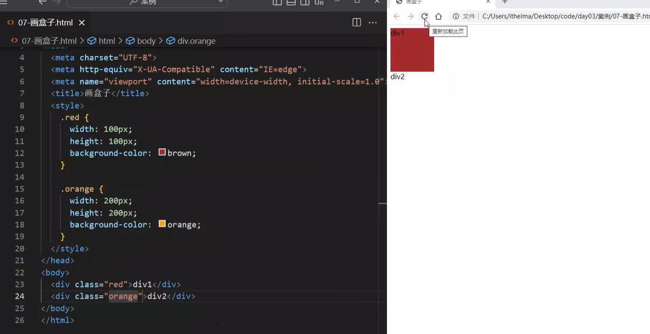
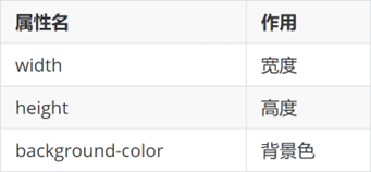
04-盒子尺寸和背景色
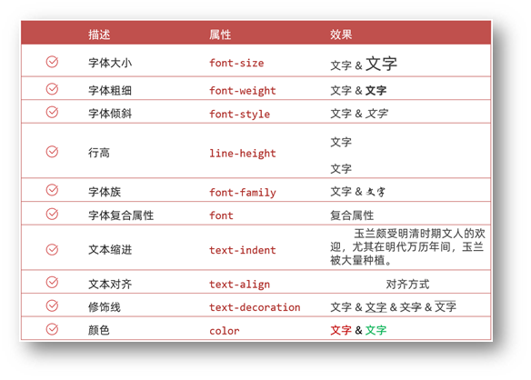
05-文字控制属性

字体大小
- 属性名:font-size
- 属性值:文字尺寸,PC 端网页最常用的单位 px
经验:谷歌浏览器默认字号是16px。
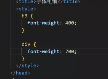
字体粗细
- 属性名:font-weight
- 属性值: 400-700
字体样式(是否倾斜)
作用:清除文字默认的倾斜效果
属性名:font-style
属性值
平常用于清除em标签的倾斜效果,因为倾斜效果不咋好看
行高
作用:设置多行文本的间距(间距=上间距+文本高度+下间距)
属性名:line-height
属性值
- 数字 + px
- 数字(当前标签font-size属性值的倍数)
line-height: 30px;
line-height: 2;
|
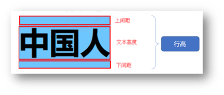
行高的测量方法:从一行文字的最顶端(最底端)量到下一行文字的最顶端(最底端)。
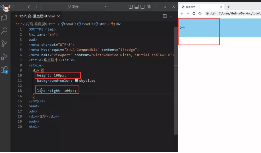
单行文字垂直居中
垂直居中技巧:行高属性值等于盒子高度属性值
注意:该技巧适用于单行文字垂直居中效果
原理其实就是设置div的标签为100px,之后行高也为100的话,字体就处于中间啦
div {
height: 100px;
background-color: skyblue;
line-height: 100px;
}
|
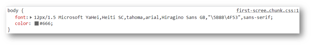
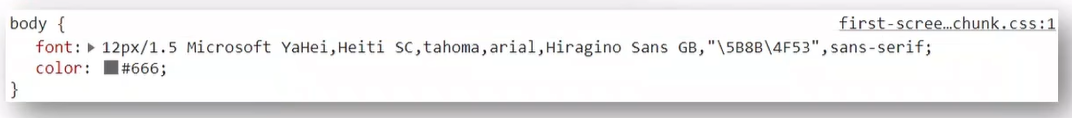
字体族
属性名:font-family
属性值:字体名
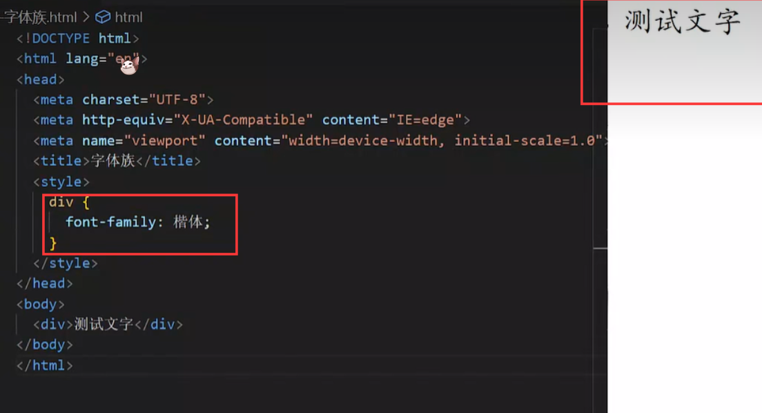
拓展(了解):font-family属性值可以书写多个字体名,各个字体名用逗号隔开,执行顺序是从左向右依次查找
font-family: Microsoft YaHei, Heiti SC, tahoma, arial, Hiragino Sans GB, "\5B8B\4F53", sans-serif;
|
font复合属性
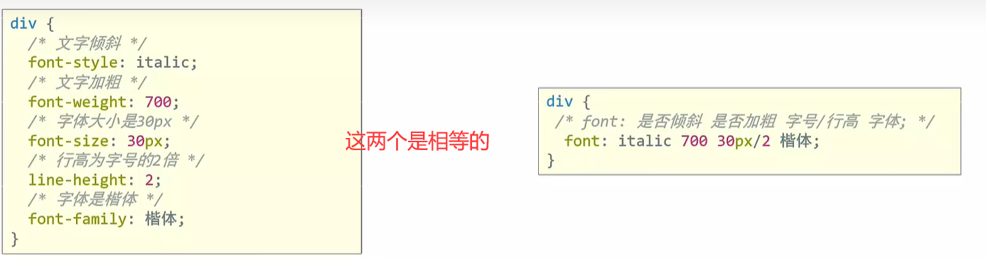
使用场景:设置网页文字公共样式
复合属性:属性的简写方式,一个属性对应多个值的写法,各个属性值之间用空格隔开。
- font: 是否倾斜 是否加粗 字号/行高 字体(必须按顺序书写)
div {
  font: italic 700 30px/2 楷体;
}
|
注意:字号和字体值必须书写,否则 font 属性不生效 。
文本缩进
一段文章的首行缩进就用这个
属性名:text-indent
属性值:
- 数字 + px
- 数字 + em(推荐:1em = 当前标签的字号大小)
p {
  //2em就是空两格
  text-indent: 2em;
}
|
文本对齐方式
作用:控制内容水平对齐方式
属性名:text-align
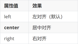
text-align本质是控制内容的对齐方式,属性要设置给内容的父级。
这里的内容,比如下面的img,调整的就是img标签居中
如果下面的是

那就是把文字居中了,这就是内容的意义,居中的是内容,不是标签
<style>
  div {
    text-align: center;
  }
</style>

<div>
  <img src="./images/1.jpg" alt="">
</div>
|
文本修饰线
属性名: text-decoration
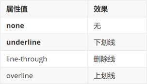
p {
    //去掉下划线,一般用于去掉a标签的下划线
     text-decoration: none
}
|
color 文字颜色
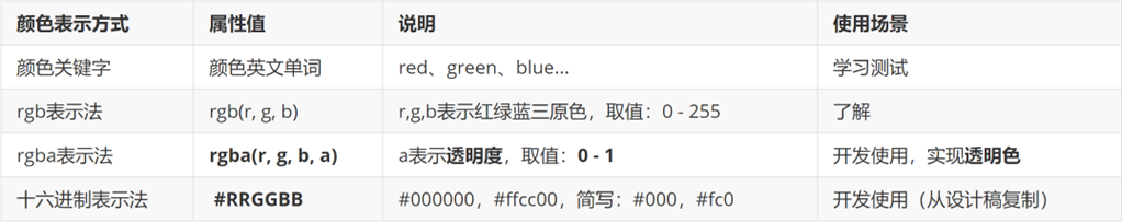
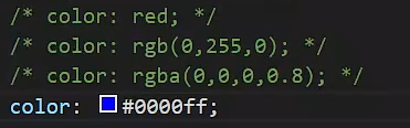
其中最后一种可以简化,6位如果两两相等可以简化成3位 比如 :00ffcc 简写成 :0fc
提示:只要属性值为颜色,都可以使用上述四种颜色表示方式,例如:背景色。
06-调试工具
作用:检查、调试代码;帮助程序员发现代码问题、解决问题
- 打开调试工具
使用调试工具
下面的font-size: 20
本来应该写成: font-size: 20pm 的,但是没写单位,所以错了,这里可以看出来他错了
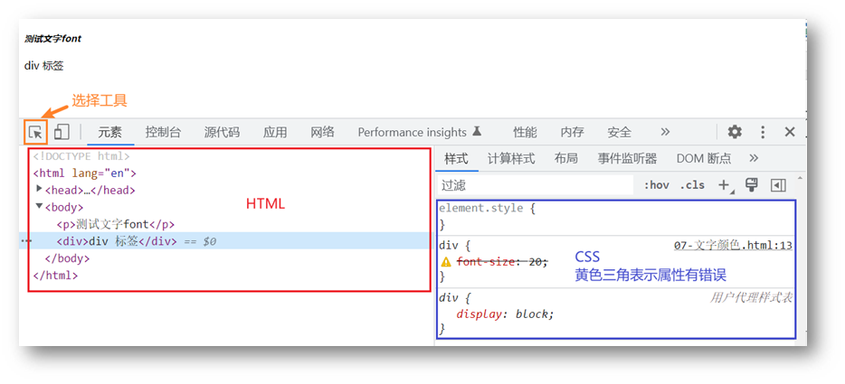
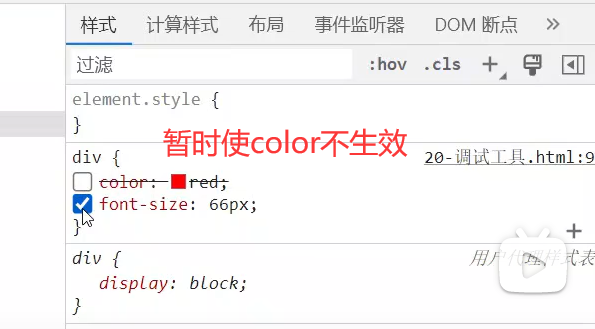
CSS属性的前面有多选框,如果勾选:这个属性生效;如果没有勾选:这个属性不生效
07-综合案例一-新闻详情
网页制作思路:
- 从上到下,先整体再局部
- 先标签,再 CSS 美化
HTML标签
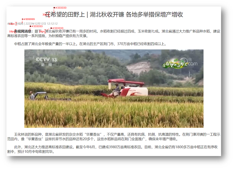
<h1>在希望的田野上 | 湖北秋收开镰 各地多举措保增产增收</h1>
<div>来源:央视网 | 2222年12月12日 12:12:12</div>
<p><strong>央视网消息:</strong>眼下,湖北省秋收开镰已有一周多的时间。水稻收割已经超过四成,玉米收割七成。湖北省通过大力推广新品种水稻,建设高标准农田等一系列措施,为秋粮稳产提供有力支撑。</p>
<p>中稻占据了湖北全年粮食产量的一半以上。在湖北的主产区荆门市,370万亩中稻已经收割四成以上。</p>
<div class="pic">
  <img src="./1.jpg" alt="">
</div>
<p>王化林说的新品种,是湖北省研发的杂交水稻“华夏香丝”,不仅产量高,还具有抗病、抗倒、抗高温的特性。在荆门漳河镇的一工程示范田内,像“华夏香丝”这样抗旱节水的品种还有20多个,这些水稻新品将在荆门全面推广,确保来年增产增收。</p>
<p>此外,湖北还大力推进高标准农田建设。截至今年6月,已建成3980万亩高标准农田。目前,湖北全省仍有1800多万亩中稻正在有序收割中,预计10月中旬收割完毕。</p>
|
CSS样式
<style>
h1 {
text-align: center;
font-weight: 400;
font-size: 30px;
color: #333;
}
div {
font-size: 14px;
color: #999;
}
p {
text-indent: 2em;
font-size: 18px;
color: #333;
}
.pic {
text-align: center;
}
</style>
|
08-综合案例二-CSS简介
HTML标签
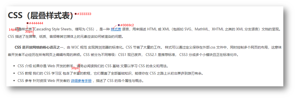
<h1>CSS(层叠样式表)</h1>
<p>层叠样式表 (Cascading Style Sheets,缩写为 CSS),是一种 <a href="#">样式表</a> 语言,用来描述 HTML 或 XML(包括如 SVG、MathML、XHTML 之类的 XML 分支语言)文档的呈现。CSS 描述了在屏幕、纸质、音频等其它媒体上的元素应该如何被渲染的问题。</p>
<p><strong>CSS 是开放网络的核心语言之一</strong>,由 W3C 规范 实现跨浏览器的标准化。CSS 节省了大量的工作。 样式可以通过定义保存在外部.css 文件中,同时控制多个网页的布局,这意味着开发者不必经历在所有网页上编辑布局的麻烦。CSS 被分为不同等级:CSS1 现已废弃, CSS2.1 是推荐标准, CSS3 分成多个小模块且正在标准化中。</p>
<ul>
  <li>CSS 介绍 如果你是 Web 开发的新手,请务必阅读我们的 CSS 基础 文章以学习 CSS 的含义和用法。</li>
  <li>CSS 教程 我们的 CSS 学习区 包含了丰富的教程,它们覆盖了全部基础知识,能使你在 CSS 之路上从初出茅庐到游刃有余。</li>
  <li>CSS 参考 针对资深 Web 开发者的 <a href="#">详细参考手册</a> ,描述了 CSS 的各个属性与概念。</li>
</ul>
|
CSS样式
<style>
  h1 {
    color: #333;
  }

  p {
    text-indent: 2em;
    font-size: 14px;
    color: #444;
    line-height: 30px;
  }

  a {
    color: #0069c2;
  }

  li {
    font-size: 14px;
    color: #444;
    line-height: 30px;
  }
</style>
|
day04-CSS进阶
目标:掌握复合选择器作用和写法;使用background属性添加背景效果
01-复合选择器
定义:由两个或多个基础选择器,通过不同的方式组合而成。
作用:更准确、更高效的选择目标元素(标签)。
后代选择器
后代选择器:选中某元素的后代(不光是儿子,还有孙子等后代)元素。
选择器写法:父选择器 子选择器 { CSS 属性},父子选择器之间用空格隔开。
<style>
  div span {
    color: red;
  }
</style>
<span> span 标签</span>
<div>
  <span>这是 div 的儿子 span</span >
</div>
|
子代选择器
只会选择儿子这一级
子代选择器:选中某元素的子代元素(最近的子级)。
选择器写法:父选择器 > 子选择器 { CSS 属性},父子选择器之间用 > 隔开。
<style>
  div > span {
    color: red;
  }
</style>

<div>
  <span>这是 div 里面的 span</span>
  <p>
    <span>这是 div 里面的 p 里面的 span</span>
  </p>
</div>
|
并集选择器
并集选择器:选中多组标签设置相同的样式。
选择器写法:选择器1, 选择器2, …, 选择器N { CSS 属性},选择器之间用 , 隔开。
<style>
  div,
  p,
  span {
    color: red;
  }
</style>

<div> div 标签</div>
<p>p 标签</p>
<span>span 标签</span>
|
交集选择器
交集选择器:选中同时满足多个条件的元素。
选择器写法:选择器1选择器2 { CSS 属性},选择器之间连写,没有任何符号。 (下面这个不是p.box,而是两个选择器,p选择器和类为box的选择器)
<style>
  p.box {
  color: red;
}
</style>

<p class="box">p 标签,使用了类选择器 box</p>
<p>p 标签</p>
<div class="box">div 标签,使用了类选择器 box</div>
|
注意:如果交集选择器中有标签选择器,标签选择器必须书写在最前面。
伪类选择器
伪类选择器:伪类表示元素状态,选中元素的某个状态设置样式。
鼠标悬停状态:选择器:hover { CSS 属性 }
任何表情都可以设置鼠标悬停的状态
<style>
  a:hover {
    color: red;
  }
  .box:hover {
    color: green;
  }
</style>

<a href="#">a 标签</a>
<div class="box">div 标签</div>
|
超链接伪类
这个和上面的有关系,但是是给超链接专门设置的,比如访问前和访问后(也就是点击这个超链接)颜色不一样,具体的实例就是
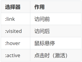
提示:如果要给超链接设置以上四个状态,需要按 LVHA 的顺序书写。
经验:工作中,一个 a 标签选择器设置超链接的样式, hover状态特殊设置
a {
  color: red;
}

a:hover {
  color: green;
}
|
02-CSS特性
CSS特性:化简代码 / 定位问题,并解决问题
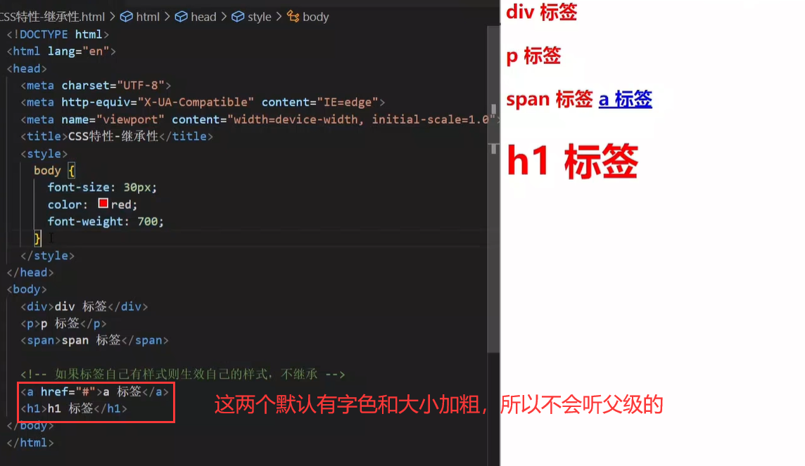
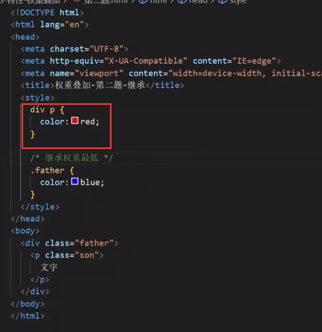
继承性
继承性:子级默认继承父级的文字控制属性。
所以一般选择器是body,然后可以继承给所有的子类,比如设置字体…
注意:如果标签有默认文字样式会继承失败。 例如:a 标签的颜色、标题的字体大小。
层叠性
特点:
- 相同的属性会覆盖:后面的 CSS 属性覆盖前面的 CSS 属性
- 不同的属性会叠加:不同的 CSS 属性都生效
<style>
  div {
    color: red;
    font-weight: 700;
  }
  div {
    color: green;
    font-size: 30px;
  }
</style>

<div>div 标签</div>
|
所以现在上面的是
div {
  font-weight: 700;
  color: green;
  font-size: 30px;
}
|
注意:选择器类型相同则遵循层叠性,否则按选择器优先级判断。
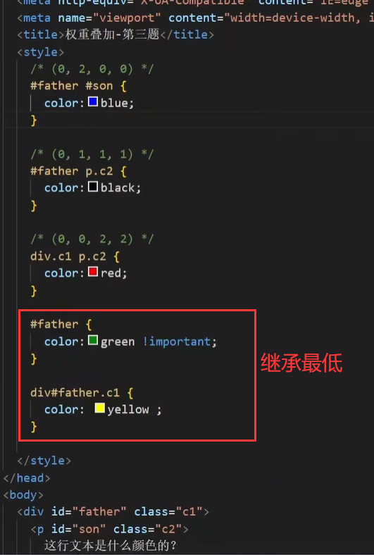
优先级
优先级:也叫权重,当一个标签使用了多种选择器时,基于不同种类的选择器的匹配规则。
<style>
  div {
    color: red;
  }
  .box {
    color: green;
  }
</style>

<div class="box">div 标签</div>
|
下面是优先级的详细说明
基础选择器
规则:选择器优先级高的样式生效。
公式:通配符选择器 < 标签选择器 < 类选择器 < id选择器 < 行内样式 < !important
(选中标签的范围越大,优先级越低。其实很好解释,越精确的优先级越高)
!important说明是权重
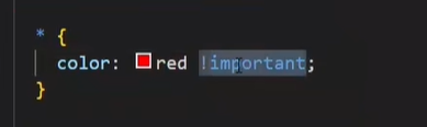
把这个优先级提取到最高,但是最好不要用
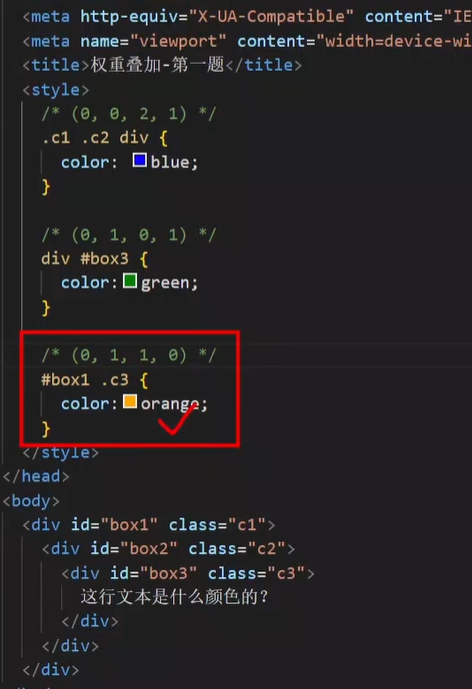
复合选择器-叠加
叠加计算:如果是复合选择器,则需要权重叠加计算。
公式:(每一级之间不存在进位)

规则:
- 从左向右依次比较选个数,同一级个数多的优先级高,如果个数相同,则向后比较
- !important 权重最高
- 继承权重最低
03-Emmet 写法
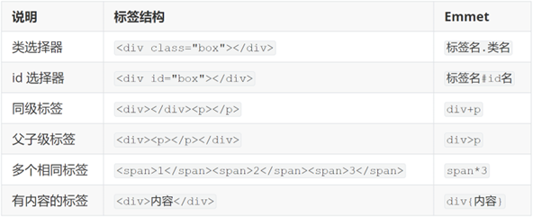
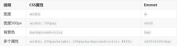
Emmet写法:代码的简写方式,输入缩写 VS Code 会自动生成对应的代码。
04-背景属性
背景图
网页中,使用背景图实现装饰性的图片效果。
- 属性名:background-image(bgi(VSCODE快捷键))
- 属性值:url(背景图 URL)
div {
  width: 400px;
  height: 400px;

  background-image: url(./images/1.png);
}
|
提示:背景图默认有平铺(复制)效果。
因为盒子太大了,所以会复制:
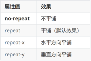
平铺方式
属性名:background-repeat(bgr)
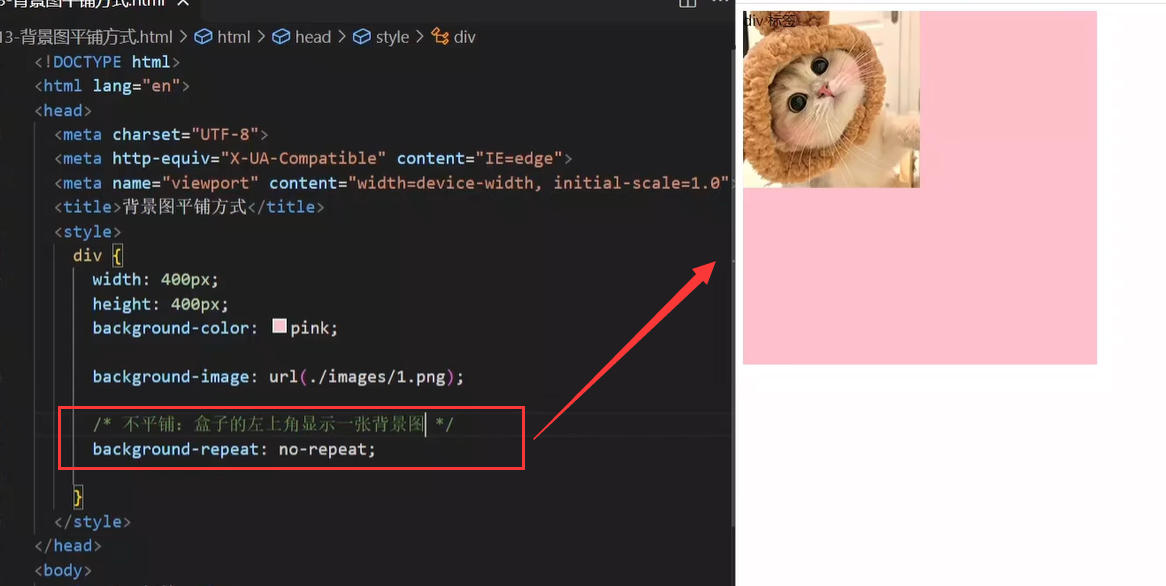
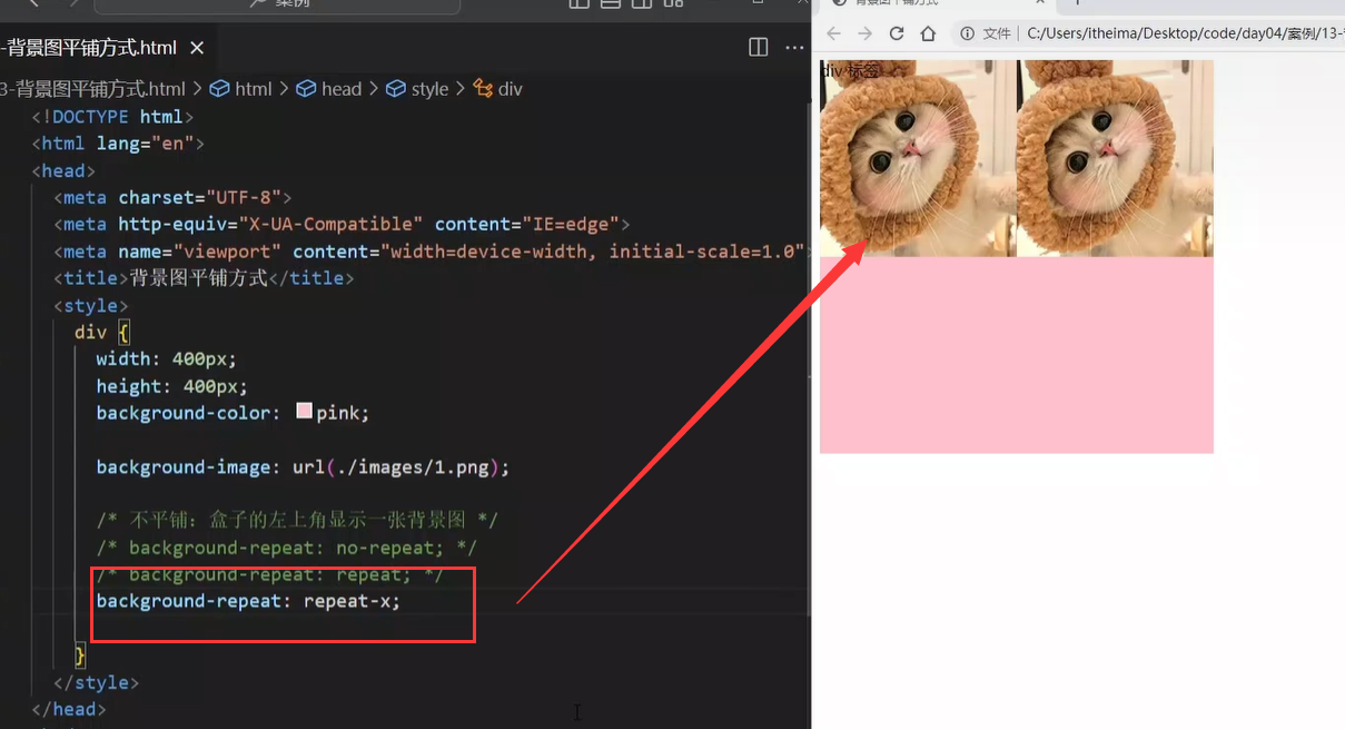
div {
  width: 400px;
  height: 400px;
  background-color: pink;
  background-image: url(./images/1.png);

  background-repeat: no-repeat;
}
|
背景图位置
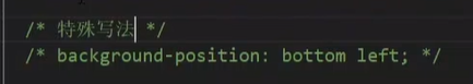
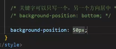
属性名:background-position(bgp)
属性值:水平方向位置 垂直方向位置
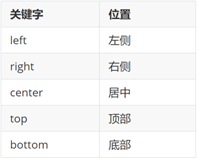
- 坐标
- 水平:正数向右;负数向左
- 垂直:正数向下;负数向上
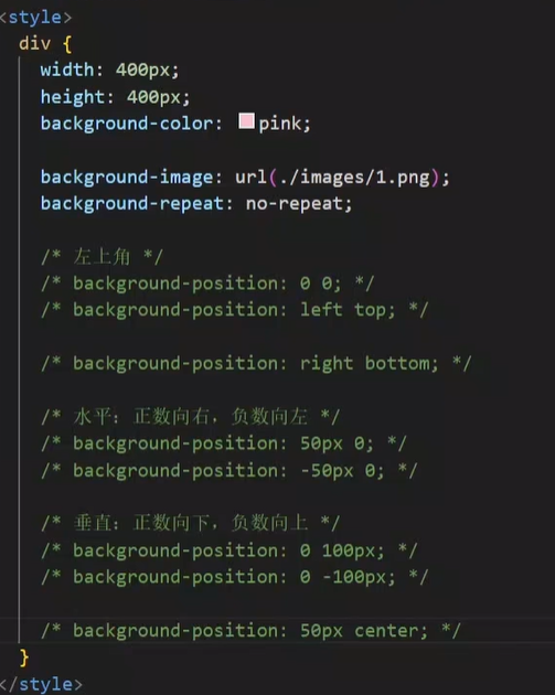
提示:
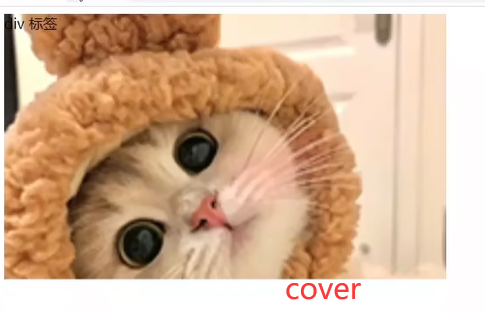
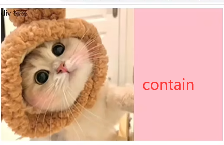
背景图缩放
作用:设置背景图大小
属性名:background-size(bgz)
常用属性值:
关键字
百分比:根据盒子尺寸计算图片大小
数字 + 单位(例如:px)
div {
width: 500px;
height: 400px;
background-color: pink;
background-image: url(./images/1.png);
background-repeat: no-repeat;
background-size: contain;
}
|
提示:工作中,图片比例与盒子比例相同,使用 cover 或 contain 缩放背景图效果相同。
背景图固定
作用:背景不会随着元素的内容滚动。
属性名:background-attachment(bga)
属性值:fixed
body {
  background-image: url(./images/bg.jpg);
  background-repeat: no-repeat;
  background-attachment: fixed;
}
|
背景复合属性
之前提到了front属性,也是一个复合属性
属性名:background(bg)
属性值:背景色 背景图 背景图平铺方式 背景图位置/背景图缩放 背景图固定(**空格隔开各个属性值,不区分顺序**)
div {
width: 400px;
height: 400px;
background: pink url(./images/1.png) no-repeat right center/cover;
}
|
05-显示模式
显示模式:标签(元素)的显示方式。

作用:布局网页的时候,根据标签的显示模式选择合适的标签摆放内容。
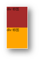
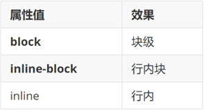
块级元素
div标签
特点:
- 独占一行
- 宽度默认是父级的100%
- 添加宽高属性生效
行内元素
span标签
特点:
- 一行可以显示多个
- 设置宽高属性不生效
- 宽高尺寸由内容撑开
行内块元素
img标签
特点:
- 一行可以显示多个
- 设置宽高属性生效
- 宽高尺寸也可以由内容撑开
转换显示模式
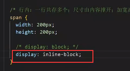
属性:display
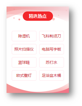
06-综合案例一-热词
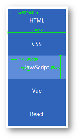
HTML标签
<a href="#">HTML</a>
<a href="#">CSS</a>
<a href="#">JavaScript</a>
<a href="#">Vue</a>
<a href="#">React</a>
|
CSS样式
<style>
a {
display: block;
width: 200px;
height: 80px;
background-color: #3064bb;
color: #fff;
text-decoration: none;
text-align: center;
line-height: 80px;
font-size: 18px;
}
a:hover {
background-color: #608dd9;
}
</style>
|
07-综合案例二 – banner 效果

HTML标签
<div class="banner">
  <h2>让创造产生价值</h2>
  <p>我们希望小游戏平台可以提供无限的可能性,让每一个创作者都可以将他们的才华和创意传递给用户。</p>
  <a href="#">我要报名</a>
</div>
|
CSS样式
<style>
.banner {
height: 500px;
background-color: #f3f3f4;
background-image: url(./images/bk.png);
background-repeat: no-repeat;
background-position: left bottom;
text-align: right;
color: #333;
}
.banner h2 {
font-size: 36px;
font-weight: 400;
line-height: 100px;
}
.banner p {
font-size: 20px;
}
.banner a {
width: 125px;
height: 40px;
background-color: #f06b1f;
display: inline-block;
text-align: center;
line-height: 40px;
color: #fff;
text-decoration: none;
font-size: 20px;
}
</style>
|
day05-盒子模型
目标:掌握盒子模型组成部分,使用盒子模型布局网页区域
01-选择器
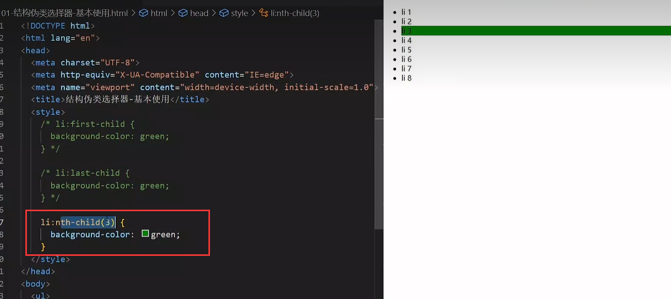
结构伪类选择器
基本使用
作用:根据元素的结构关系查找元素。
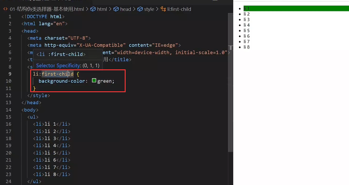
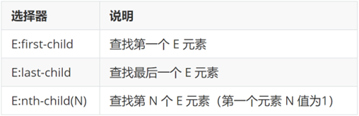
li:first-child {
  background-color: green;
}
|
:nth-child(公式)
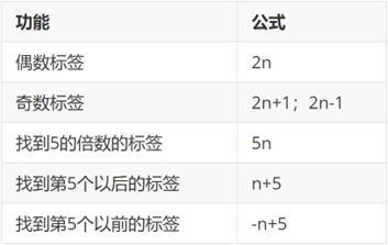
(最后两个是都包括5的)
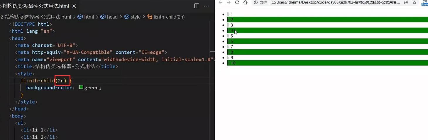
提示:公式中的n取值从 0 开始。
伪元素选择器
作用:创建虚拟元素(伪元素),用来摆放装饰性的内容。
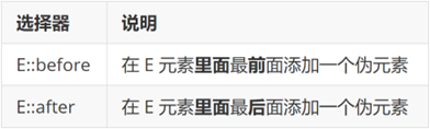
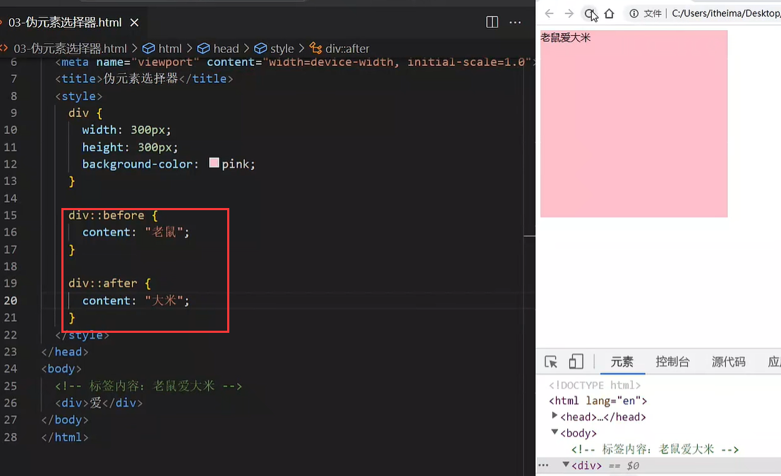
div::before {
  content: "before 伪元素";
}
div::after {
  content: "after 伪元素";
}
|
注意点:
- 必须设置 content: ””属性,用来设置伪元素的内容,如果没有设置content,这个伪元素选择器是不会生效的,如果没有内容,则引号留空即可
- 伪元素默认是行内显示模式(也就是说,给它设置高度不生效,上面写的有)
- 权重和标签选择器相同
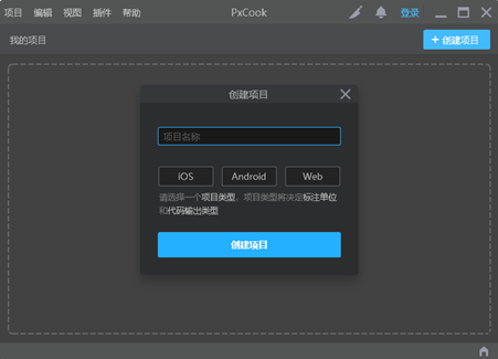
02-PxCook
PxCook(像素大厨) 是一款切图设计工具软件。支持PSD文件(设计稿的文件名称)的文字、颜色、距离自动智能识别。
- 开发面板(自动智能识别)
- 设计面板(手动测量尺寸和颜色)
使用方法:创建项目 → 输入 项目名称、项目类型 Web → 单击按钮【创建项目】 → 单击按钮【添加】,导入设计稿
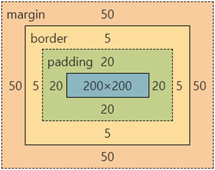
03-盒子模型
作用:布局网页,摆放盒子和内容。
盒子模型-组成
- 内容区域 – width & height
- 内边距 – padding(出现在内容与盒子边缘之间)
- 边框线 – border
- 外边距 – margin(出现在盒子外面)
div {
  margin: 50px;
  border: 5px solid brown;
  padding: 20px;
  width: 200px;
  height: 200px;
  background-color: pink;
}
|
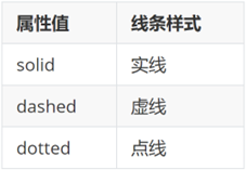
边框线
四个方向
属性名:border(bd)
属性值:边框线粗细 线条样式 颜色(不区分顺序)
div {
  border: 5px solid brown;
  width: 200px;
  height: 200px;
  background-color: pink;
}
|
单方向边框线
属性名:border-方位名词(bd+方位名词首字母,例如,bdl)
属性值:边框线粗细 线条样式 颜色(不区分顺序)
div {
  border-top: 2px solid red;
  border-right: 3px dashed green;
  border-bottom: 4px dotted blue;
  border-left: 5px solid orange;
  width: 200px;
  height: 200px;
  background-color: pink;
}
|
内边距
作用:设置 内容 与 盒子边缘 之间的距离。
- 属性名:padding / padding-方位名词
div {
padding: 30px;
padding-top: 10px;
padding-right: 20px;
padding-bottom: 40px;
padding-left: 80px;
width: 200px;
height: 200px;
background-color: pink;
}
|
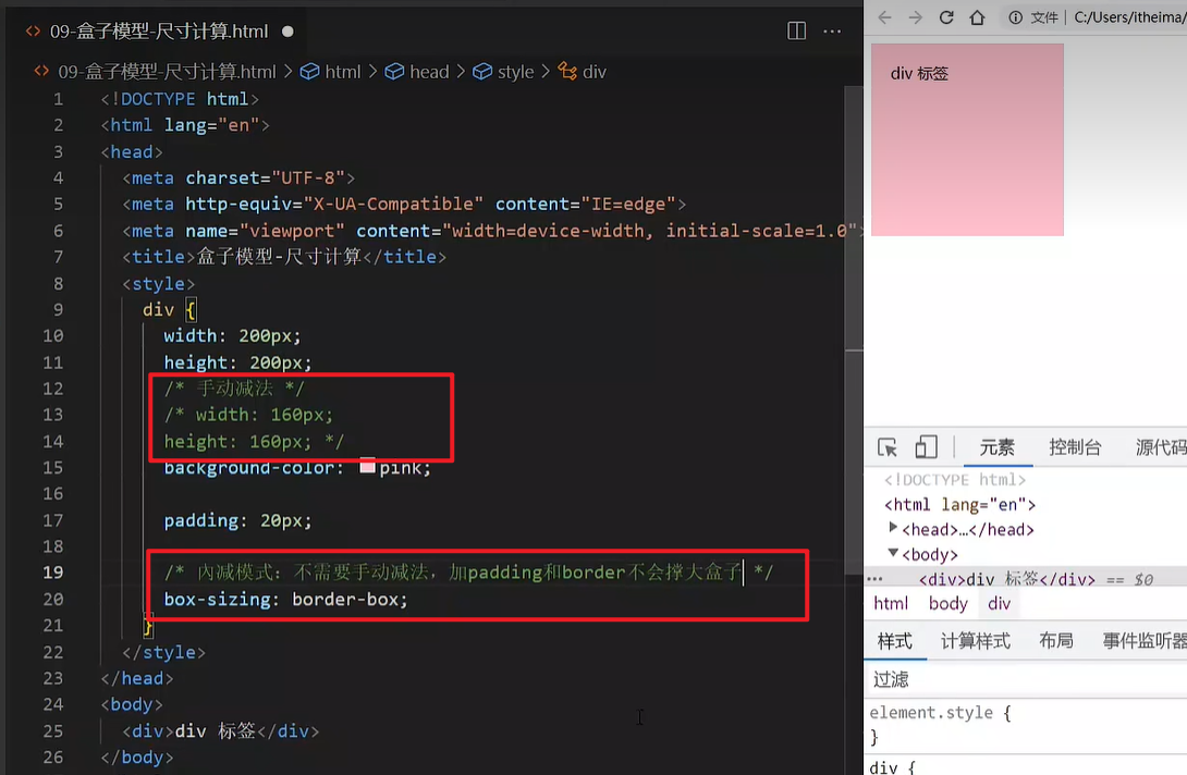
提示:添加 padding 会撑大盒子。
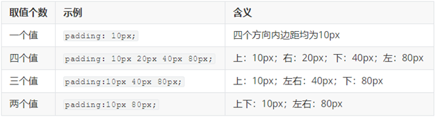
技巧:从上开始顺时针赋值,当前方向没有数值则与对面取值相同。
尺寸计算
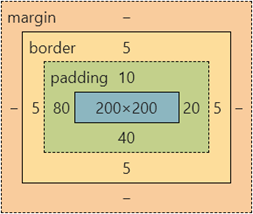
默认情况:盒子尺寸 = 内容尺寸 + border 尺寸 + 内边距尺寸
结论:给盒子加 border / padding 会撑大盒子
解决:
外边距
作用:拉开两个盒子之间的距离
属性名:margin
提示:与 padding 属性值写法、含义相同
版心居中
上下margin 值为0,左右 margin 值 为 auto(盒子要有宽度)
div {
margin: 0 auto;
width: 1000px;
height: 200px;
background-color: pink;
}
|
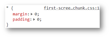
清除默认样式
清除标签默认的样式,比如:默认的内外边距。
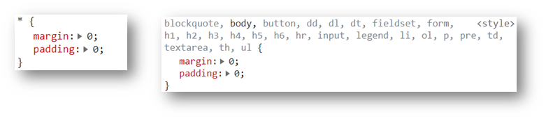
* {
margin: 0;
padding: 0;
box-sizing: border-box;
}
li {
list-style: none;
}
|
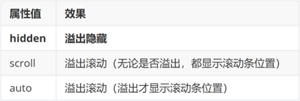
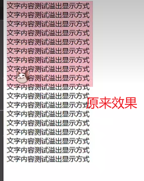
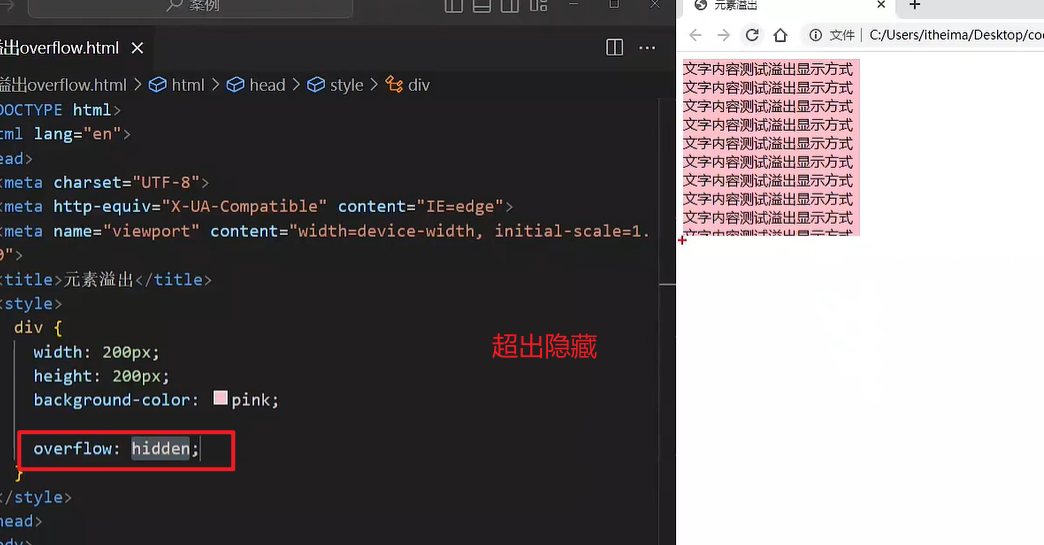
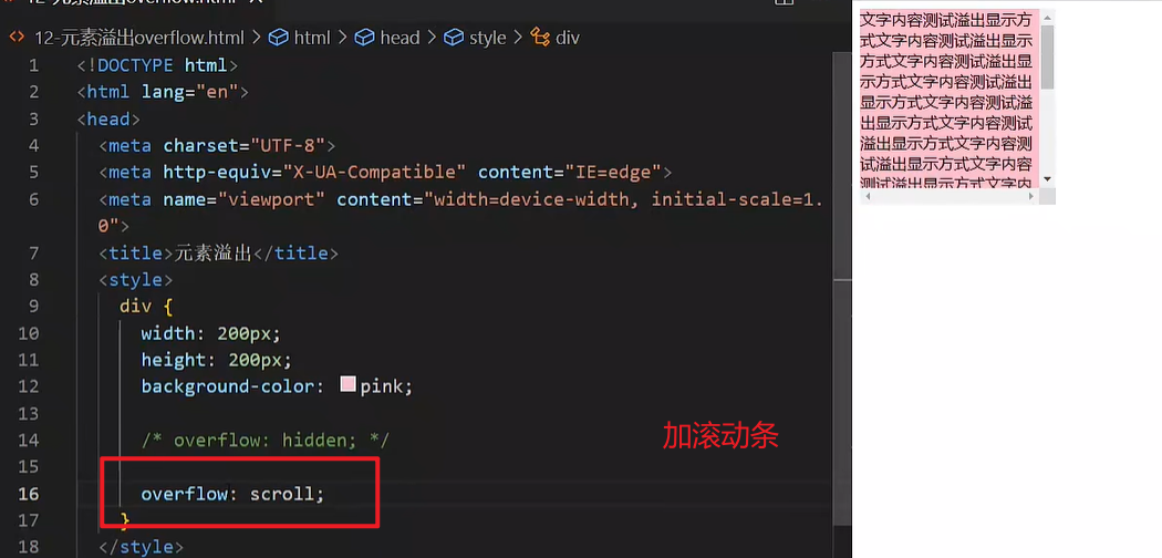
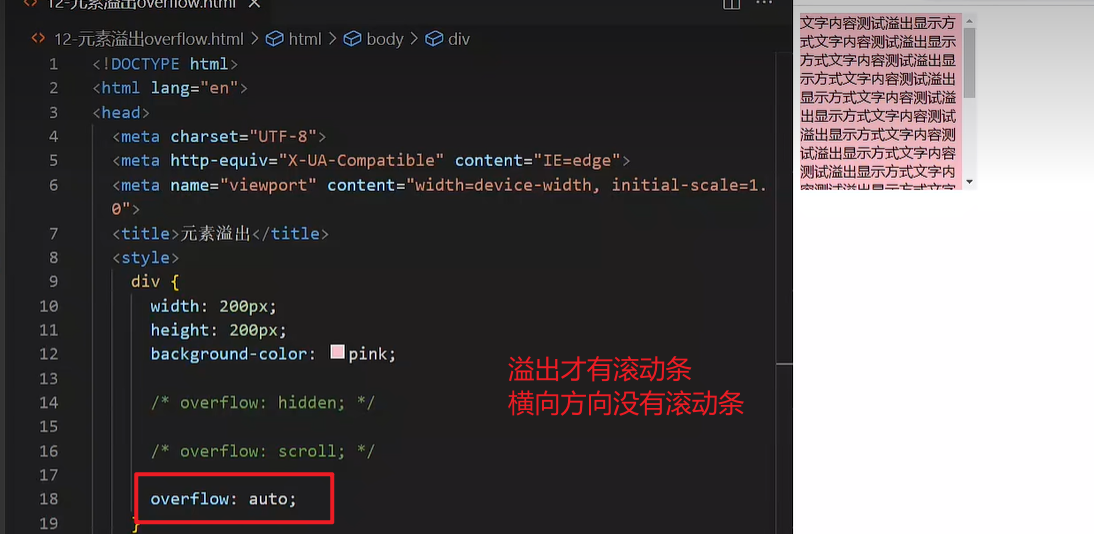
元素溢出
作用:控制溢出元素的内容的显示方式。
属性名:overflow
外边距问题
合并现象
场景:垂直排列的兄弟元素,上下 margin 会合并
现象:取两个 margin 中的较大值生效
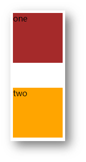
.one {
margin-bottom: 50px;
}
.two {
margin-top: 20px;
}
|
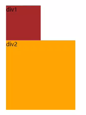
外边距塌陷
场景:父子级的标签,子级的添加 上外边距 会产生塌陷问题
现象:导致父级一起向下移动
.son {
  margin-top: 50px;
  width: 100px;
  height: 100px;
  background-color: orange;
}
|
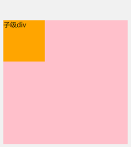
解决方法:
- 取消子级margin,父级设置padding
- 父级设置 overflow: hidden
- 父级设置 border-top
行内元素 – 内外边距问题
场景:行内元素添加 margin 和 padding,无法改变元素垂直位置
解决方法:给行内元素添加 line-height 可以改变垂直位置
span {
margin: 50px;
padding: 20px;
line-height: 100px;
}
|
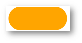
圆角
作用:设置元素的外边框为圆角。
属性名:border-radius
属性值:数字+px / 百分比
提示:属性值是圆角半径
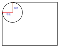
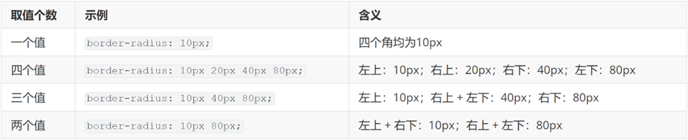
技巧:从左上角开始顺时针赋值,当前角没有数值则与对角取值相同。
- 正圆形状:给正方形盒子设置圆角属性值为 宽高的一半 / 50%
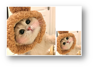
img {
  width: 200px;
  height: 200px;

  border-radius: 100px;
  border-radius: 50%;
}
|
- 胶囊形状:给长方形盒子设置圆角属性值为 盒子高度的一半
div {
  width: 200px;
  height: 80px;
  background-color: orange;
  border-radius: 40px;
}
|
盒子阴影(拓展)
作用:给元素设置阴影效果
属性名:box-shadow
属性值:X 轴偏移量 Y 轴偏移量 模糊半径 扩散半径 颜色 内外阴影
注意:
- X 轴偏移量 和 Y 轴偏移量 必须书写
- 默认是外阴影,内阴影需要添加 inset
外阴影
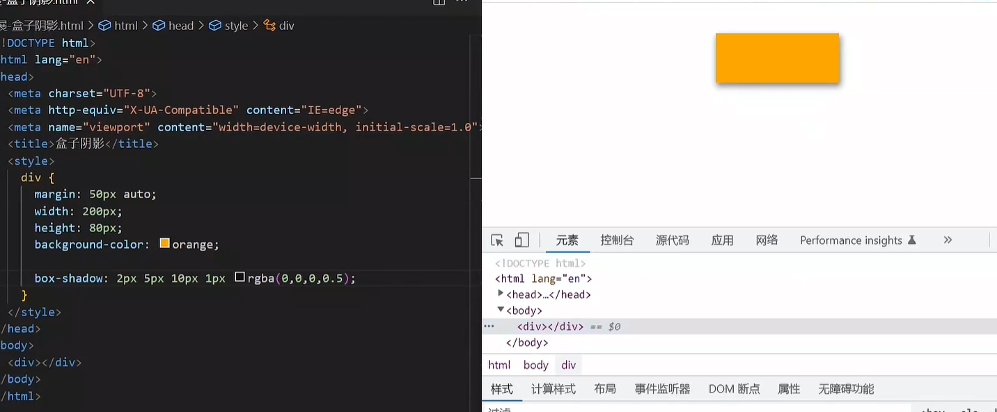
内阴影(好难看)
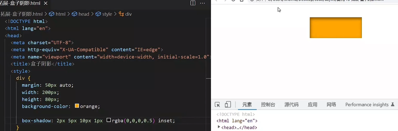
div {
  width: 200px;
  height: 80px;
  background-color: orange;
  box-shadow: 2px 5px 10px 0 rgba(0, 0, 0, 0.5) inset;
}
|
04-综合案例-产品卡片
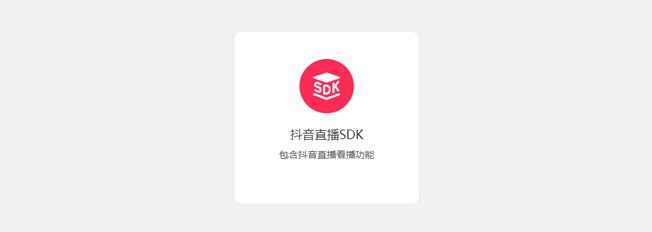
CSS 书写顺序:
- 盒子模型属性
- 文字样式
- 圆角、阴影等修饰属性
HTML标签
<div class="product">
  <img src="./images/liveSDK.svg" alt="">
  <h4>抖音直播SDK</h4>
  <p>包含抖音直播看播功能</p>
</div>
|
CSS样式
<style>
  * {
    margin: 0;
    padding: 0;
    box-sizing: border-box;
  }

  body {
    background-color: #f1f1f1;
  }

  .product {
    margin: 50px auto;
    padding-top: 40px;

    width: 270px;
    height: 253px;
    background-color: #fff;
    text-align: center;

    border-radius: 10px;
  }

  .product h4 {
    margin-top: 20px;
    margin-bottom: 12px;
    font-size: 18px;
    color: #333;
    font-weight: 400;
  }

  .product p {
    font-size: 12px;
    color: #555;
  }
</style>
|
05-综合案例二 – 新闻列表
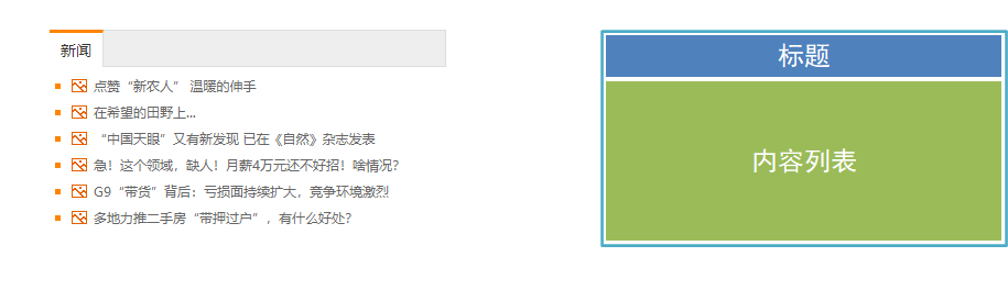
整体布局
<style>
* {
margin: 0;
padding: 0;
box-sizing: border-box;
}
li {
list-style: none;
}
a {
text-decoration: none;
}
.news {
margin: 100px auto;
width: 360px;
height: 200px;
}
</style>
<div class="news"></div>
|
标题区域
<style>
.news .hd {
height: 34px;
background-color: #eee;
border: 1px solid #dbdee1;
border-left: 0;
}
.news .hd a {
margin-top: -1px;
display: block;
border-top: 3px solid #ff8400;
border-right: 1px solid #dbdee1;
width: 48px;
height: 34px;
background-color: #fff;
text-align: center;
line-height: 32px;
font-size: 14px;
color: #333;
}
</style>
<div class="hd"><a href="#">新闻</a></div>
|
内容区域
<style>
.news .bd {
  padding: 5px;
}

.news .bd li {
  padding-left: 15px;
  background-image: url(./images/square.png);
  background-repeat: no-repeat;
  background-position: 0 center;
}

.news .bd li a {
  padding-left: 20px;
  background: url(./images/img.gif) no-repeat 0 center;

  font-size: 12px;
  color: #666;
  line-height: 24px;
}

.news .bd li a:hover {
  color: #ff8400;
}
</style>

<div class="bd">
  <ul>
    <li><a href="#">点赞“新农人” 温暖的伸手</a></li>
    <li><a href="#">在希望的田野上...</a></li>
    <li><a href="#">“中国天眼”又有新发现 已在《自然》杂志发表</a></li>
    <li><a href="#">急!这个领域,缺人!月薪4万元还不好招!啥情况?</a></li>
    <li><a href="#">G9“带货”背后:亏损面持续扩大,竞争环境激烈</a></li>
    <li><a href="#">多地力推二手房“带押过户”,有什么好处?</a></li>
  </ul>
</div>
|
day06-Flex布局
目标:熟练使用 Flex 完成结构化布局
01-标准流
标准流也叫文档流,指的是标签在页面中默认的排布规则,例如:块元素独占一行,行内元素可以一行显示多个。
02-浮动
基本使用
作用:让块元素水平排列。
属性名:float
属性值
<style>
.one {
width: 100px;
height: 100px;
background-color: brown;
float: left;
}
.two {
width: 200px;
height: 200px;
background-color: orange;
float: right;
}
</style>
<div class="one">one</div>
<div class="two">two</div>
|
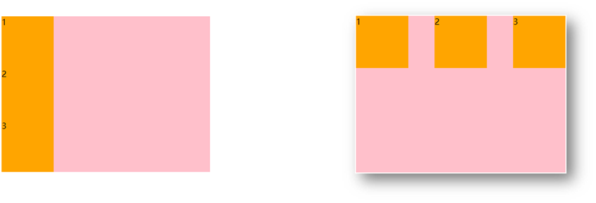
特点:
- 浮动后的盒子顶对齐
- 浮动后的盒子具备行内块特点
- 浮动后的盒子脱标,不占用标准流的位置
产品区域布局
HTML标签
<div class="product">
<div class="left"></div>
<div class="right">
<ul>
<li></li>
<li></li>
<li></li>
<li></li>
<li></li>
<li></li>
<li></li>
<li></li>
</ul>
</div>
</div>
|
CSS样式
<style>
* {
margin: 0;
padding: 0;
}
li {
list-style: none;
}
.product {
margin: 50px auto;
width: 1226px;
height: 628px;
background-color: pink;
}
.left {
float: left;
width: 234px;
height: 628px;
background-color: skyblue;
}
.right {
float: right;
width: 978px;
height: 628px;
background-color: brown;
}
.right li {
float: left;
margin-right: 14px;
margin-bottom: 14px;
width: 234px;
height: 300px;
background-color: orange;
}
.right li:nth-child(4n) {
margin-right: 0;
}
</style>
|
清除浮动
场景:浮动元素会脱标,如果父级没有高度,子级无法撑开父级高度(可能导致页面布局错乱)
解决方法:清除浮动(清除浮动带来的影响)
场景搭建
<style>
.top {
margin: 10px auto;
width: 1200px;
background-color: pink;
}
.left {
float: left;
width: 200px;
height: 300px;
background-color: skyblue;
}
.right {
float: right;
width: 950px;
height: 300px;
background-color: orange;
}
.bottom {
height: 100px;
background-color: brown;
}
</style>
<div class="top">
<div class="left"></div>
<div class="right"></div>
</div>
<div class="bottom"></div>
|
额外标签法
在父元素内容的最后添加一个块级元素,设置 CSS 属性 clear: both
<style>
.clearfix {
  clear: both;
}
</style>

<div class="father">
  <div class="left"></div>
  <div class="right"></div>
  <div class="clearfix"></div>
</div>
|
单伪元素法
- 准备 after 伪元素
.clearfix::after {
  content: "";
  display: block;
  clear: both;
}
|
- 父级使用 clearfix 类
<div class="father clearfix"></div>
|
双伪元素法
- 准备 after 和 before 伪元素
.clearfix::before,
.clearfix::after {
content: "";
display: table;
}
.clearfix::after {
clear: both;
}
|
- 父级使用 clearfix 类
<div class="father clearfix"></div>
|
overfow法
.father {
margin: 10px auto;
width: 1200px;
background-color: pink;
overflow: hidden;
}
|
03-Flex布局
Flex 布局也叫弹性布局,是浏览器提倡的布局模型,非常适合结构化布局,提供了强大的空间分布和对齐能力。
Flex 模型不会产生浮动布局中脱标现象,布局网页更简单、更灵活。
Flex组成
设置方式:给父元素设置 display: flex,子元素可以自动挤压或拉伸
组成部分:
- 弹性容器
- 弹性盒子
- 主轴:默认在水平方向
- 侧轴 / 交叉轴:默认在垂直方向
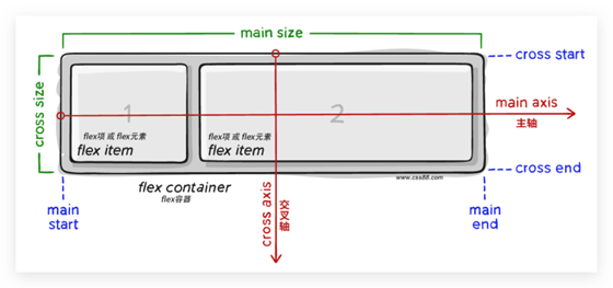
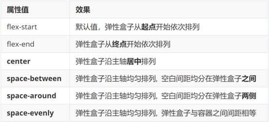
主轴对齐方式
属性名:justify-content

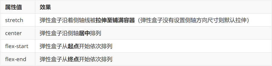
侧轴对齐方式
- align-items:当前弹性容器内所有弹性盒子的侧轴对齐方式(给弹性容器设置)
- align-self:单独控制某个弹性盒子的侧轴对齐方式(给弹性盒子设置)
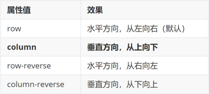
修改主轴方向
主轴默认在水平方向,侧轴默认在垂直方向
属性名:flex-direction
弹性伸缩比
作用:控制弹性盒子的主轴方向的尺寸。
属性名:flex
属性值:整数数字,表示占用父级剩余尺寸的份数。
弹性盒子换行
弹性盒子可以自动挤压或拉伸,默认情况下,所有弹性盒子都在一行显示。
属性名:flex-wrap
属性值
行内对齐方式
属性名:align-content
注意:该属性对单行弹性盒子模型无效。
04-综合案例 – 抖音解决方案
整体布局
<style>
* {
  margin: 0;
  padding: 0;
  box-sizing: border-box;
}

li {
  list-style: none;
}

.box {
  margin: 50px auto;
  width: 1200px;
  height: 418px;
  border: 1px solid #ddd;
  border-radius: 10px;
}
</style>

<div class="box"></div>
|
列表布局
<style>
.box ul {
display: flex;
flex-wrap: wrap;
justify-content: space-between;
align-content: space-between;
padding: 90px 40px 90px 60px;
height: 418px;
}
.box li {
display: flex;
width: 500px;
height: 88px;
}
</style>
<div class="box">
<ul>
<li>1</li>
<li>2</li>
<li>3</li>
<li>4</li>
</ul>
</div>
|
内容样式
<style>
.box .pic {
margin-right: 15px;
}
.box .text h4 {
line-height: 40px;
font-size: 20px;
font-weight: 400;
color: #333;
}
.box .text p {
font-size: 14px;
color: #666;
}
</style>
<ul>
<li>
<div class="pic">
<img src="./images/1.svg" alt="">
</div>
<div class="text">
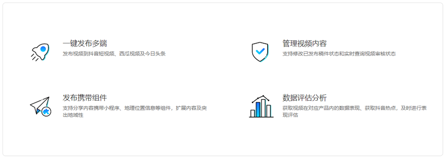
<h4>一键发布多端</h4>
<p>发布视频到抖音短视频、西瓜视频及今日头条</p>
</div>
</li>
<li>
<div class="pic">
<img src="./images/2.svg" alt="">
</div>
<div class="text">
<h4>管理视频内容</h4>
<p>支持修改已发布稿件状态和实时查询视频审核状态</p>
</div>
</li>
<li>
<div class="pic">
<img src="./images/3.svg" alt="">
</div>
<div class="text">
<h4>发布携带组件</h4>
<p>支持分享内容携带小程序、地理位置信息等组件,扩展内容及突出地域性</p>
</div>
</li>
<li>
<div class="pic">
<img src="./images/4.svg" alt="">
</div>
<div class="text">
<h4>数据评估分析</h4>
<p>获取视频在对应产品内的数据表现、获取抖音热点,及时进行表现评估</p>
</div>
</li>
</ul>
|
day07-学成在线
01-项目目录
网站根目录是指存放网站的第一层文件夹,内部包含当前网站的所有素材,包含 HTML、CSS、图片、JavaScript等等。
<link rel="stylesheet" href="./css/base.css">
<link rel="stylesheet" href="./css/index.css">
|
02-版心居中
.wrapper {
  margin: 0 auto;
  width: 1200px;
}

body {
  background-color: #f3f5f7;
}
|
03-布局思路
- 布局思路:先整体再局部,从外到内,从上到下,从左到右
- CSS 实现思路
- 画盒子,调整盒子范围 → 宽高背景色
- 调整盒子位置 → flex 布局、内外边距
- 控制图片、文字内容样式
HTML结构
<div class="header">
<div class="wrapper">
<div class="logo">logo</div>
<div class="nav">导航</div>
<div class="search">search</div>
<div class="user">用户</div>
</div>
</div>
|
CSS样式
.header {
height: 100px;
background-color: #fff;
}
.header .wrapper {
padding-top: 29px;
display: flex;
}
|
logo 功能:
- 单击跳转到首页
- 搜索引擎优化:提升网站百度搜索排名
实现方法:
- 标签结构:h1 > a > 网站名称(搜索关键字)
<div class="logo">
  <h1><a href="#">学成在线</a></h1>
</div>
|
.logo a {
display: block;
width: 195px;
height: 41px;
background-image: url(../images/logo.png);
font-size: 0;
}
|
实现方法:
- 标签结构:ul > li * 3 > a
- 优势:避免堆砌 a 标签,网站搜索排名降级
HTML结构
<ul>
  <li><a href="#" class="active">首页</a></li>
  <li><a href="#">课程</a></li>
  <li><a href="#">职业规划</a></li>
</ul>
|
CSS样式
.nav {
margin-left: 102px;
}
.nav ul {
display: flex;
}
.nav li {
margin-right: 24px;
}
.nav li a {
display: block;
padding: 6px 8px;
line-height: 27px;
font-size: 19px;
}
.nav li .active,
.nav li a:hover {
border-bottom: 2px solid #00a4ff;
}
|
HTML结构
<div class="search"></div>
|
CSS样式
.search {
  display: flex;
  margin-left: 64px;
  padding-left: 19px;
  padding-right: 12px;
  width: 412px;
  height: 40px;
  background-color: #f3f5f7;
  border-radius: 20px;
}
|
HTML结构
<div class="search">
  <input type="text" placeholder="请输入关键词">
  <a href="#"></a>
</div>
|
CSS样式
.search input {
flex: 1;
border: 0;
background-color: transparent;
outline: none;
}
.search input::placeholder {
font-size: 14px;
color: #999;
}
.search a {
align-self: center;
width: 16px;
height: 16px;
background-image: url(../images/search.png);
}
|
HTML结构
<div class="user">
  <a href="#">
    <img src="./uploads/user.png" alt="">
    <span>播仔学前端</span>
  </a>
</div>
|
CSS样式
.user {
margin-left: 32px;
margin-top: 4px;
}
.user img {
margin-right: 7px;
vertical-align: middle;
}
.user span {
font-size: 16px;
color: #666;
}
|
10-banner区域-布局
HTML结构
<div class="banner">
  <div class="wrapper">
    <div class="left">left</div>
    <div class="right">right</div>
  </div>
</div>
|
CSS样式
.banner {
height: 420px;
background-color: #0092cb;
}
.banner .wrapper {
display: flex;
justify-content: space-between;
height: 420px;
background-image: url(../uploads/banner.png);
}
|
11-banner区域-侧导航
HTML结构
<div class="left">
  <ul>
    <li><a href="#">前端开发</a></li>
    <li><a href="#">后端开发</a></li>
    <li><a href="#">移动开发</a></li>
    <li><a href="#">人工智能</a></li>
    <li><a href="#">商业预测</a></li>
    <li><a href="#">云计算&大数据</a></li>
    <li><a href="#">运维&测试</a></li>
    <li><a href="#">UI设计</a></li>
    <li><a href="#">产品</a></li>
  </ul>
</div>
|
CSS样式
.banner .left {
padding: 3px 20px;
width: 191px;
height: 420px;
background-color: rgba(0,0,0,0.42);
}
.banner .left a {
display: block;
height: 46px;
background: url(../images/right.png) no-repeat right center;
line-height: 46px;
font-size: 16px;
color: #fff;
}
.banner .left a:hover {
background-image: url(../images/right-hover.png);
color: #00a4ff;
}
|
12-banner区域-课程表布局
HTML布局
<div class="right">
  <h3>我的课程表</h3>
  <div class="content">1</div>
</div>
|
CSS样式
.banner .right {
margin-top: 60px;
width: 218px;
height: 305px;
background-color: #209dd5;
border-radius: 10px;
}
.banner .right h3 {
margin-left: 14px;
height: 48px;
line-height: 48px;
font-size: 15px;
color: #fff;
font-weight: 400;
}
.banner .right .content {
padding: 14px;
height: 257px;
background-color: #fff;
border-radius: 10px;
}
|
13-banner区域-课程表内容
HTML结构
<dl>
  <dt>数据可视化课程</dt>
  <dd><span>正在学习</span>-<strong>echarts使用步骤</strong></dd>
</dl>
<dl>
  <dt>Vue3医疗项目课程  </dt>
  <dd><span>正在学习</span>-<strong>认识组合式API</strong></dd>
</dl>
<dl>
  <dt>React核心技术课程</dt>
  <dd><span>正在学习</span>-<strong>rudex配合TS使用</strong></dd>
</dl>
|
CSS样式
.banner .right dl {
  margin-bottom: 12px;
  border-bottom: 1px solid #e0e0e0;
}

.banner .right dt {
  margin-bottom: 8px;
  font-size: 14px;
  line-height: 20px;
  font-weight: 700;
}

.banner .right dd {
  margin-bottom: 8px;
  font-size: 12px;
  line-height: 16px;
}

.banner .right dd span {
  color: #00a4ff;
}

.banner .right dd strong {
  color: #7d7d7d;
  font-weight: 400;
}
|
14-banner区域-全部课程
HTML结构
CSS样式
.banner .right a {
  display: block;
  height: 32px;
  background-color: #00a4ff;
  text-align: center;
  line-height: 32px;
  font-size: 14px;
  color: #fff;
  border-radius: 15px;
}
|
15-精品推荐-区域布局
HTML结构
<div class="recommend wrapper">
<h3>精品推荐</h3>
<ul>
<li><a href="#">HTML</a></li>
</ul>
<a href="#" class="modify">修改兴趣</a>
</div>
|
CSS样式
.recommend {
display: flex;
margin-top: 11px;
padding: 0 20px;
height: 60px;
background-color: #fff;
box-shadow: 0px 1px 2px 0px rgba(211, 211, 211, 0.5);
line-height: 60px;
}
|
16-精品推荐-内容样式
HTML结构
<ul>
  <li><a href="#">HTML</a></li>
  <li><a href="#">CSS</a></li>
  <li><a href="#">JavaScript</a></li>
  <li><a href="#">Node.js</a></li>
  <li><a href="#">Ajax</a></li>
  <li><a href="#">Vue2.0</a></li>
  <li><a href="#">Vue3.0</a></li>
  <li><a href="#">TypeScript</a></li>
  <li><a href="#">React</a></li>
</ul>
|
CSS样式
.recommend h3 {
font-size: 18px;
color: #00a4ff;
font-weight: 400;
}
.recommend ul {
flex: 1;
display: flex;
}
.recommend ul li a {
padding: 0 24px;
border-right: 1px solid #e0e0e0;
font-size: 18px;
}
.recommend ul li:last-child a {
border-right: 0;
}
.recommend .modify {
font-size: 16px;
color: #00a4ff;
}
|
17-推荐课程-标题区域
HTML结构
<div class="course wrapper">
<div class="hd">
<h3>精品推荐</h3>
<a href="#" class="more">查看全部</a>
</div>
<div class="bd">1</div>
</div>
|
CSS样式
.course {
margin-top: 15px;
}
.hd {
display: flex;
justify-content: space-between;
height: 60px;
line-height: 60px;
}
.hd h3 {
font-size: 21px;
font-weight: 400;
}
.hd .more {
padding-right: 20px;
background: url(../images/more.png) no-repeat right center;
font-size: 14px;
color: #999;
}
|
18-推荐课程-内容布局
HTML结构
<ul>
  <li>1</li>
  <li>2</li>
  <li>3</li>
  <li>4</li>
  <li>5</li>
  <li>6</li>
  <li>7</li>
  <li>8</li>
</ul>
|
CSS样式
.bd ul {
display: flex;
flex-wrap: wrap;
justify-content: space-between;
}
.bd li {
margin-bottom: 14px;
width: 228px;
height: 271px;
background-color: pink;
}
|
19-推荐课程-内容样式
HTML结构
<ul>
  <li>
    <a href="#">
      <div class="pic"><img src="./uploads/course01.png" alt=""></div>
      <div class="text">
        <h4>JavaScript数据看板项目实战</h4>
        <p><span>高级</span> · <i>1125</i>人在学习</p>
      </div>
    </a>
  </li>
  <li>
    <a href="#">
      <div class="pic"><img src="./uploads/course02.png" alt=""></div>
      <div class="text">
        <h4>Vue.js实战——面经全端项目</h4>
        <p><span>高级</span> · <i>2726</i>人在学习</p>
      </div>
    </a>
  </li>
  <li>
    <a href="#">
      <div class="pic"><img src="./uploads/course03.png" alt=""></div>
      <div class="text">
        <h4>玩转Vue全家桶,iHRM人力资源项目</h4>
        <p><span>高级</span> · <i>9456</i>人在学习</p>
      </div>
    </a>
  </li>
  <li>
    <a href="#">
      <div class="pic"><img src="./uploads/course04.png" alt=""></div>
      <div class="text">
        <h4>Vue.js实战医疗项目——优医问诊</h4>
        <p><span>高级</span> · <i>7192</i>人在学习</p>
      </div>
    </a>
  </li>
  <li>
    <a href="#">
      <div class="pic"><img src="./uploads/course05.png" alt=""></div>
      <div class="text">
        <h4>小程序实战:小兔鲜电商小程序项目</h4>
        <p><span>高级</span> · <i>2703</i>人在学习</p>
      </div>
    </a>
  </li>
  <li>
    <a href="#">
      <div class="pic"><img src="./uploads/course06.png" alt=""></div>
      <div class="text">
        <h4>前端框架Flutter开发实战</h4>
        <p><span>高级</span> · <i>2841</i>人在学习</p>
      </div>
    </a>
  </li>
  <li>
    <a href="#">
      <div class="pic"><img src="./uploads/course07.png" alt=""></div>
      <div class="text">
        <h4>熟练使用React.js——极客园H5项目</h4>
        <p><span>高级</span> · <i>95682</i>人在学习</p>
      </div>
    </a>
  </li>
  <li>
    <a href="#">
      <div class="pic"><img src="./uploads/course08.png" alt=""></div>
      <div class="text">
        <h4>熟练使用React.js——极客园PC端项目</h4>
        <p><span>高级</span> · <i>904</i>人在学习</p>
      </div>
    </a>
  </li>
  <li>
    <a href="#">
      <div class="pic"><img src="./uploads/course09.png" alt=""></div>
      <div class="text">
        <h4>前端实用技术,Fetch API 实战</h4>
        <p><span>高级</span> · <i>1516</i>人在学习</p>
      </div>
    </a>
  </li>
  <li>
    <a href="#">
      <div class="pic"><img src="./uploads/course10.png" alt=""></div>
      <div class="text">
        <h4>前端高级Node.js零基础入门教程</h4>
        <p><span>高级</span> · <i>2766</i>人在学习</p>
      </div>
    </a>
  </li>
</ul>
|
CSS样式
.bd li .pic {
  height: 156px;
}

.bd li .text {
  padding: 20px;
  height: 115px;
  background-color: #fff;
}

.bd li .text h4 {
  margin-bottom: 13px;
  height: 40px;
  font-size: 14px;
  line-height: 20px;
  font-weight: 400;
}

.bd li .text p {
  font-size: 14px;
  line-height: 20px;
  color: #999;
}

.bd li .text p span {
  color: #fa6400;
}

.bd li .text p i {
  font-style: normal;
}
|
20-前端开发工程师区域
HTML结构
<div class="wrapper">
<div class="hd">
<h3>前端开发工程师</h3>
<ul>
<li><a href="#" class="active">热门</a></li>
<li><a href="#">初级</a></li>
<li><a href="#">中级</a></li>
<li><a href="#">高级</a></li>
</ul>
<a href="#" class="more">查看全部</a>
</div>
<div class="bd">
<div class="left">
<img src="./uploads/web_left.png" alt="">
</div>
<div class="right">
<div class="top"><img src="./uploads/web_top.png" alt=""></div>
<div class="bottom">
<ul>
<li>
<a href="#">
<div class="pic"><img src="./uploads/web01.png" alt=""></div>
<div class="text">
<h4>JS高级javaScript进阶面向对象ES6</h4>
<p><span>高级</span> · <i>101937</i>人在学习</p>
</div>
</a>
</li>
<li>
<a href="#">
<div class="pic"><img src="./uploads/web02.png" alt=""></div>
<div class="text">
<h4>零基础玩转微信小程序</h4>
<p><span>高级</span> · <i>133781</i>人在学习</p>
</div>
</a>
</li>
<li>
<a href="#">
<div class="pic"><img src="./uploads/web03.png" alt=""></div>
<div class="text">
<h4>JavaScript基础——语法解析+项目实战</h4>
<p><span>高级</span> · <i>8927</i>人在学习</p>
</div>
</a>
</li>
<li>
<a href="#">
<div class="pic"><img src="./uploads/web04.png" alt=""></div>
<div class="text">
<h4>前端框架Vue2+Vue3全套视频</h4>
<p><span>高级</span> · <i>26022</i>人在学习</p>
</div>
</a>
</li>
</ul>
</div>
</div>
</div>
</div>
|
CSS样式
.hd ul {
display: flex;
}
.hd li {
margin-right: 60px;
font-size: 16px;
}
.hd li .active {
color: #00a4ff;
}
.bd {
display: flex;
justify-content: space-between;
}
.bd .left {
width: 228px;
}
.bd .right {
width: 957px;
}
.bd .right .top {
margin-bottom: 15px;
height: 100px;
}
|
21-版权-布局
HTML结构
<div class="footer">
<div class="wrapper">
<div class="left">left</div>
<div class="right">right</div>
</div>
</div>
|
CSS样式
.footer {
margin-top: 60px;
padding-top: 60px;
height: 273px;
background-color: #fff;
}
.footer .wrapper {
display: flex;
justify-content: space-between;
}
.footer .left {
width: 440px;
background-color: pink;
}
|
22-版权-内容
HTML结构
<div class="left">
  <a href="#"><img src="./images/logo.png" alt=""></a>
  <p>学成在线致力于普及中国最好的教育它与中国一流大学和机构合作提供在线课程。
    © 2017年XTCG Inc.保留所有权利。-沪ICP备15025210号</p>
  <a href="#" class="download">下载APP</a>
</div>
<div class="right">
  <dl>
    <dt>关于学成网</dt>
    <dd><a href="#">关于</a></dd>
    <dd><a href="#">管理团队</a></dd>
    <dd><a href="#">工作机会</a></dd>
    <dd><a href="#">客户服务</a></dd>
    <dd><a href="#">帮助</a></dd>
  </dl>
  <dl>
    <dt>新手指南</dt>
    <dd><a href="#">如何注册</a></dd>
    <dd><a href="#">如何选课</a></dd>
    <dd><a href="#">如何拿到毕业证</a></dd>
    <dd><a href="#">学分是什么</a></dd>
    <dd><a href="#">考试未通过怎么办</a></dd>
  </dl>
  <dl>
    <dt>合作伙伴</dt>
    <dd><a href="#">合作机构</a></dd>
    <dd><a href="#">合作导师</a></dd>
  </dl>
</div>
|
CSS样式
.footer .left p {
  margin-top: 24px;
  margin-bottom: 14px;
  font-size: 12px;
  line-height: 17px;
  color: #666;
}

.footer .left .download {
  display: block;
  width: 120px;
  height: 36px;
  border: 1px solid #00a4ff;
  text-align: center;
  line-height: 34px;
  font-size: 16px;
  color: #00a4ff;
}

.footer .right {
  display: flex;
}

.footer .right dl {
  margin-left: 130px;
}

.footer .right dt {
  margin-bottom: 12px;
  font-size: 16px;
  line-height: 23px;
}

.footer .right a {
  font-size: 14px;
  color: #666;
  line-height: 24px;
}
|
day08-CSS高级
目标:掌握定位的作用及特点;掌握 CSS 高级技巧
01-定位
作用:灵活的改变盒子在网页中的位置
实现:
1.定位模式:position
2.边偏移:设置盒子的位置
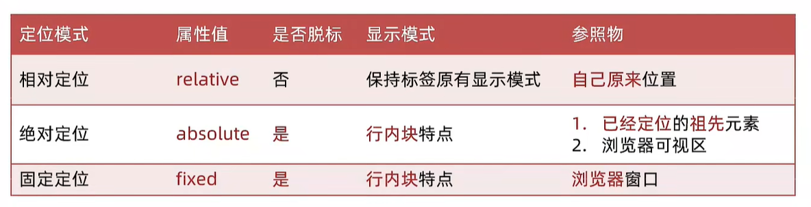
相对定位
position: relative
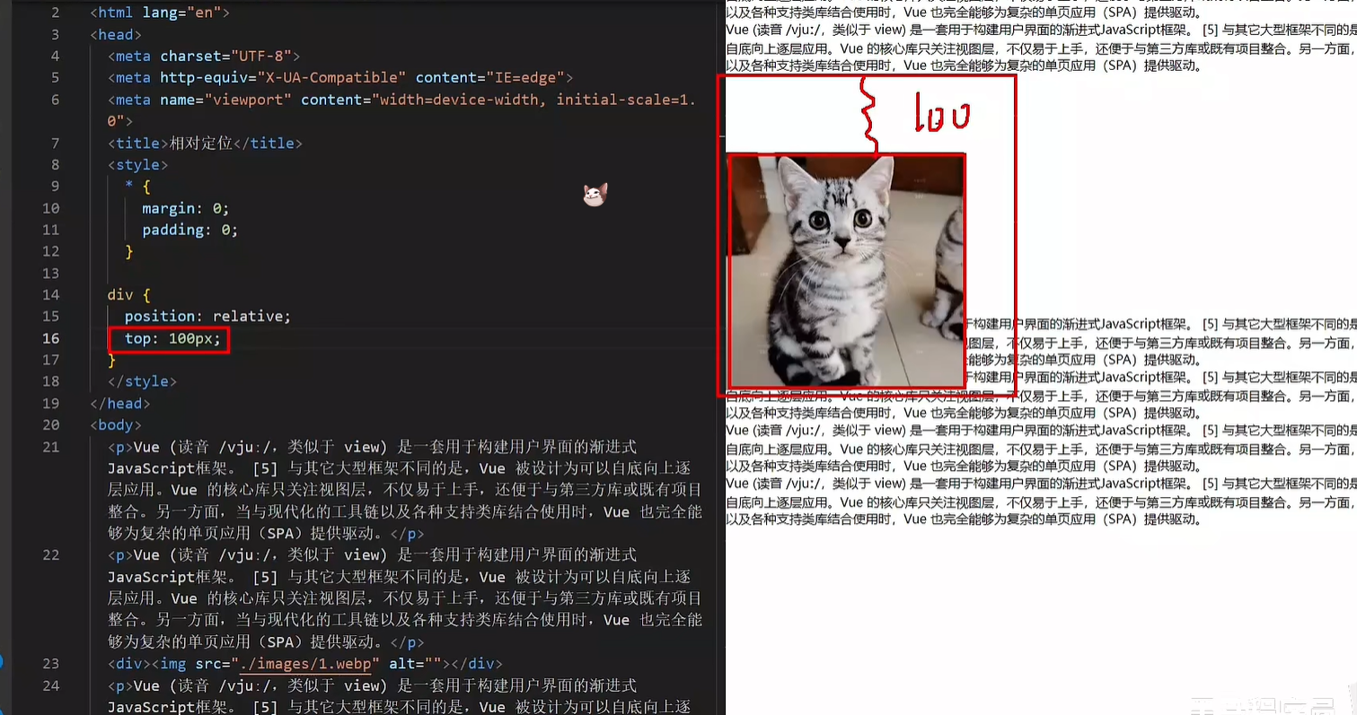
特点:
- 不脱标,占用自己原来位置(其他标签不会占它的位置)
- 显示模式特点保持不变
- 设置边偏移则相对自己原来位置移动(比如设置div往右移动,就真的向右移动了全部)
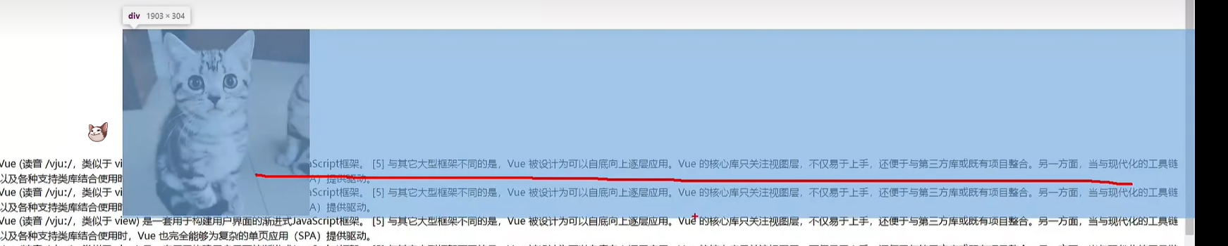
div {
  position: relative;
  top: 100px;
  left: 200px;
}
|
绝对定位
position: absolute
其实绝对定位是根据父级来为参照物的
使用场景:子级绝对定位,父级相对定位(子绝父相)
特点:
- 脱标,不占位
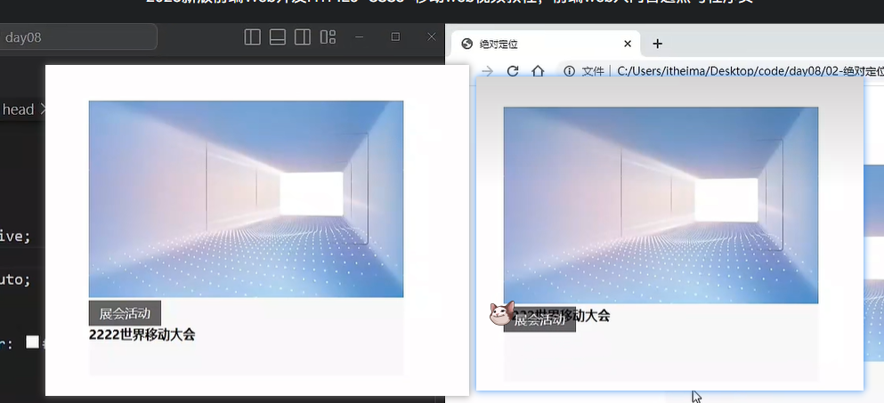
- 显示模式具备行内块特点(宽高生效)
- 设置边偏移则相对最近的已经定位的祖先元素改变位置
- 如果祖先元素都未定位,则相对浏览器可视区改变位置
.father {
  position: relative;
}

.father span {
  position: absolute;
  top: 0;
  right: 0;
}
|
定位居中
实现步骤:
- 绝对定位
- 水平、垂直边偏移为 50%
- 子级向左、上移动自身尺寸的一半
- 左、上的外边距为 –尺寸的一半
- transform: translate(-50%, -50%)
img {
position: absolute;
left: 50%;
top: 50%;
transform: translate(-50%, -50%);
}
|
固定定位
position: fixed
场景:元素的位置在网页滚动时不会改变
特点:
- 脱标,不占位
- 显示模式具备行内块(img标签行内块宽度由内容撑开,可以自己设定宽度)特点
- 设置边偏移相对浏览器窗口改变位置
div {
  position: fixed;
  top: 0;
  right: 0;

  width: 500px;
}
|
堆叠层级z-index
默认效果:按照标签书写顺序,后来者居上
作用:设置定位元素的层级顺序,改变定位元素的显示顺序
属性名:z-index
属性值:整数数字(默认值为0,取值越大,层级越高)
.box1 {
background-color: pink;
z-index: 1;
}
.box2 {
background-color: skyblue;
left: 100px;
top: 100px;
z-index: 2;
}
|
定位总结
02-高级技巧
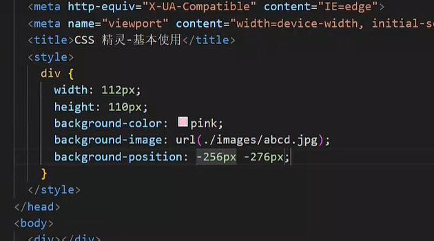
CSS精灵
CSS 精灵,也叫 CSS Sprites,是一种网页图片应用处理方式。把网页中一些背景图片整合到一张图片文件中,再background-position 精确的定位出背景图片的位置。
优点:减少服务器被请求次数,减轻服务器的压力,提高页面加载速度
实现步骤:
- 创建盒子,盒子尺寸与小图尺寸相同
- 设置盒子背景图为精灵图
- 添加 background-position 属性,改变背景图位置
3.1 使用 PxCook 测量小图片左上角坐标
3.2 取**负数**坐标为 background-position 属性值(向左上移动图片位置)
案例-京东服务
HTML结构
<div class="service">
  <ul>
    <li>
      <h5></h5>
      <p>品类齐全,轻松购物</p>
    </li>
    <li>
      <h5></h5>
      <p>多仓直发,极速配送</p>
    </li>
    <li>
      <h5></h5>
      <p>正品行货,精致服务</p>
    </li>
    <li>
      <h5></h5>
      <p>天天低价,畅选无忧</p>
    </li>
  </ul>
</div>
|
CSS样式
<style>
* {
margin: 0;
padding: 0;
box-sizing: border-box;
}
li {
list-style: none;
}
.service {
margin: 100px auto;
width: 1190px;
height: 42px;
}
.service ul {
display: flex;
}
.service li {
display: flex;
padding-left: 40px;
width: 297px;
height: 42px;
}
.service li h5 {
margin-right: 10px;
width: 36px;
height: 42px;
background: url(./images/sprite.png) 0 -192px;
}
.service li:nth-child(2) h5 {
background-position: -41px -192px;
}
.service li:nth-child(3) h5 {
background-position: -82px -192px;
}
.service li:nth-child(4) h5 {
background-position: -123px -192px;
}
.service li p {
font-size: 18px;
color: #444;
font-weight: 700;
line-height: 42px;
}
</style>
|
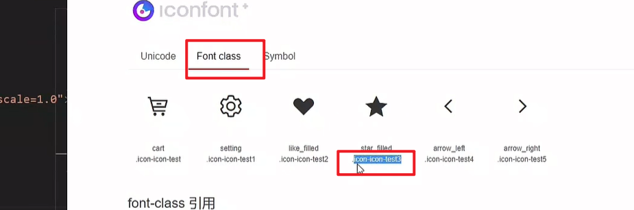
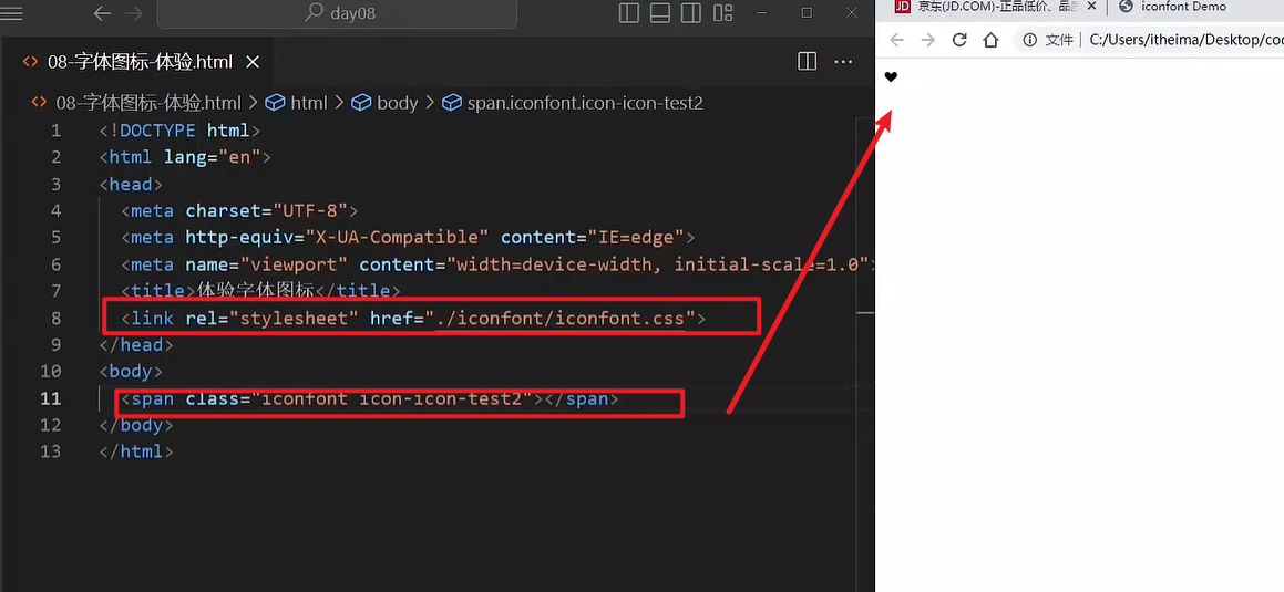
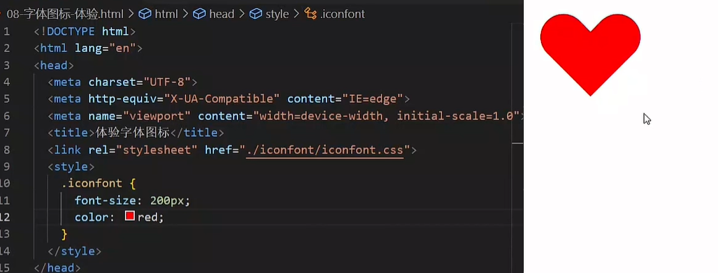
字体图标
字体图标:展示的是图标,本质是字体
作用:在网页中添加简单的、颜色单一的小图标
优点
- 灵活性:灵活地修改样式,例如:尺寸、颜色等
- 轻量级:体积小、渲染快、降低服务器请求次数
- 兼容性:几乎兼容所有主流浏览器
- 使用方便:先下载再使用
下载字体
iconfont 图标库:https://www.iconfont.cn/
登录 → 素材库 → 官方图标库 → 进入图标库 → 选图标,加入购物车 → 购物车,添加至项目,确定 → 下载至本地
使用字体
引入字体样式表(iconfont.css)
标签使用字体图标类名
- iconfont:字体图标基本样式(字体名,字体大小等等)
- icon-xxx:图标对应的类名
上传矢量图
作用:项目特有的图标上传到 iconfont 图标库,生成字体
上传步骤:上传(首页右上角) → 上传图标 → 选择 svg 矢量图,打开 → 提交 → 系统审核
03-CSS修饰属性
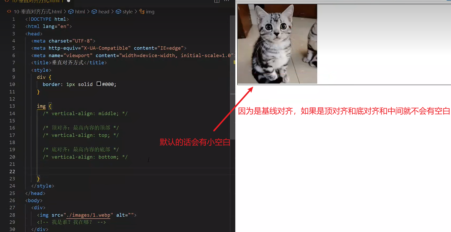
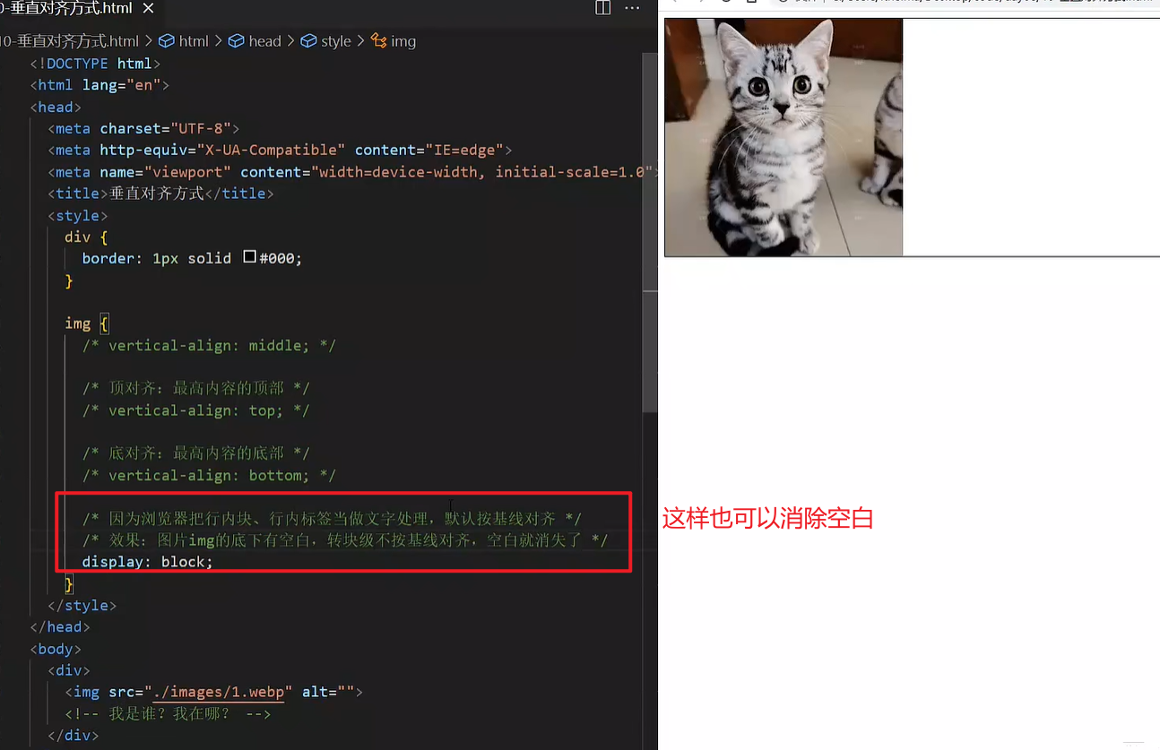
垂直对齐方式
属性名:vertical-align
过渡
作用:可以为一个元素在不同状态之间切换的时候添加过渡效果
属性名:transition(复合属性)
属性值:过渡的属性 花费时间 (s)
提示:
- 过渡的属性可以是具体的 CSS 属性
- 也可以为 all(两个状态属性值不同的所有属性(最常见的就是宽和高属性),都产生过渡效果)
- transition 设置给元素本身
img {
width: 200px;
height: 200px;
transition: all 1s;
}
img:hover {
width: 500px;
height: 500px;
}
|
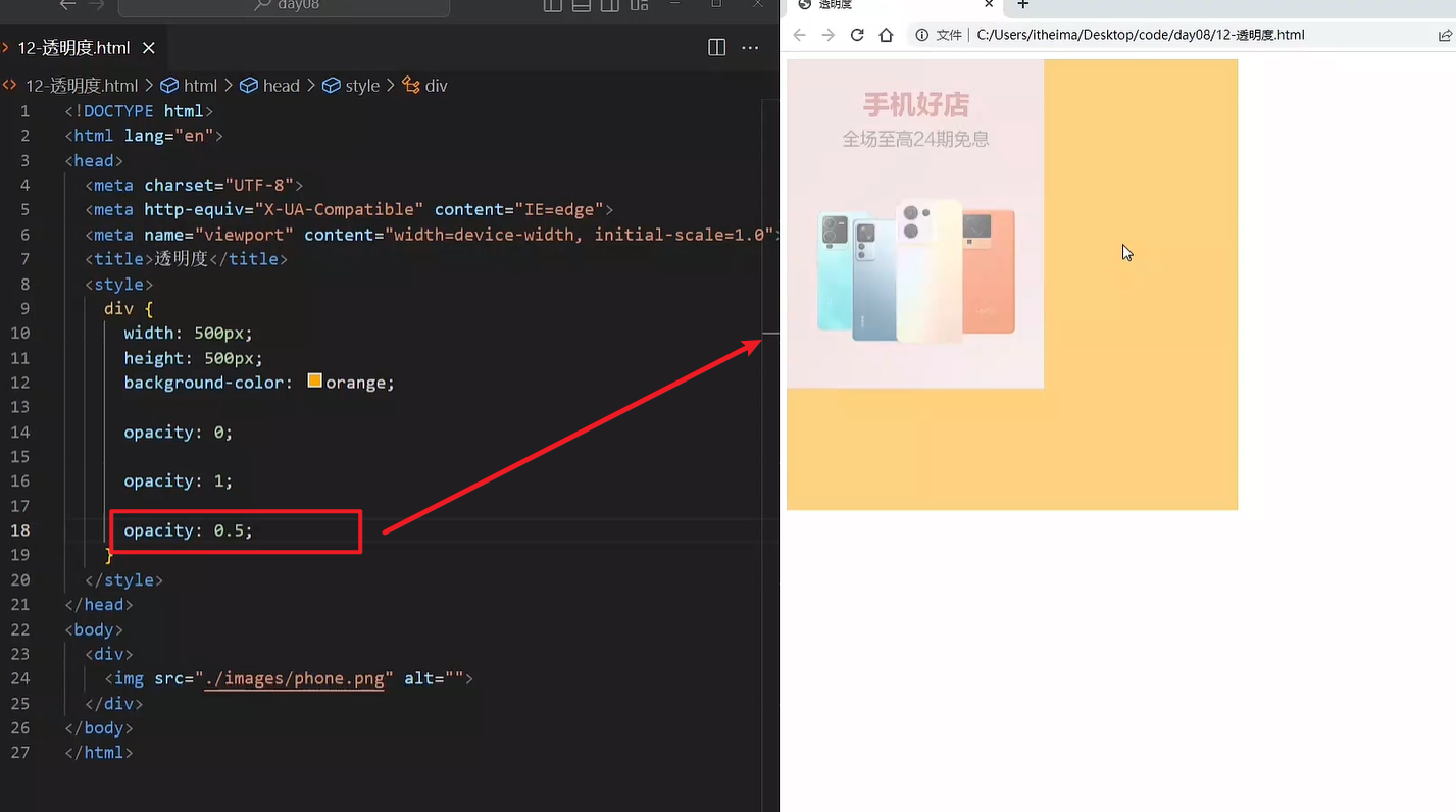
透明度opacity
作用:设置整个元素的透明度(包含背景和内容)
属性名:opacity
属性值:0 – 1
0:完全透明(元素不可见)
1:不透明
0-1之间小数:半透明
下面的0和1被覆盖了
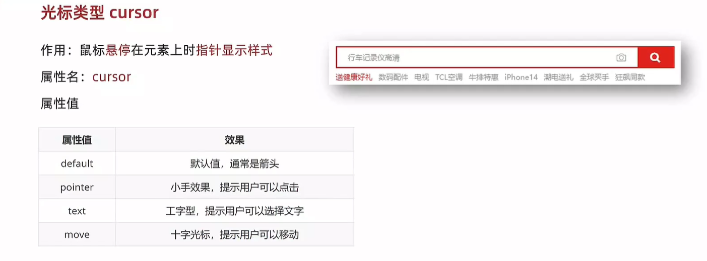
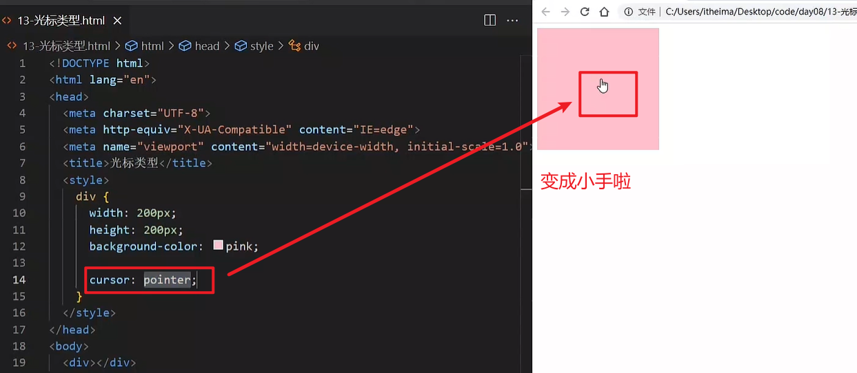
光标类型cursor
作用:鼠标悬停在元素上时指针显示样式
属性名:cursor
04-综合案例-轮播图
图片效果
HTML结构
<div class="banner">
<ul>
<li><a href="#"><img src="./images/banner1.jpg" alt=""></a></li>
<li><a href="#"><img src="./images/banner2.jpg" alt=""></a></li>
<li><a href="#"><img src="./images/banner3.jpg" alt=""></a></li>
</ul>
</div>
|
CSS样式
* {
margin: 0;
padding: 0;
box-sizing: border-box;
}
li {
list-style: none;
}
.banner {
position: relative;
margin: 100px auto;
width: 564px;
height: 315px;
overflow: hidden;
}
.banner img {
width: 564px;
border-radius: 12px;
vertical-align: middle;
}
.banner ul {
display: flex;
}
|
箭头
HTML结构
<a href="#" class="prev">
<i class="iconfont icon-zuoce"></i>
</a>
<a href="#" class="next">
<i class="iconfont icon-youce"></i>
</a>
|
CSS样式
.banner .prev,
.banner .next {
display: none;
position: absolute;
top: 50%;
transform: translateY(-50%);
width: 20px;
height: 30px;
background-color: rgba(0,0,0, 0.3);
text-decoration: none;
color: #fff;
line-height: 30px;
}
.banner:hover .prev,
.banner:hover .next {
display: block;
}
.banner .prev {
left: 0;
border-radius: 0 15px 15px 0;
}
.banner .next {
right: 0;
border-radius: 15px 0 0 15px;
text-align: center;
}
|
圆点
HTML结构
<ol>
<li></li>
<li class="active"></li>
<li></li>
</ol>
|
CSS样式
.banner ol {
position: absolute;
bottom: 20px;
left: 50%;
transform: translateX(-50%);
height: 13px;
background-color: rgba(255,255,255,0.3);
display: flex;
border-radius: 10px;
}
.banner ol li {
margin: 3px;
width: 8px;
height: 8px;
background-color: #fff;
border-radius: 50%;
cursor: pointer;
}
.banner ol .active {
background-color: #ff5000;
}
|
day09-小兔鲜儿
01-搭建项目目录
- xtx-pc
- images 文件夹:存放固定使用的图片素材,例如:logo、样式修饰图等等
- uploads 文件夹:存放非固定使用的图片素材,例如:商品图、宣传图需要上传的图片
- iconfont 文件夹:字体图标素材
- css 文件夹:存放 CSS 文件(link 标签引入)
- base.css:基础公共样式
- common.css:各个网页相同模块的重复样式,例如:头部、底部
- index.css:首页 CSS 样式
- index.html:首页 HTML 文件
引入样式表
<link rel="stylesheet" href="./iconfont/iconfont.css">
<link rel="stylesheet" href="./css/base.css">
<link rel="stylesheet" href="./css/common.css">
<link rel="stylesheet" href="./css/index.css">
|
02-网页头部SEO三大标签
SEO:搜索引擎优化,提升网站百度搜索排名
提升SEO的常见方法:
- 竞价排名
- 将网页制作成html后缀
- 标签语义化(在合适的地方使用合适的标签)
- ……
网页头部 SEO 标签:
- title:网页标题标签
- description:网页描述
- keywords:网页关键词
<meta name="description" content="小兔鲜儿官网,致力于打造全球最大的食品、生鲜电商购物平台。">
<meta name="keywords" content="小兔鲜儿,食品,生鲜,服装,家电,电商,购物">
<title>小兔鲜儿-新鲜、惠民、快捷!</title>
|
03-Favicon图标
Favicon 图标:网页图标,出现在浏览器标题栏,增加网站辨识度。
图标:favicon.ico,一般存放到网站的根目录里面
<link rel="shortcut icon" href="favicon.ico" type="image/x-icon">
|
04-版心
common.css
.wrapper {
margin: 0 auto;
width: 1240px;
}
|
05-快捷导航-布局
HTML结构
<div class="shortcut">
<div class="wrapper">1</div>
</div>
|
CSS样式
.shortcut {
height: 52px;
background-color: #333;
}
.shortcut .wrapper {
display: flex;
justify-content: flex-end;
height: 52px;
background-color: pink;
}
|
06-快捷导航-内容
HTML结构
<ul>
  <li><a href="#" class="login">请先登录</a></li>
  <li><a href="#">免费注册</a></li>
  <li><a href="#">我的订单</a></li>
  <li><a href="#">会员中心</a></li>
  <li><a href="#">帮助中心</a></li>
  <li><a href="#">在线客服</a></li>
  <li><a href="#"><span class="iconfont icon-mobile-phone"></span>手机版</a></li>
</ul>
|
CSS样式
.shortcut ul {
  display: flex;
  line-height: 52px;
}

.shortcut li a {
  padding: 0 15px;
  border-right: 1px solid #999;
  font-size: 14px;
  color: #fff;
}

.shortcut li:last-child a {
  border-right: 0;
}

.shortcut li .iconfont {
  margin-right: 4px;
  vertical-align: middle;
}

.shortcut li .login {
  color: #5EB69C;
}
|
07-头部-布局
HTML结构
<div class="header wrapper">
<div class="logo">logo</div>
<div class="nav">导航</div>
<div class="search">搜索</div>
<div class="cart">购物车</div>
</div>
|
CSS样式
.header {
display: flex;
margin-top: 22px;
margin-bottom: 22px;
height: 88px;
background-color: pink;
}
|
08-头部-logo
HTML结构
<div class="logo">
<h1><a href="#">小兔鲜儿</a></h1>
</div>
|
CSS样式
.logo {
margin-right: 40px;
width: 200px;
height: 88px;
}
.logo a {
display: block;
width: 200px;
height: 88px;
background-image: url(../images/logo.png);
font-size: 0;
}
|
09-头部-导航
HTML结构
<ul>
  <li><a href="#">首页</a></li>
  <li><a href="#">生鲜</a></li>
  <li><a href="#">美食</a></li>
  <li><a href="#">餐厨</a></li>
  <li><a href="#">电器</a></li>
  <li><a href="#">居家</a></li>
  <li><a href="#">洗护</a></li>
  <li><a href="#">孕婴</a></li>
  <li><a href="#">服装</a></li>
</ul>
|
CSS样式
.nav {
margin-top: 33px;
margin-right: 28px;
}
.nav ul {
display: flex;
}
.nav li {
margin-right: 47px;
}
.nav li a {
padding-bottom: 10px;
}
.nav li a:hover {
border-bottom: 2px solid #5EB69C;
color: #5EB69C;
}
|
10-头部-搜索
HTML结构
<div class="search">
<span class="iconfont icon-search"></span>
<input type="text" placeholder="搜一搜">
</div>
|
CSS样式
.search {
display: flex;
margin-top: 33px;
margin-right: 45px;
width: 170px;
height: 34px;
border-bottom: 2px solid #F4F4F4;
}
.search .iconfont {
margin-right: 8px;
font-size: 18px;
color: #ccc;
}
.search input {
flex: 1;
width: 0;
}
.search input::placeholder {
font-size: 16px;
color: #ccc;
}
|
11-头部-购物车
HTML结构
<div class="cart">
<span class="iconfont icon-cart-full"></span>
<i>2</i>
</div>
|
CSS样式
.cart {
position: relative;
margin-top: 32px;
}
.cart .iconfont {
font-size: 24px;
}
.cart i {
position: absolute;
top: 1px;
left: 15px;
padding: 0 6px;
height: 15px;
background-color: #E26237;
border-radius: 8px;
font-size: 14px;
color: #FFFEFE;
line-height: 15px;
}
|
12-底部-布局
HTML结构
<div class="footer">
<div class="wrapper">
<div class="service">服务</div>
<div class="help">帮助中心</div>
<div class="copyright">版权</div>
</div>
</div>
|
CSS样式
.footer {
height: 580px;
background-color: #F5F5F5;
}
.service {
padding: 60px 0;
height: 178px;
border-bottom: 1px solid #E8E8E8;
}
.help {
display: flex;
justify-content: space-between;
padding-top: 60px;
height: 300px;
background-color: pink;
}
|
13-底部-服务区域
HTML结构
<ul>
  <li>
    <h5></h5>
    <p>价格亲民</p>
  </li>
  <li>
    <h5></h5>
    <p>物流快捷</p>
  </li>
  <li>
    <h5></h5>
    <p>品质新鲜</p>
  </li>
  <li>
    <h5></h5>
    <p>售后无忧</p>
  </li>
</ul>
|
CSS结构
.service ul {
display: flex;
justify-content: space-evenly;
}
.service li {
display: flex;
width: 190px;
height: 58px;
}
.service li h5 {
margin-right: 20px;
width: 58px;
height: 58px;
background-image: url(../images/sprite.png);
}
.service li p {
font-size: 28px;
line-height: 58px;
}
.service li:nth-child(2) h5 {
background-position: 0 -58px;
}
.service li:nth-child(3) h5 {
background-position: 0 -116px;
}
.service li:nth-child(4) h5 {
background-position: 0 -174px;
}
|
14-底部-帮助中心-左侧
HTML结构
<div class="left">
  <dl>
    <dt>购物指南</dt>
    <dd><a href="#">购物流程</a></dd>
    <dd><a href="#">支付方式</a></dd>
    <dd><a href="#">售后规则</a></dd>
  </dl>
  <dl>
    <dt>配送方式</dt>
    <dd><a href="#">配送运费</a></dd>
    <dd><a href="#">配送范围</a></dd>
    <dd><a href="#">配送时间</a></dd>
  </dl>
  <dl>
    <dt>关于我们</dt>
    <dd><a href="#">平台规则</a></dd>
    <dd><a href="#">联系我们</a></dd>
    <dd><a href="#">问题反馈</a></dd>
  </dl>
  <dl>
    <dt>售后服务</dt>
    <dd><a href="#">售后政策</a></dd>
    <dd><a href="#">退款说明</a></dd>
    <dd><a href="#">取消订单</a></dd>
  </dl>
  <dl>
    <dt>服务热线</dt>
    <dd><a href="#">在线客服<span class="iconfont icon-customer-service"></span></a></dd>
    <dd><a href="#">客服电话 400-0000-000</a></dd>
    <dd><a href="#">工作时间 周一至周日 8:00-18:00</a></dd>
  </dl>
</div>
|
CSS样式
.help .left {
display: flex;
}
.help .left dl {
margin-right: 84px;
}
.help .left dl:last-child {
margin-right: 0;
}
.help .left dt {
margin-bottom: 30px;
font-size: 18px;
}
.help .left dd {
margin-bottom: 10px;
}
.help .left a {
color: #969696;
}
.help .left .iconfont {
color: #5EB69C;
}
|
15-底部-帮助中心-右侧
HTML结构
<div class="right">
  <ul>
    <li>
      <div class="pic"><img src="./images/wechat.png" alt=""></div>
      <p>微信公众号</p>
    </li>
    <li>
      <div class="pic"><img src="./images/app.png" alt=""></div>
      <p>APP下载二维码</p>
    </li>
  </ul>
</div>
|
CSS样式
.help .right ul {
display: flex;
}
.help .right li:first-child {
margin-right: 55px;
}
.help .right .pic {
margin-bottom: 10px;
width: 120px;
height: 120px;
}
.help .right p {
color: #969696;
text-align: center;
}
|
16-底部-版权
HTML结构
<p>
  <a href="#">关于我们</a>|
  <a href="#">帮助中心</a>|
  <a href="#">售后服务</a>|
  <a href="#">配送与验收</a>|
  <a href="#">商务合作</a>|
  <a href="#">搜索推荐</a>|
  <a href="#">友情链接</a>
</p>
<p>CopyRight © 小兔鲜</p>
|
CSS样式
.copyright {
text-align: center;
}
.copyright p {
margin-bottom: 10px;
color: #A1A1A1;
}
.copyright p a {
margin: 0 10px;
color: #A1A1A1;
}
|
day10-小兔鲜儿
01-banner-轮播图
index.css
HTML结构
<div class="banner">
<div class="wrapper">
<ul class="pic">
<li><a href="#"><img src="./uploads/banner1.png" alt=""></a></li>
<li><a href="#"><img src="./uploads/banner1.png" alt=""></a></li>
<li><a href="#"><img src="./uploads/banner1.png" alt=""></a></li>
</ul>
</div>
</div>
|
CSS样式
.banner {
height: 500px;
background-color: #F5F5F5;
}
.banner .wrapper {
position: relative;
height: 500px;
background-color: pink;
overflow: hidden;
}
.banner .pic {
display: flex;
width: 3720px;
}
|
02-banner-侧导航
HTML结构
<div class="subnav">
<ul>
<li>
<div><a href="#" class="classify">生鲜</a><a href="#">水果</a><a href="#">蔬菜</a></div>
<span class="iconfont icon-arrow-right-bold"></span>
</li>
<li>
<div><a href="#" class="classify">美食</a><a href="#">面点</a><a href="#">干果</a></div>
<span class="iconfont icon-arrow-right-bold"></span>
</li>
<li>
<div><a href="#" class="classify">餐厨</a><a href="#">数码产品</a></div>
<span class="iconfont icon-arrow-right-bold"></span>
</li>
<li>
<div><a href="#" class="classify">电器</a><a href="#">床品</a><a href="#">四件套</a><a href="#">被枕</a></div>
<span class="iconfont icon-arrow-right-bold"></span>
</li>
<li>
<div><a href="#" class="classify">居家</a><a href="#">奶粉</a><a href="#">玩具</a><a href="#">辅食</a></div>
<span class="iconfont icon-arrow-right-bold"></span>
</li>
<li>
<div><a href="#" class="classify">洗护</a><a href="#">洗发</a><a href="#">洗护</a><a href="#">美妆</a></div>
<span class="iconfont icon-arrow-right-bold"></span>
</li>
<li>
<div><a href="#" class="classify">孕婴</a><a href="#">奶粉</a><a href="#">玩具</a></div>
<span class="iconfont icon-arrow-right-bold"></span>
</li>
<li>
<div><a href="#" class="classify">服饰</a><a href="#">女装</a><a href="#">男装</a></div>
<span class="iconfont icon-arrow-right-bold"></span>
</li>
<li>
<div><a href="#" class="classify">杂货</a><a href="#">户外</a><a href="#">图书</a></div>
<span class="iconfont icon-arrow-right-bold"></span>
</li>
<li>
<div><a href="#" class="classify">品牌</a><a href="#">品牌制造</a></div>
<span class="iconfont icon-arrow-right-bold"></span>
</li>
</ul>
</div>
|
CSS样式
.subnav {
position: absolute;
left: 0;
top: 0;
width: 250px;
height: 500px;
background-color: rgba(0,0,0,0.42);
}
.subnav li {
display: flex;
justify-content: space-between;
padding-left: 30px;
padding-right: 12px;
height: 50px;
line-height: 50px;
color: #fff;
cursor: pointer;
}
.subnav li a {
margin-right: 5px;
font-size: 14px;
color: #fff;
}
.subnav li .classify {
margin-right: 14px;
font-size: 16px;
}
.subnav li .iconfont {
font-size: 14px;
}
.subnav li:hover {
background-color: #00BE9A;
}
|
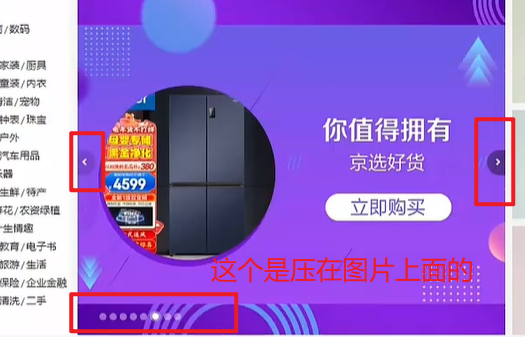
03-banner-圆点指示器
HTML结构
<ol>
<li class="current"><i></i></li>
<li><i></i></li>
<li><i></i></li>
</ol>
|
CSS样式
.banner ol {
position: absolute;
bottom: 17px;
right: 16px;
display: flex;
}
.banner ol li {
margin-left: 8px;
width: 22px;
height: 22px;
border-radius: 50%;
cursor: pointer;
}
.banner ol i {
display: block;
margin: 4px;
width: 14px;
height: 14px;
background-color: rgba(255,255,255,0.5);
border-radius: 50%;
}
.banner ol .current {
background-color: rgba(255,255,255,0.5);
}
.banner ol .current i {
background-color: #fff;
}
|
04-新鲜好物-标题
考虑公共样式
HTML结构
<div class="goods wrapper">
<div class="title">
<div class="left">
<h3>新鲜好物</h3>
<p>新鲜出炉 品质靠谱</p>
</div>
<div class="right">
<a href="#" class="more">查看全部<span class="iconfont icon-arrow-right-bold"></span></a>
</div>
</div>
</div>
|
CSS样式
.title {
display: flex;
justify-content: space-between;
margin-top: 40px;
margin-bottom: 30px;
height: 42px;
}
.title .left {
display: flex;
}
.title .left h3 {
margin-right: 35px;
font-size: 30px;
}
.title .left p {
align-self: flex-end;
color: #A1A1A1;
}
.title .right .more {
line-height: 42px;
color: #A1A1A1;
}
.title .right .more .iconfont {
margin-left: 10px;
}
|
05-新鲜好物-内容
HTML结构
<div class="bd">
<ul>
<li>
<a href="#">
<div class="pic"><img src="./uploads/goods1.png" alt=""></div>
<div class="txt">
<h4>KN95级莫兰迪色防护口罩</h4>
<p>¥<span>79</span></p>
</div>
</a>
</li>
<li>
<a href="#">
<div class="pic"><img src="./uploads/goods2.png" alt=""></div>
<div class="txt">
<h4>紫檀外独板三层普洱茶盒</h4>
<p>¥<span>566</span></p>
</div>
</a>
</li>
<li>
<a href="#">
<div class="pic"><img src="./uploads/goods3.png" alt=""></div>
<div class="txt">
<h4>法拉蒙高颜值记事本可定制</h4>
<p>¥<span>58</span></p>
</div>
</a>
</li>
<li>
<a href="#">
<div class="pic"><img src="./uploads/goods4.png" alt=""></div>
<div class="txt">
<h4>科技布布艺沙发</h4>
<p>¥<span>3579</span></p>
</div>
</a>
</li>
</ul>
</div>
|
CSS样式
.bd ul {
display: flex;
justify-content: space-between;
}
.bd li {
width: 304px;
height: 404px;
background-color: #EEF9F4;
}
.bd li .pic {
width: 304px;
height: 304px;
}
.bd li .txt {
text-align: center;
}
.bd li h4 {
margin-top: 18px;
margin-bottom: 8px;
font-size: 20px;
}
.goods .bd p {
font-size: 18px;
color: #AA2113;
}
.goods .bd p span {
margin-left: 3px;
font-size: 22px;
}
|
06-人气推荐
HTML结构
<div class="recommend wrapper">
<div class="title">
<div class="left">
<h3>人气推荐</h3>
<p>人气爆款 不容错过</p>
</div>
</div>
<div class="bd">
<ul>
<li>
<a href="#">
<div class="pic"><img src="./uploads/recommend1.png" alt=""></div>
<div class="txt">
<h4>特惠推荐</h4>
<p>我猜得到 你的需要</p>
</div>
</a>
</li>
<li>
<a href="#">
<div class="pic"><img src="./uploads/recommend2.png" alt=""></div>
<div class="txt">
<h4>爆款推荐</h4>
<p>人气好物推荐</p>
</div>
</a>
</li>
<li>
<a href="#">
<div class="pic"><img src="./uploads/recommend3.png" alt=""></div>
<div class="txt">
<h4>节日礼品一站买全</h4>
<p>编辑尽心整理推荐</p>
</div>
</a>
</li>
<li>
<a href="#">
<div class="pic"><img src="./uploads/recommend4.png" alt=""></div>
<div class="txt">
<h4>鲜花园艺</h4>
<p>给生活增加仪式感</p>
</div>
</a>
</li>
</ul>
</div>
</div>
|
CSS样式
.recommend .bd li {
background-color: #fff;
}
.recommend .bd p {
color: #A1A1A1;
}
|
07-热门品牌-布局
HTML结构
<div class="brand">
<div class="wrapper">
<div class="title">
<div class="left">
<h3>热门品牌</h3>
<p>国际经典 品质认证</p>
</div>
<div class="button">1</div>
</div>
</div>
</div>
|
CSS样式
.brand {
margin-top: 60px;
height: 468px;
background-color: #F5F5F5;
}
.brand .wrapper {
overflow: hidden;
height: 468px;
}
.brand .title {
position: relative;
margin-bottom: 40px;
}
.brand .button {
position: absolute;
right: 0;
bottom: -25px;
display: flex;
}
|
08-热门品牌-内容
HTML结构
<div class="button">
<a href="#" class="prev">
<i class="iconfont icon-arrow-left-bold"></i>
</a>
<a href="#" class="next">
<i class="iconfont icon-arrow-right-bold"></i>
</a>
</div>
<div class="bd">
<ul>
<li><a href="#"><img src="./uploads/hot1.png" alt=""></a></li>
<li><a href="#"><img src="./uploads/hot2.png" alt=""></a></li>
<li><a href="#"><img src="./uploads/hot3.png" alt=""></a></li>
<li><a href="#"><img src="./uploads/hot4.png" alt=""></a></li>
<li><a href="#"><img src="./uploads/hot5.png" alt=""></a></li>
</ul>
</div>
|
CSS样式
.brand .button a {
  margin-left: 12px;
  width: 20px;
  height: 20px;
  text-align: center;
  line-height: 20px;
  color: #fff;
}

.brand .button .prev {
  background-color: #ddd;
}

.brand .button .next {
  background-color: #00BE9A;
}

.brand .bd li {
  width: 244px;
  height: 306px;
}
|
09-生鲜-标题
HTML结构
<div class="fresh wrapper">
<div class="title">
<div class="left">
<h3>生鲜</h3>
</div>
<div class="right">
<ul>
<li><a href="#" class="active">热门</a></li>
<li><a href="#">蔬菜</a></li>
<li><a href="#">肉禽蛋</a></li>
<li><a href="#">水果</a></li>
<li><a href="#">海鲜</a></li>
<li><a href="#">零食</a></li>
<li><a href="#">饮料</a></li>
</ul>
<a href="#" class="more">查看全部<span class="iconfont icon-arrow-right-bold"></span></a>
</div>
</div>
</div>
|
CSS样式
.fresh .title {
margin-top: 60px;
margin-bottom: 20px;
}
.title .right {
display: flex;
}
.title .right ul {
display: flex;
margin-top: 10px;
margin-right: 58px;
}
.title .right ul a {
display: block;
margin-left: 6px;
padding: 0 7px;
height: 20px;
line-height: 20px;
}
.title .right ul .active {
background-color: #00BE9A;
color: #fff;
}
|
10-生鲜-内容布局
HTML结构
<div class="content">
<div class="left">
<a href="#"><img src="./uploads/fresh_left.png" alt=""></a>
</div>
<div class="right">
<ul>
<li>1</li>
<li>2</li>
<li>3</li>
<li>4</li>
<li>5</li>
<li>6</li>
<li>7</li>
<li>8</li>
</ul>
</div>
</div>
|
CSS样式
.content {
display: flex;
justify-content: space-between;
}
.content .left {
width: 248px;
height: 610px;
}
.content .right {
width: 968px;
height: 610px;
}
.content .right ul {
display: flex;
flex-wrap: wrap;
}
.content .right li {
position: relative;
padding: 10px 21px 0;
width: 242px;
height: 305px;
border: 2px solid #fff;
overflow: hidden;
}
|
11-生鲜-产品内容
HTML结构
<ul>
  <li>
    <a href="#">
      <div class="pic"><img src="./uploads/fresh1.png" alt=""></div>
      <div class="txt">
        <div class="info">
          <h4>双味千层,手抓饼烤肉组合</h4>
          <p>240g/袋 4片装</p>
          <p>加热即食</p>
        </div>
        <p class="price">¥<span>89.99</span></p>
      </div>
    </a>
  </li>
  <li>
    <a href="#">
      <div class="pic"><img src="./uploads/fresh2.png" alt=""></div>
      <div class="txt">
        <div class="info">
          <h4>云南甘蔗慢熬红糖馒头</h4>
          <p>220g/袋 5个装</p>
          <p>加热即食</p>
        </div>
        <p class="price">¥<span>9.00</span></p>
      </div>
    </a>
  </li>
  <li>
    <a href="#">
      <div class="pic"><img src="./uploads/fresh3.png" alt=""></div>
      <div class="txt">
        <div class="info">
          <h4>日式风味小圆饼</h4>
          <p>圆形【海盐味】</p>
          <p>糖果零食</p>
        </div>
        <p class="price">¥<span>588.00</span></p>
      </div>
    </a>
  </li>
  <li>
    <a href="#">
      <div class="pic"><img src="./uploads/fresh4.png" alt=""></div>
      <div class="txt">
        <div class="info">
          <h4>全麦奶油浓香小面包</h4>
          <p>50g*12袋</p>
          <p>美味西点</p>
        </div>
        <p class="price">¥<span>69.00</span></p>
      </div>
    </a>
  </li>
  <li>
    <a href="#">
      <div class="pic"><img src="./uploads/fresh5.png" alt=""></div>
      <div class="txt">
        <div class="info">
          <h4>秘制外皮五福摩提大福点心</h4>
          <p>150g/盒</p>
          <p>美味西点</p>
        </div>
        <p class="price">¥<span>39.99</span></p>
      </div>
    </a>
  </li>
  <li>
    <a href="#">
      <div class="pic"><img src="./uploads/fresh6.png" alt=""></div>
      <div class="txt">
        <div class="info">
          <h4>水果面膜韩国蜂蜜柚子茶</h4>
          <p>560g/瓶</p>
          <p>冲调饮品</p>
        </div>
        <p class="price">¥<span>39.99</span></p>
      </div>
    </a>
  </li>
  <li>
    <a href="#">
      <div class="pic"><img src="./uploads/fresh7.png" alt=""></div>
      <div class="txt">
        <div class="info">
          <h4>浓情比利时巧克力礼盒装</h4>
          <p>205克/盒</p>
          <p>糖果零食</p>
        </div>
        <p class="price">¥<span>120.00</span></p>
      </div>
    </a>
  </li>
  <li>
    <a href="#">
      <div class="pic"><img src="./uploads/fresh8.png" alt=""></div>
      <div class="txt">
        <div class="info">
          <h4>抹茶奶油小蛋糕礼盒装</h4>
          <p>220克/盒</p>
          <p>美味西点</p>
        </div>
        <p class="price">¥<span>60.00</span></p>
      </div>
    </a>
  </li>
</ul>
|
CSS样式
.content .pic {
width: 200px;
height: 180px;
}
.content .info {
margin-top: 14px;
margin-bottom: 5px;
height: 60px;
line-height: 19px;
}
.content .price {
color: #AF2F22;
}
.content .price span {
margin-left: 5px;
font-size: 22px;
}
|
12-生鲜-过渡效果
HTML结构
<div class="cover">
  <p>找相似</p>
  <p></p>
  <p>发现更多宝贝<span class="iconfont icon-arrow-right-bold"></span></p>
</div>
|
CSS样式
.content li .cover {
position: absolute;
left: 0;
bottom: -86px;
padding-top: 15px;
width: 242px;
height: 84px;
background-color: #00BE9A;
text-align: center;
color: #fff;
transition: all 0.5s;
}
.content .cover p:nth-child(1) {
font-size: 18px;
}
.content .cover p:nth-child(2) {
margin: 3px auto 6px;
width: 120px;
height: 1px;
background-color: rgba(255,255,255,0.11);
}
.content .cover p:nth-child(3) {
font-size: 13px;
}
.content .cover p:nth-child(3) .iconfont {
font-size: 14px;
}
.content .right li:hover .cover {
bottom: 0;
}
.content .right li:hover {
border: 2px solid #00BE9A;
}
|
13-最新专题-布局
HTML结构
<div class="topic wrapper">
<div class="title">
<div class="left">
<h3>最新专题</h3>
</div>
<div class="right">
<a href="#" class="more">查看全部<span class="iconfont icon-arrow-right-bold"></span></a>
</div>
</div>
<div class="topic-bd">
<ul>
<li>1</li>
<li>2</li>
<li>3</li>
</ul>
</div>
</div>
|
CSS样式
.topic {
margin-bottom: 40px;
}
.topic .title {
margin-top: 100px;
}
.topic-bd ul {
display: flex;
justify-content: space-between;
}
.topic-bd li {
width: 405px;
height: 355px;
background-color: pink;
}
|
14-最新专题-内容
HTML结构
<ul>
  <li>
    <a href="#">
      <div class="pic">
        <img src="./uploads/topic1.png" alt="">
      </div>
      <div class="txt">
        <div class="left">
          <p>
            <i class="iconfont icon-favorites-fill"></i>
            <span>1220</span>
          </p>
          <p>
            <i class="iconfont icon-browse"></i>
            <span>1800</span>
          </p>
        </div>
        <div class="right">
          <p>
            <i class="iconfont icon-comment"></i>
            <span>246</span>
          </p>
        </div>
      </div>
    </a>
  </li>
  <li>
    <a href="#">
      <div class="pic">
        <img src="./uploads/topic2.png" alt="">
      </div>
      <div class="txt">
        <div class="left">
          <p>
            <i class="iconfont icon-favorites-fill"></i>
            <span>1220</span>
          </p>
          <p>
            <i class="iconfont icon-browse"></i>
            <span>1800</span>
          </p>
        </div>
        <div class="right">
          <p>
            <i class="iconfont icon-comment"></i>
            <span>246</span>
          </p>
        </div>
      </div>
    </a>
  </li>
  <li>
    <a href="#">
      <div class="pic">
        <img src="./uploads/topic3.png" alt="">
      </div>
      <div class="txt">
        <div class="left">
          <p>
            <i class="iconfont icon-favorites-fill"></i>
            <span>1220</span>
          </p>
          <p>
            <i class="iconfont icon-browse"></i>
            <span>1800</span>
          </p>
        </div>
        <div class="right">
          <p>
            <i class="iconfont icon-comment"></i>
            <span>246</span>
          </p>
        </div>
      </div>
    </a>
  </li>
</ul>
|
CSS样式
.topic-bd ul {
display: flex;
justify-content: space-between;
}
.topic-bd li {
width: 405px;
height: 355px;
background-color: pink;
}
.topic-bd .pic {
position: relative;
width: 405px;
height: 288px;
}
.topic-bd .txt {
display: flex;
justify-content: space-between;
align-items: center;
padding: 0 15px;
width: 405px;
height: 67px;
font-size: 14px;
color: #666;
}
.topic-bd .txt .left {
display: flex;
}
.topic-bd .txt .left p {
margin-right: 20px;
}
.topic-bd .txt .left p:nth-child(1) i {
color: #AA2113;
}
|
15-最新专题-定位文字
HTML结构
<div class="pic">
<img src="./uploads/topic2.png" alt="">
<div class="cover">
<div class="left">
<h4>吃这些美食才不算辜负自己</h4>
<p>餐厨起居洗护好物</p>
</div>
<div class="right">¥<span>29.9</span><span>起</span></div>
</div>
</div>
|
CSS样式
.topic-bd .cover {
position: absolute;
left: 0;
bottom: 0;
display: flex;
justify-content: space-between;
align-items: center;
padding: 0 15px;
width: 405px;
height: 90px;
background-image: linear-gradient(180deg, rgba(137,137,137,0.00) 0%, rgba(0,0,0,0.90) 100%);
}
.topic-bd .cover .left {
color: #fff;
}
.topic-bd .cover .left h4 {
margin-bottom: 6px;
font-size: 20px;
}
.topic-bd .cover .right {
padding: 0 7px;
height: 25px;
background-color: #fff;
color: #AA2113;
font-size: 15px;
}
.topic-bd .cover .right span {
font-size: 18px;
}
|
移动 Web 第一天
目标:使用位移、缩放、旋转、渐变效果丰富网页元素的呈现方式。
01-平面转换
简介
作用:为元素添加动态效果,一般与过渡配合使用
概念:改变盒子在平面内的形态(位移、旋转、缩放、倾斜)
平面转换也叫 2D 转换,属性是 transform
平移
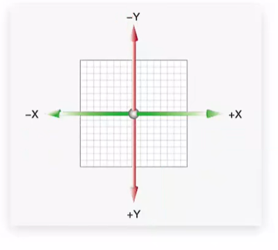
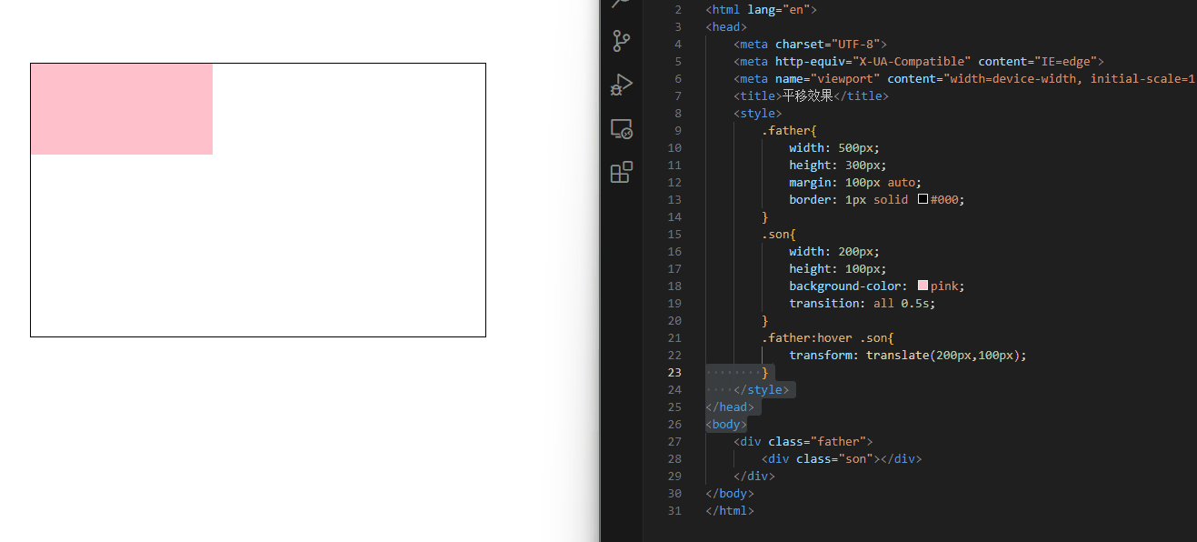
<!DOCTYPE html>
<html lang="en">
<head>
<meta charset="UTF-8">
<meta http-equiv="X-UA-Compatible" content="IE=edge">
<meta name="viewport" content="width=device-width, initial-scale=1.0">
<title>平移效果</title>
<style>
.father{
width: 500px;
height: 300px;
margin: 100px auto;
border: 1px solid #000;
}
.son{
width: 200px;
height: 100px;
background-color: pink;
transition: all 1s;
}
.father:hover .son{
transform: translateY(100px);
}
</style>
</head>
<body>
<div class="father">
<div class="son"></div>
</div>
</body>
</html>
|
transform: translate(X轴移动距离, Y轴移动距离);
|
- 取值
- 像素单位数值
- 百分比(参照盒子自身尺寸计算结果)
- 正负均可
- 技巧
- translate() 只写一个值,表示沿着 X 轴移动
- 单独设置 X 或 Y 轴移动距离:translateX() 或 translateY()
定位居中
方法一:margin
方法二:平移 → 百分比参照盒子自身尺寸计算结果
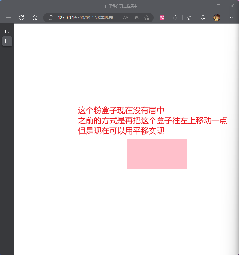
<!DOCTYPE html>
<html lang="en">
<head>
    <meta charset="UTF-8">
    <meta http-equiv="X-UA-Compatible" content="IE=edge">
    <meta name="viewport" content="width=device-width, initial-scale=1.0">
    <title>平移实现定位居中</title>
    <style>
        .box{
            position: absolute;
            left: 50%;
            top:50%;


            transform: translate(-50%,-50%);

            width: 200px;
            height: 100px;
            background-color: pink;
        }
    </style>
</head>
<body>
    <div class="box"></div>
</body>
</html>
|
案例-双开门
<div class="father">
    <div class="left"></div>
    <div class="right"></div>
</div>
|
* {
margin: 0;
padding: 0;
}
.father {
display: flex;
margin: 0 auto;
width: 1366px;
height: 600px;
background-image: url(./images/bg.jpg);
overflow: hidden;
}
.father .left,
.father .right {
width: 50%;
height: 600px;
background-image: url(./images/fm.jpg);
transition: all .5s;
}
.father .right {
background-position: right 0;
}
.father:hover .left {
transform: translate(-100%);
}
.father:hover .right {
transform: translateX(100%);
}
|
旋转
- 取值:角度单位是 deg
- 技巧
- 取值正负均可
- 取值为正,顺时针旋转
- 取值为负,逆时针旋转
转换原点
默认情况下,转换原点是盒子中心点
transform-origin: 水平原点位置 垂直原点位置;
|
取值:
- 方位名词(left、top、right、bottom、center)
- 像素单位数值
- 百分比
案例-时钟
.hour {
width: 6px;
height: 50px;
background-color: #333;
margin-left: -3px;
transform: rotate(15deg);
transform-origin: center bottom;
}
.minute {
width: 5px;
height: 65px;
background-color: #333;
margin-left: -3px;
transform: rotate(90deg);
transform-origin: center bottom;
}
.second {
width: 4px;
height: 80px;
background-color: red;
margin-left: -2px;
transform: rotate(240deg);
transform-origin: center bottom;
}
|
多重转换
多重转换技巧:先平移再旋转
transform: translate() rotate();
|
- 多重转换原理:以第一种转换方式坐标轴为准转换形态
- 旋转会改变网页元素的坐标轴向
- 先写旋转,则后面的转换效果的轴向以旋转后的轴向为准,会影响转换结果
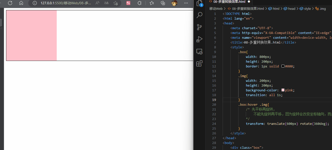
<!DOCTYPE html>
<html lang="en">
<head>
<meta charset="UTF-8">
<meta http-equiv="X-UA-Compatible" content="IE=edge">
<meta name="viewport" content="width=device-width, initial-scale=1.0">
<title>08-多重转换效果.html</title>
<style>
.box{
width: 800px;
height: 200px;
border: 1px solid #000;
}
.img{
width: 200px;
height: 200px;
background-color: pink;
transition: all 1s;
}
.box:hover .img{
transform: translate(600px) rotate(360deg);
}
</style>
</head>
<body>
<div class="box">
<div class="img"></div>
</div>
</body>
</html>
|
缩放
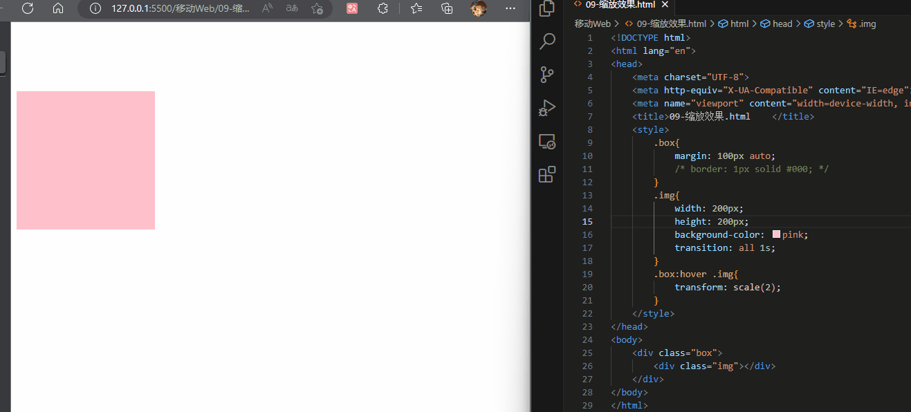
transform: scale(缩放倍数);
transform: scale(X轴缩放倍数, Y轴缩放倍数);
|
- 技巧
- 通常,只为 scale() 设置一个值,表示 X 轴和 Y 轴等比例缩放
- 取值大于1表示放大,取值小于1表示缩小
<!DOCTYPE html>
<html lang="en">
<head>
<meta charset="UTF-8">
<meta http-equiv="X-UA-Compatible" content="IE=edge">
<meta name="viewport" content="width=device-width, initial-scale=1.0">
<title>09-缩放效果.html </title>
<style>
.box{
margin: 100px auto;
width: 800px;
height: 200px;
}
.img{
width: 200px;
height: 200px;
background-color: pink;
transition: all 1s;
}
.box:hover .img{
transform: scale(2);
}
</style>
</head>
<body>
<div class="box">
<div class="img"></div>
</div>
</body>
</html>
|
案例-播放特效
.box li {
overflow: hidden;
}
.pic {
position: relative;
}
.pic::after {
position: absolute;
left: 50%;
top: 50%;
content: '';
width: 58px;
height: 58px;
background-image: url(./images/play.png);
transform: translate(-50%, -50%) scale(5);
opacity: 0;
transition: all .5s;
}
.box li:hover .pic::after {
transform: translate(-50%, -50%) scale(1);
opacity: 1;
}
|
倾斜
取值:角度度数 deg
02-渐变
渐变是多个颜色逐渐变化的效果,一般用于设置盒子背景
分类:
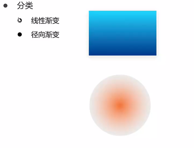
线性渐变
background-image: linear-gradient(
渐变方向,
颜色1 终点位置,
颜色2 终点位置,
......
);
|
取值:
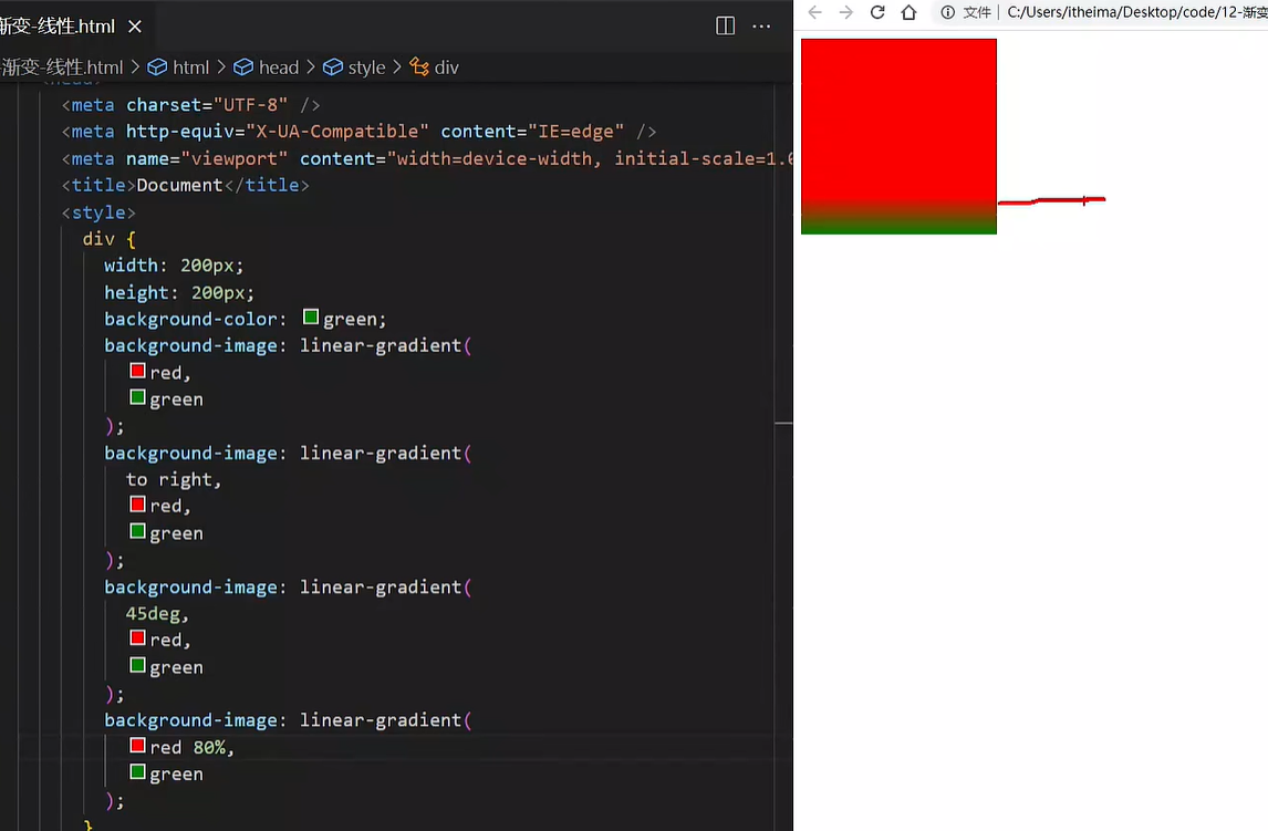
案例-产品展示
<div class="box">
<img src="./images/product.jpeg" alt="" />
<div class="title">OceanStor Pacific 海量存储斩获2021 Interop金奖</div>
<div class="mask"></div>
</div>
|
.mask {
position: absolute;
left: 0;
top: 0;
width: 100%;
height: 100%;
background-image: linear-gradient(
transparent,
rgba(0,0,0,0.5)
);
opacity: 0;
transition: all .5s;
}
.box:hover .mask {
opacity: 1;
}
|
径向渐变
径向渐变一般是用来给按钮加高光的
background-image: radial-gradient(
半径 at 圆心位置,
颜色1 终点位置,
颜色2 终点位置,
......
);
|
取值:
- 半径可以是2条,则为椭圆
- 圆心位置取值:像素单位数值 / 百分比 / 方位名词
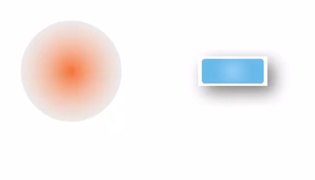
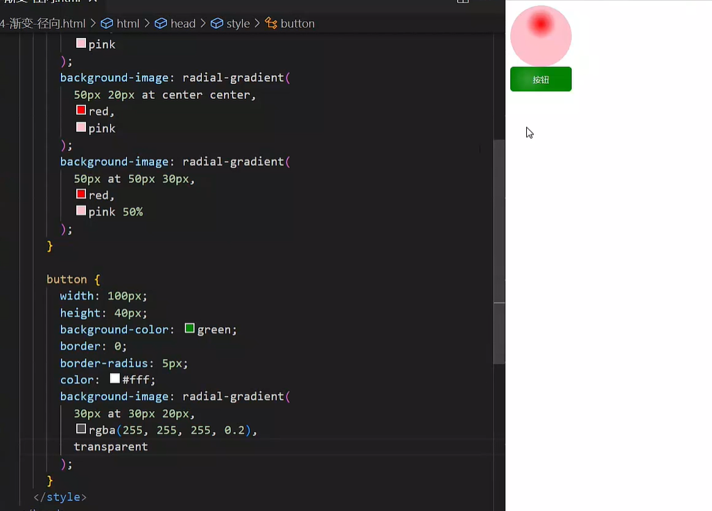
03-综合案例
导航-频道
箭头旋转
.x-header-nav .nav-item:hover .icon-down {
transform: rotate(-180deg);
}
|
频道列表
.channel-layer {
position: absolute;
top: 60px;
left: 50%;
z-index: -2;
width: 1080px;
height: 120px;
padding: 10px;
margin-left: -540px;
color: #72727b;
background-color: #f5f5f5;
border: 1px solid #e4e4e4;
border-top: none;
transition: all 0.5s;
transform: translateY(-120px);
}
.x-header-nav .nav-item:hover .channel-layer {
transform: translateY(0);
}
|
渐变按钮
搜索按钮
.x-header-search form .btn {
position: absolute;
top: 0;
right: 0;
width: 60px;
height: 40px;
line-height: 40px;
text-align: center;
background-color: #f86442;
border-top-right-radius: 20px;
border-bottom-right-radius: 20px;
background-image: linear-gradient(
to right,
rgba(255, 255, 255, 0.3),
#f86442
);
}
|
登录按钮
.card .card-info .login {
padding: 3px 34px;
color: #fff;
background-color: #ff7251;
border-radius: 30px;
box-shadow: 0 4px 8px 0 rgb(252 88 50 / 50%);
background-image: linear-gradient(
to right,
rgba(255, 255, 255, 0.2),
#ff7251
);
}
|
客户端按钮
.download .dl .dl-btn {
width: 68px;
height: 34px;
line-height: 34px;
color: #fff;
text-align: center;
border-radius: 4px;
background-image: radial-gradient(
50px at 10px 10px,
rgba(255, 255, 255, 0.5),
transparent
);
}
|
轮播图
.banner .banner-list .banner-item.left {
z-index: 0;
transform: translate(-160px) scale(0.8);
transform-origin: left center;
}
.banner .banner-list .banner-item.right {
z-index: 0;
transform: translate(160px) scale(0.8);
transform-origin: right center;
}
|
猜你喜欢
.album-item .album-item-box::after {
position: absolute;
left: 0;
top: 0;
content: '';
width: 100%;
height: 100%;
background: rgba(0,0,0,.5) url(../assets/play.png) no-repeat center / 20px;
opacity: 0;
transition: all .5s;
}
.album-item .album-item-box:hover::after {
opacity: 1;
background-size: 50px;
}
.album-item .album-item-box:hover img {
transform: scale(1.1);
}
|
移动 Web 第二天
01-空间转换
空间转换简介
- 空间:是从坐标轴角度定义的 X 、Y 和 Z 三条坐标轴构成了一个立体空间,Z 轴位置与视线方向相同。
- 空间转换也叫 3D转换
- 属性:transform
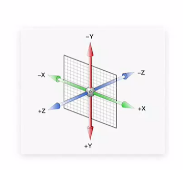
平移
transform: translate3d(x, y, z);
transform: translateX();
transform: translateY();
transform: translateZ();
|
取值与平面转换相同
默认情况下,Z 轴平移没有效果,原因:电脑屏幕默认是平面,无法显示 Z 轴平移效果(学完下一小节就能看见了)
视距
其实用大白话说就是模拟你的人眼到显示屏的距离…..
作用:指定了观察者与 Z=0 平面的距离,为元素添加透视效果
透视效果:近大远小、近实远虚
属性:(添加给直接父级(跨级不好使),取值范围 800-1200)
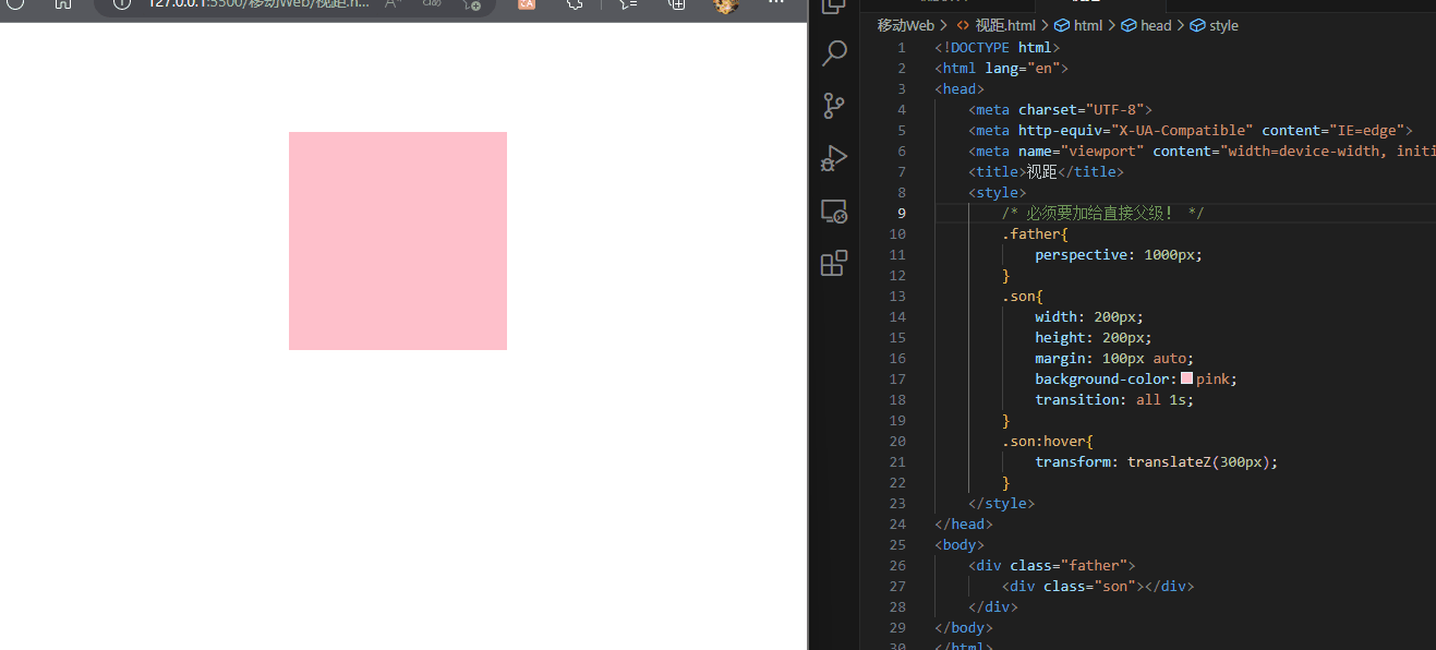
<!DOCTYPE html>
<html lang="en">
<head>
<meta charset="UTF-8">
<meta http-equiv="X-UA-Compatible" content="IE=edge">
<meta name="viewport" content="width=device-width, initial-scale=1.0">
<title>视距</title>
<style>
.father{
perspective: 1000px;
}
.son{
width: 200px;
height: 200px;
margin: 100px auto;
background-color:pink;
transition: all 1s;
}
.son:hover{
transform: translateZ(300px);
}
</style>
</head>
<body>
<div class="father">
<div class="son"></div>
</div>
</body>
</html>
|
旋转
Z 轴:rotateZ()
X 轴:rotateX()
Y 轴:rotateY()
Z轴就是跟之前平面的一样,因为绕Z轴旋转就是跟我们平面中心旋转一样
X轴旋转(和Y轴旋转)都需要添加视距才可以观察的比较清楚
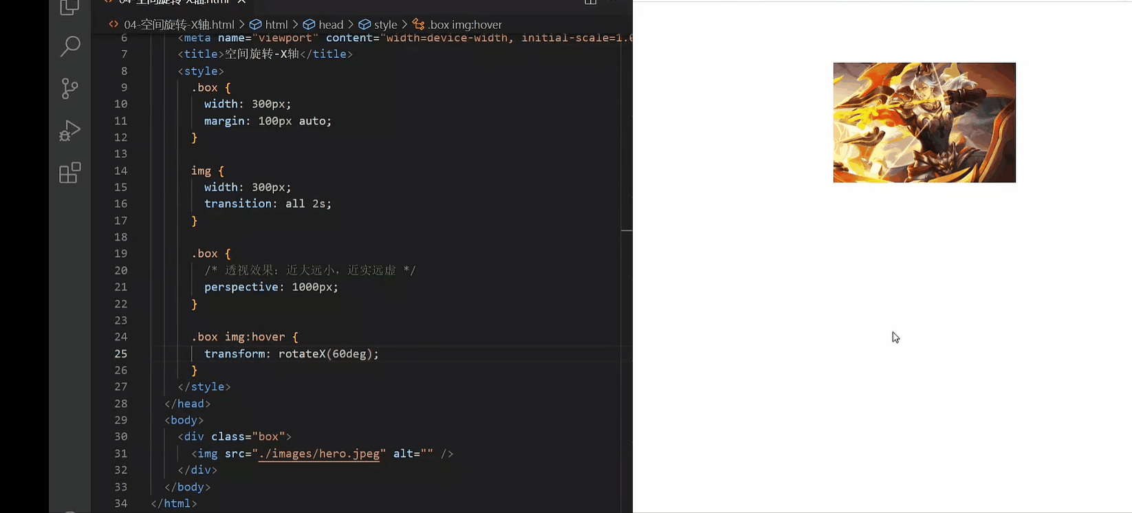
左手法则
作用:根据旋转方向确定取值正负
使用:左手握住旋转轴, 拇指指向正值方向, 其他四个手指弯曲方向为旋转正值方向
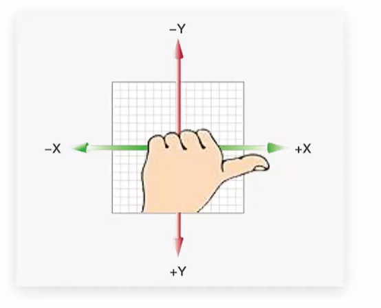
rotate3d-了解
不常用!!!
- rotate3d(x, y, z, 角度度数) :用来设置自定义旋转轴的位置及旋转的角度
- x,y,z 取值为0-1之间的数字
立体呈现
作用:设置元素的子元素是位于 3D 空间中还是平面中
属性名:transform-style
属性值:
- flat:子级处于平面中
- preserve-3d:子级处于 3D 空间
呈现立体图形步骤:
- 父元素添加transform-style:preserve-3d
- 子级定位
- 调整子盒子的位置(位移或旋转)
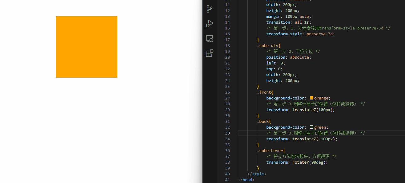
<!DOCTYPE html>
<html lang="en">
<head>
<meta charset="UTF-8">
<meta http-equiv="X-UA-Compatible" content="IE=edge">
<meta name="viewport" content="width=device-width, initial-scale=1.0">
<title>立体呈现</title>
<style>
.cube{
position: relative;
width: 200px;
height: 200px;
margin: 100px auto;
transition: all 1s;
transform-style: preserve-3d;
}
.cube div{
position: absolute;
left: 0;
top: 0;
width: 200px;
height: 200px;
}
.front{
background-color: orange;
transform: translateZ(100px);
}
.back{
background-color: green;
transform: translateZ(-100px);
}
.cube:hover{
transform: rotateY(90deg);
}
</style>
</head>
<body>
<div class="cube">
<div class="front"></div>
<div class="back"></div>
</div>
</body>
</html>
|
案例-3d导航
案例步骤:
- 搭建立方体
- 绿色是立方体的前面
- 橙色是立方体的上面
- 鼠标悬停,立方体旋转
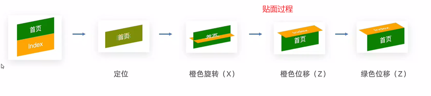
<!DOCTYPE html>
<html lang="en">
<head>
<meta charset="UTF-8" />
<meta name="viewport" content="width=device-width, initial-scale=1.0" />
<title>3D导航</title>
<style>
ul {
margin: 0;
padding: 0;
list-style: none;
}
.nav {
width: 300px;
height: 40px;
margin: 50px auto;
}
.nav ul {
display: flex;
}
.nav li {
position: relative;
width: 100px;
height: 40px;
line-height: 40px;
transition: all 0.5s;
transform-style: preserve-3d;
}
.nav li a {
position: absolute;
left: 0;
top: 0;
display: block;
width: 100%;
height: 100%;
text-align: center;
text-decoration: none;
color: #fff;
}
.nav li a:first-child {
background-color: green;
transform: translateZ(20px);
}
.nav li a:last-child {
background-color: orange;
transform: rotateX(90deg) translateZ(20px);
}
.nav li:hover {
transform: rotateX(-90deg);
}
</style>
</head>
<body>
<div class="nav">
<ul>
<li>
<a href="#">首页</a>
<a href="#">Index</a>
</li>
<li>
<a href="#">登录</a>
<a href="#">Login</a>
</li>
<li>
<a href="#">注册</a>
<a href="#">Register</a>
</li>
</ul>
</div>
</body>
</html>
|
效果:
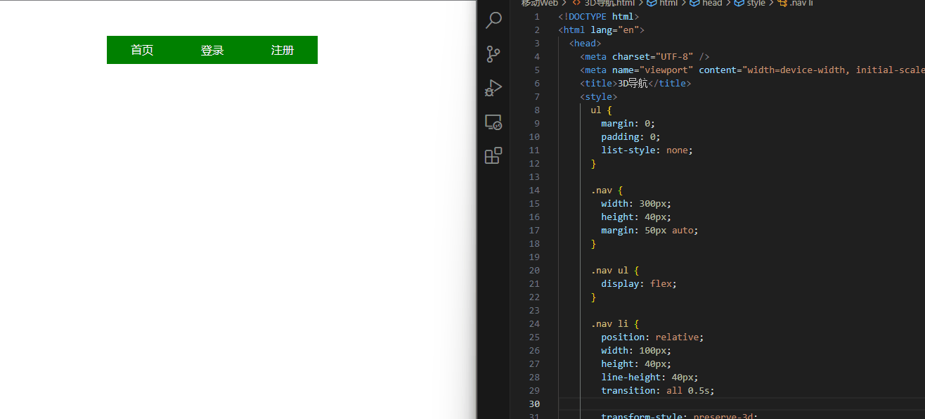
缩放
transform: scale3d(x, y, z);
transform: scaleX();
transform: scaleY();
transform: scaleZ();
|
02-动画
- 过渡:实现两个状态间的变化过程
- 动画:实现多个状态间的变化过程,动画过程可控(重复播放、最终画面、是否暂停)
动画实现步骤
- 定义动画
@keyframes 动画名称 {
from {}
to {}
}
@keyframes 动画名称 {
0% {}
10% {}
......
100% {}
}
|
- 使用动画
举例:
<!DOCTYPE html>
<html lang="en">
<head>
<meta charset="UTF-8" />
<meta http-equiv="X-UA-Compatible" content="IE=edge" />
<meta name="viewport" content="width=device-width, initial-scale=1.0" />
<title>动画实现步骤</title>
<style>
.box {
width: 200px;
height: 100px;
background-color: pink;
animation: change 1s;
}
@keyframes change {
0% {
width: 200px;
height: 100px;
}
20% {
width: 300px;
height: 300px;
}
100% {
width: 800px;
height: 500px;
}
}
</style>
</head>
<body>
<div class="box"></div>
</body>
</html>
|
animation复合属性

提示:
- 动画名称和动画时长必须赋值
- 取值不分先后顺序
- 如果有两个时间值,第一个时间表示动画时长,第二个时间表示延迟时间
<!DOCTYPE html>
<html lang="en">
<head>
<meta charset="UTF-8" />
<meta http-equiv="X-UA-Compatible" content="IE=edge" />
<meta name="viewport" content="width=device-width, initial-scale=1.0" />
<title>animation复合属性</title>
<style>
.box {
width: 200px;
height: 100px;
background-color: pink;
animation: change 1s linear;
animation: change 1s steps(3);
animation: change 1s 2s;
animation: change 1s 3;
animation: change 1s infinite;
animation: change 1s infinite alternate;
animation: change 1s forwards;
animation: change 1s backwards;
}
@keyframes change {
from {
width: 200px;
}
to {
width: 800px;
}
}
</style>
</head>
<body>
<div class="box"></div>
</body>
</html>
|
animation拆分写法
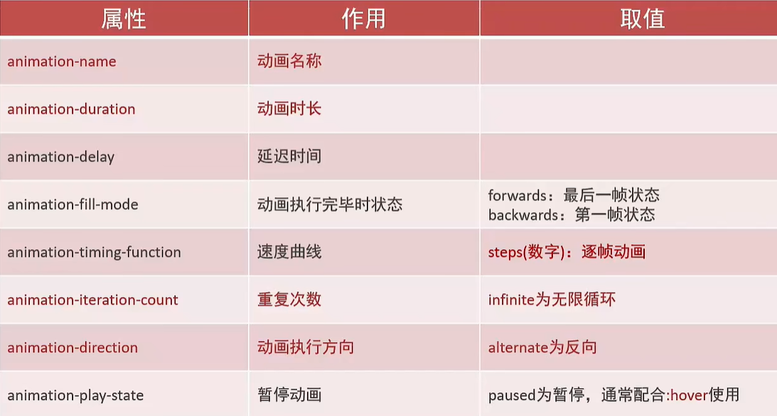
使用:
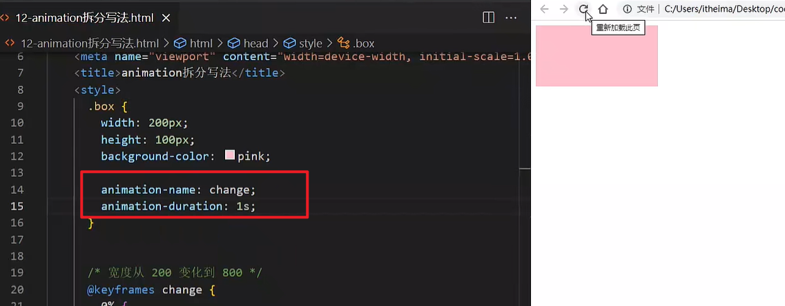
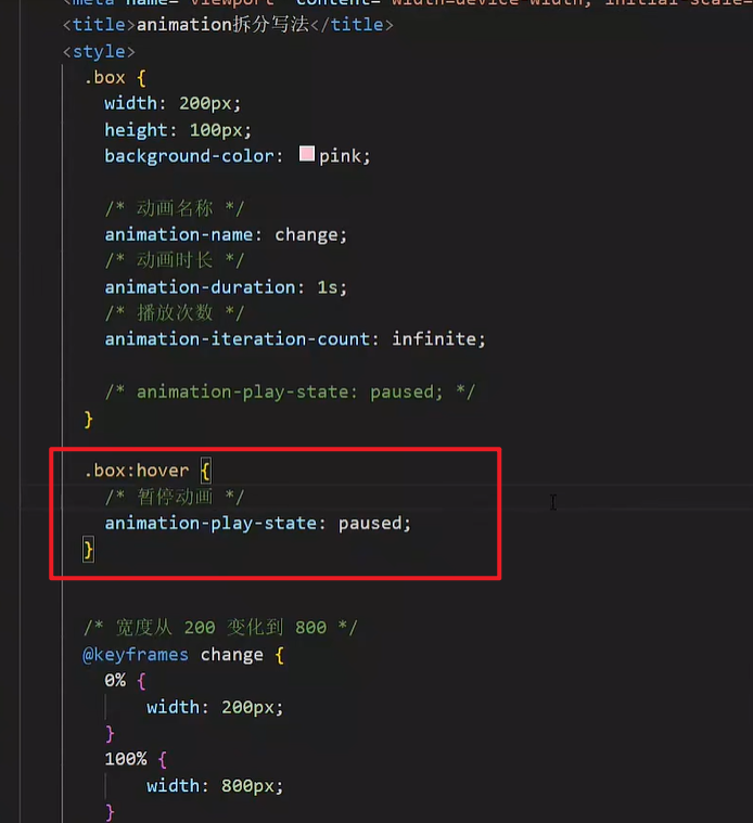
案例-走马灯
<!DOCTYPE html>
<html lang="en">
<head>
<meta charset="UTF-8" />
<meta name="viewport" content="width=device-width, initial-scale=1.0" />
<title>走马灯</title>
<style>
* {
padding: 0;
margin: 0;
}
li {
list-style: none;
}
img {
display: block;
width: 200px;
}
.box {
width: 600px;
height: 112px;
border: 5px solid #000;
margin: 100px auto;
overflow: hidden;
}
.box ul {
display: flex;
animation: move 6s infinite linear;
}
@keyframes move {
0% {
transform: translate(0);
}
100% {
transform: translate(-1400px);
}
}
.box:hover ul {
animation-play-state: paused;
}
</style>
</head>
<body>
<div class="box">
<ul>
<li><img src="./images/1.jpg" alt="" /></li>
<li><img src="./images/2.jpg" alt="" /></li>
<li><img src="./images/3.jpg" alt="" /></li>
<li><img src="./images/4.jpg" alt="" /></li>
<li><img src="./images/5.jpg" alt="" /></li>
<li><img src="./images/6.jpg" alt="" /></li>
<li><img src="./images/7.jpg" alt="" /></li>
<li><img src="./images/1.jpg" alt="" /></li>
<li><img src="./images/2.jpg" alt="" /></li>
<li><img src="./images/3.jpg" alt="" /></li>
</ul>
</div>
</body>
</html>
|
无缝动画原理:复制开头图片到结尾位置(图片累加宽度 = 区域宽度)也就是说一个框里面可以容纳三张图片,然后你需要复制三张图片到最后
精灵动画
核心
制作步骤
1.准备显示区域
盒子尺寸与一张精灵小图尺寸相同
2.定义动画
移动背景图(移动距离 = 精灵图宽度)
3.使用动画
steps(N),N 与精灵小图个数相同
div {
width: 140px;
height: 140px;
border: 1px solid #000;
background-image: url(./images/bg.png);
animation: run 1s steps(12) infinite;
}
@keyframes run {
from {
background-position: 0 0;
}
to {
background-position: -1680px 0;
}
}
|
多组动画
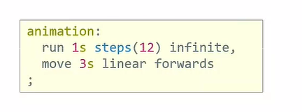
animation:
动画一,
动画二,
... ...
;
|
03-综合案例-全名出游
背景
html {
height: 100%;
}
body {
height: 100%;
background: url(../images/f1_1.jpg) no-repeat center 0 / cover;
}
|
云彩位置和动画
<div class="cloud">
<img src="./images/yun1.png" alt="">
<img src="./images/yun2.png" alt="">
<img src="./images/yun3.png" alt="">
</div>
|
.cloud img {
position: absolute;
left: 50%;
}
.cloud img:nth-child(1) {
margin-left: -250px;
top: 20px;
animation: cloud 1s infinite alternate linear;
}
.cloud img:nth-child(2) {
margin-left: 400px;
top: 100px;
animation: cloud 1s infinite alternate linear 0.4s;
}
.cloud img:nth-child(3) {
margin-left: -550px;
top: 200px;
animation: cloud 1s infinite alternate linear 0.6s;
}
@keyframes cloud {
100% {
transform: translate(20px);
}
}
|
文字动画
<div class="text">
<img src="./images/font1.png" alt="">
</div>
|
.text img {
position: absolute;
left: 50%;
top: 50%;
transform: translate(-50%, -50%);
animation: text 1s;
}
@keyframes text {
0% {
transform: translate(-50%, -50%) scale(1);
}
20% {
transform: translate(-50%, -50%) scale(0.1);
}
40% {
transform: translate(-50%, -50%) scale(1.4);
}
70% {
transform: translate(-50%, -50%) scale(0.8);
}
100% {
transform: translate(-50%, -50%) scale(1);
}
}
|
移动 Web 第三天
01-移动 Web 基础
谷歌模拟器
模拟移动设备,方便查看页面效果
屏幕分辨率
分类:
- 物理分辨率:硬件分辨率(出厂设置)
- 逻辑分辨率:软件 / 驱动设置(缩放调节的分辨率)
结论:制作网页参考 逻辑分辨率
他们的网页都是通过参考逻辑分辨率来写的代码
视口
作用:显示 HTML 网页的区域,用来约束 HTML 的尺寸
<!DOCTYPE html>
<html lang="en">
<head>
<meta charset="UTF-8">
<meta http-equiv="X-UA-Compatible" content="IE=edge">
<!– 视口标签 -->
<meta name="viewport" content="width=device-width, initial-scale=1.0">
<title>Document</title>
</head>
<body>
</body>
</html>
|
- width=device-width:视口宽度 = 设备宽度
- initial-scale=1.0:缩放1倍(不缩放)
这个在生成html骨架的时候就会自动生成,不用改就可以!!
二倍图
概念:设计稿里面每个元素的尺寸的倍数
作用:防止图片在高分辨率屏幕下模糊失真
使用方法:
像素大厨:
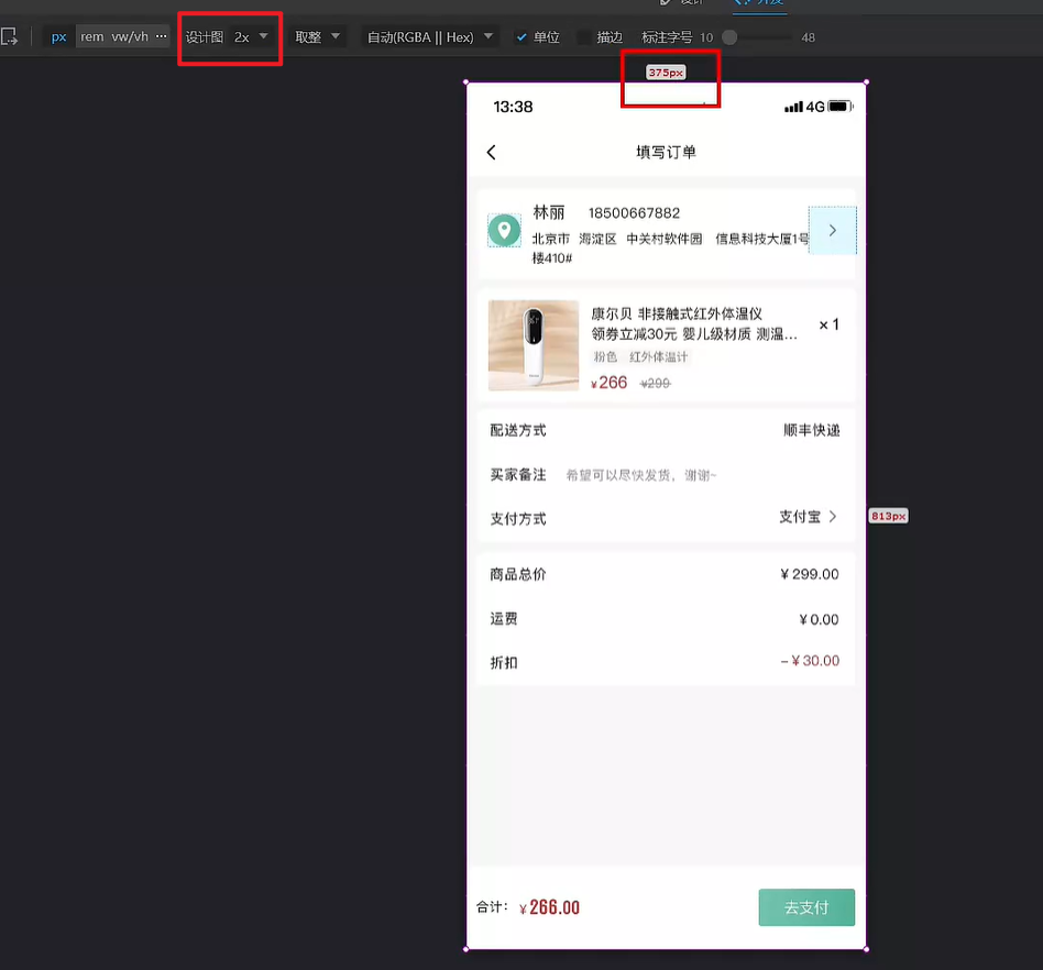
html:
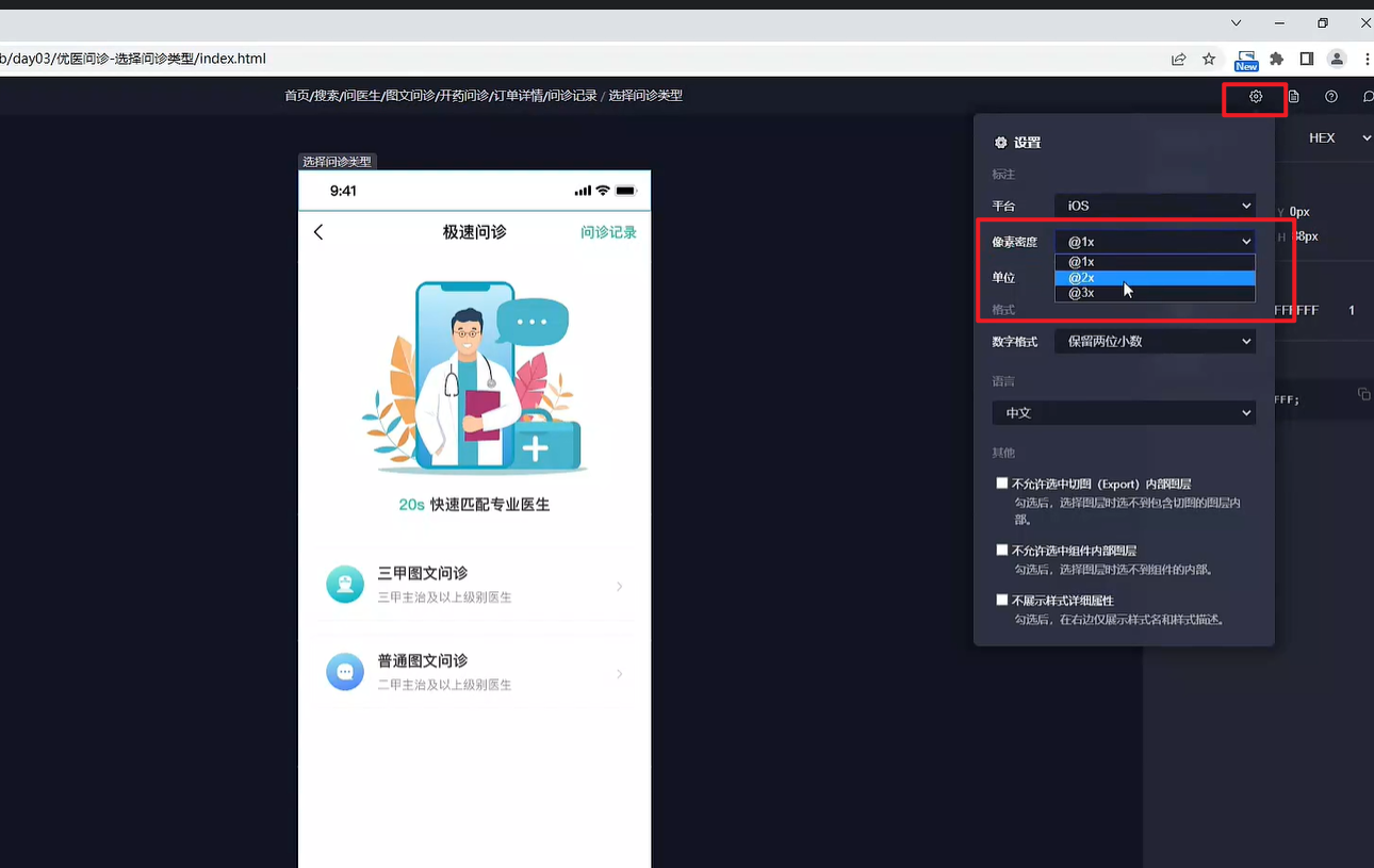
现在都是基于iPhone6/7/8进行设计的 也就是说:
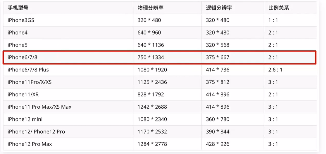
适配方案
<!DOCTYPE html>
<html lang="en">
<head>
<meta charset="UTF-8" />
<meta http-equiv="X-UA-Compatible" content="IE=edge" />
<meta name="viewport" content="width=device-width, initial-scale=1.0" />
<title>京东</title>
<style>
* {
margin: 0;
padding: 0;
}
li {
list-style: none;
}
.toolbar {
position: fixed;
left: 0;
bottom: 0;
width: 100%;
height: 50px;
background-color: pink;
}
.toolbar ul {
display: flex;
}
.toolbar li {
width: 25%;
height: 50px;
text-align: center;
}
.toolbar img {
height: 50px;
}
</style>
</head>
<body>
<div class="toolbar">
<ul>
<li>
<a href="#"><img src="./images/index.png" alt="" /></a>
</li>
<li>
<a href="#"><img src="./images/classify.png" alt="" /></a>
</li>
<li>
<a href="#"><img src="./images/car.png" alt="" /></a>
</li>
<li>
<a href="#"><img src="./images/login.png" alt="" /></a>
</li>
</ul>
</div>
</body>
</html>
|
实现效果:
上面的只能实现宽度自适应,但是高度不可以,所以rem就是解决移动端这个问题的。rem可以实现移动端的适配,下面会讲
02-rem
简介
- rem单位,是相对单位
- rem单位是相对于HTML标签的字号计算结果
- 1rem = 1HTML字号大小
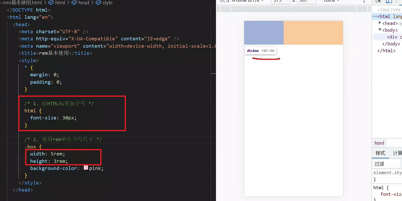
媒体查询
手机屏幕大小不同,分辨率不同,可以根据媒体查询设置不同的HTML标签字号
媒体查询能够检测视口的宽度,然后编写差异化的 CSS 样式
当某个条件成立, 执行对应的CSS样式
@media (width:375px) {
html {
background-color: green;
}
}
|
rem 布局
之前有一个问题是:设备宽度不同,HTML标签字号设置不固定
目前rem布局方案中,将网页等分成10份, HTML标签的字号为视口宽度的 1/10。
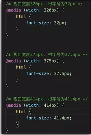
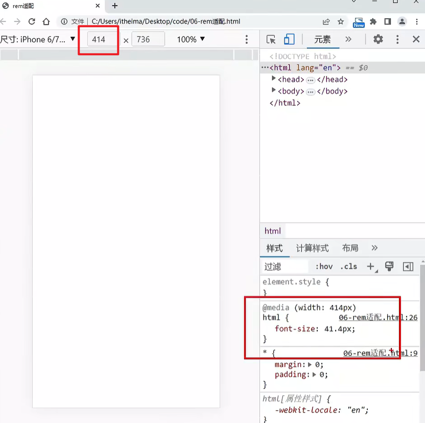
flexible.js
上面我们根据不同的视口宽度编写了不同的媒体查询,但是那么多数值的视口我们怎么能写得完呢???所以我们要借助别人的力量来完成真正的适配!!
flexible.js 是手淘(手机淘宝。。。。)开发出的一个用来适配移动端的 js 库。
核心原理就是根据不同的视口宽度给网页中 html 根节点设置不同的 font-size。
<body>
......
<script src="./js/flexible.js"></script>
</body>
|
其实这个文件内容很少。。
rem 移动适配
rem单位尺寸
- 确定基准根字号
- 查看设计稿宽度 → 确定参考设备宽度(视口宽度) → 确定基准根字号(1/10视口宽度)
- rem单位的尺寸
- rem单位的尺寸 = px单位数值 / 基准根字号(375的是37.5)
但是这种算法还得自己算,不方便,所以下面的less就是用来解决这个问题的。
03-less
Less是一个CSS预处理器, Less文件后缀是.less。扩充了 CSS 语言, 使 CSS 具备一定的逻辑性、计算能力
注意:浏览器不识别 Less 代码,目前阶段,网页要引入对应的 CSS 文件
VS Code 插件:Easy LESS,保存(ctrl+s) less文件后自动生成对应的 CSS 文件
注释
- 单行注释(单行注释不会保存到css文件中)
- 块注释
- 语法:/* 注释内容 */
- 快捷键: Shift + Alt + A(会快捷键冲突,不好用)
运算
- 加、减、乘直接书写计算表达式
- 除法需要添加 小括号 或 .
- 表达式存在多个单位以第一个单位为准
除法推荐使用小括号()
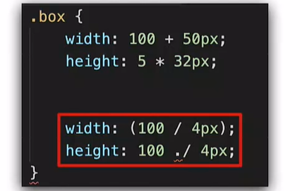
嵌套
作用:快速生成后代选择器
提示:用 & 表示当前选择器,写到哪个大括号里面就代表是谁,不会生成后代选择器,通常配合伪类或伪元素使用
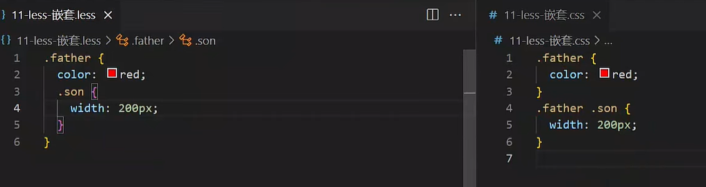
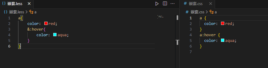
变量
概念:容器,存储数据
作用:存储数据,方便使用和修改
语法:
- 定义变量:@变量名: 数据;
- 使用变量:CSS属性:@变量名;
@myColor: pink;
.box {
color: @myColor;
}
a {
color: @myColor;
}
|
导入
作用:导入 less 公共样式文件
语法:导入: @import “文件路径”;
提示:如果是 less 文件可以省略后缀
@import './base.less';
@import './common';
|
导入的这些less文件之后会生成一个css文件,之后就只需要引入这一个css文件就可以包括多个less文件啦
导出
之前我们保存less文件之后生成的css文件名和less文件名是一样的,这个名字我们可以手动控制!
写法:在 less 文件的第一行添加 // out: 存储URL
提示:文件夹名称后面添加 /
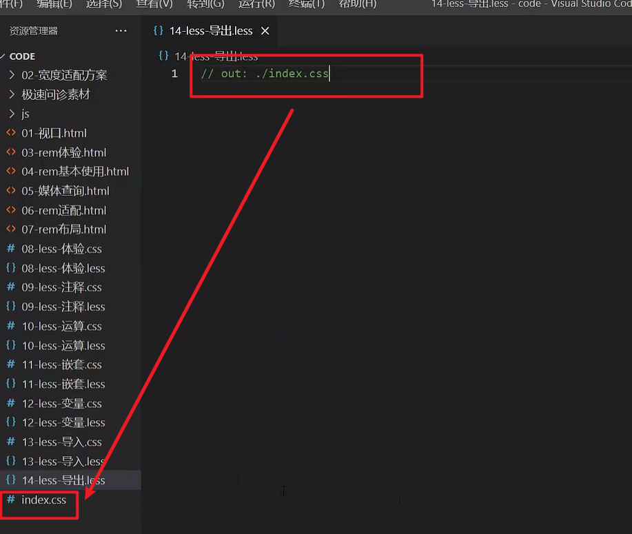
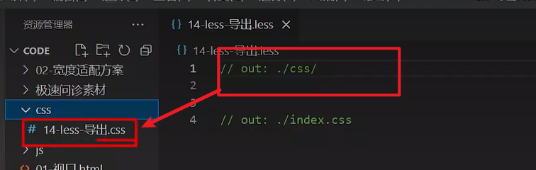
禁止导出
写法:在 less 文件第一行添加: // out: false
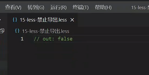
04-综合案例-极速问诊
准备工作
<link rel="stylesheet" href="./iconfont/iconfont.css">
<link rel="stylesheet" href="./css/index.css">
<body>
......
<script src="./js/flexible.js"></script>
</body>
|
头部布局
header {
display: flex;
justify-content: space-between;
padding: 0 (15 / @rootSize);
height: (44 / @rootSize);
background-color: pink;
line-height: (44 / @rootSize);
}
|
头部内容
<a href="#" class="back"><span class="iconfont icon-left"></span></a>
<h3>极速问诊</h3>
<a href="#" class="note">问诊记录</a>
|
.icon-left {
font-size: (22 / @rootSize);
}
h3 {
font-size: (17 / @rootSize);
}
.note {
font-size: (15 / @rootSize);
color: #2CB5A5;
}
|
banner 区域
<div class="banner">
<img src="./assets/entry.png" alt="">
<p><span>20s</span> 快速匹配专业医生</p>
</div>
|
.banner {
margin-top: (30 / @rootSize);
margin-bottom: (34 / @rootSize);
text-align: center;
img {
margin-bottom: (18 / @rootSize);
width: (240 / @rootSize);
height: (206 / @rootSize);
}
p {
font-size: (16 / @rootSize);
span {
color: #16C2A3;
}
}
}
|
问诊类型布局
<div class="type">
<ul>
<li>
<a href="#">
<div class="pic">1</div>
<div class="txt">2</div>
<span class="iconfont icon-right"></span>
</a>
</li>
<li>2</li>
</ul>
</div>
|
.type {
padding: 0 (15 / @rootSize);
li {
margin-bottom: (15 / @rootSize);
padding: 0 (15 / @rootSize);
height: (78 / @rootSize);
border: 1px solid #EDEDED;
border-radius: (4 / @rootSize);
a {
display: flex;
align-items: center;
height: (78 / @rootSize);
}
}
}
|
问诊类型内容
<div class="pic">
<img src="./assets/type01.png" alt="">
</div>
<div class="txt">
<h4>三甲图文问诊</h4>
<p>三甲主治及以上级别医生</p>
</div>
<span class="iconfont icon-right"></span>
|
img {
margin-right: (14 / @rootSize);
width: (40 / @rootSize);
height: (40 / @rootSize);
}
.txt {
flex:1;
h4 {
font-size: (16 / @rootSize);
color: #3C3E42;
line-height: (24 / @rootSize);
}
p {
font-size: (13 / @rootSize);
color: #848484;
}
}
.iconfont {
font-size: (16 / @rootSize);
}
|
移动 Web 第四天
01-vw适配方案
vw和vh基本使用
vw和vh是相对单位,相对视口尺寸计算结果
- vw:viewport width(1vw = 1/100视口宽度 )
- vh:lviewport height ( 1vh = 1/100视口高度 )
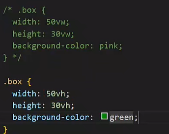
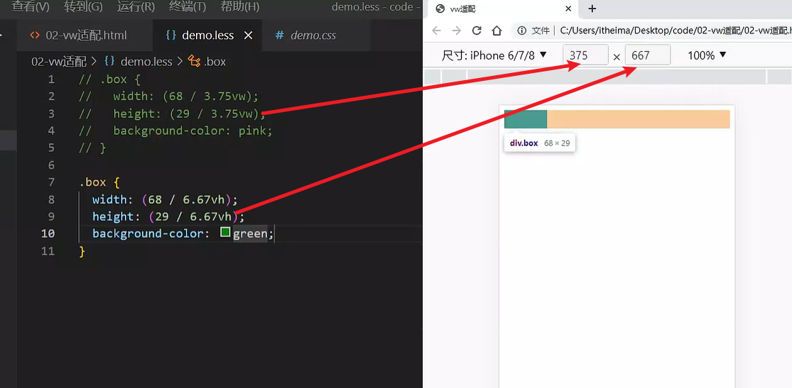
vw布局
vw单位的尺寸 = px 单位数值 / ( 1/100 视口宽度 )
vh问题
不能把vw和vh混用。
vh是1/100视口高度,全面屏视口高度尺寸大,如果混用可能会导致盒子变形
02-综合案例-酷我音乐
准备工作
<link rel="stylesheet" href="./iconfont/iconfont.css">
<link rel="stylesheet" href="./css/index.css">
|
头部布局
<header>
<div class="left">left</div>
<a href="#">下载APP</a>
</header>
|
body {
background-color: #f9fafb;
}
@vw:3.75vw;
header {
display: flex;
justify-content: space-between;
align-items: center;
padding: 0 (15 / @vw);
height: (50 / @vw);
background-color: #fff;
}
|
头部内容
header {
.left {
width: (235 / @vw);
height: (50 / @vw);
background-image: url(../assets/head.png);
background-size: contain;
background-repeat: no-repeat;
}
a {
width: (80 / @vw);
height: (30 / @vw);
background-color: #ffe31b;
border-radius: (15 / @vw);
text-align: center;
line-height: (30 / @vw);
font-size: (14 / @vw);
}
}
|
搜索区域
<div class="search">
<div class="txt">
<span class="iconfont icon-sousuo"></span>
<span>搜索你想听的歌曲</span>
</div>
</div>
|
.search {
padding: (10 / @vw) (15 / @vw);
height: (52 / @vw);
.txt {
height: (32 / @vw);
background-color: #f2f4f5;
border-radius: (16 / @vw);
text-align: center;
line-height: (32 / @vw);
color: #a1a4b3;
font-size: (14 / @vw);
.iconfont {
font-size: (16 / @vw);
}
}
}
|
banner 区域
<div class="banner">
<ul>
<li><a href="#"><img src="./assets/banner01.jpeg" alt=""></a></li>
</ul>
</div>
|
.banner {
padding: 0 (15 / @vw);
height: (108 / @vw);
ul {
li {
width: (345 / @vw);
height: (108 / @vw);
img {
width: 100%;
height: 100%;
object-fit: cover;
border-radius: (5 / @vw);
}
}
}
}
|
标题公共样式
<div class="list">
<div class="title">
<h4>酷我排行榜</h4>
<a href="#">更多<span class="iconfont icon-right"></span></a>
</div>
</div>
|
.list {
margin-top: (20 / @vw);
padding: 0 (15 / @vw);
}
.title {
display: flex;
justify-content: space-between;
margin-bottom: (16 / @vw);
line-height: (25 / @vw);
h4 {
font-size: (20 / @vw);
}
a {
font-size: (12 / @vw);
color: #a1a4b3;
}
}
|
排行榜内容
<div class="content">
<ul>
<li>
<div class="pic"><img src="./assets/icon_rank_hot.png" alt=""></div>
<div class="txt">
<a href="#" class="more">酷我热歌榜<span class="iconfont icon-right"></span></a>
<a href="#">1.樱花树下的约定(完整版) - 旺仔小乔</a>
<a href="#">2.就让这大雨全都落下 - 容祖儿</a>
<a href="#">3.缺氧 - 轩姨(相信光)</a>
</div>
</li>
<li>
<div class="pic"><img src="./assets/icon_rank_new.png" alt=""></div>
<div class="txt">
<a href="#" class="more">酷我新歌榜<span class="iconfont icon-right"></span></a>
<a href="#">1.樱花树下的约定(完整版) - 旺仔小乔</a>
<a href="#">2.就让这大雨全都落下 - 容祖儿</a>
<a href="#">3.缺氧 - 轩姨(相信光)</a>
</div>
</li>
<li>
<div class="pic"><img src="./assets/icon_rank_rise.png" alt=""></div>
<div class="txt">
<a href="#" class="more">酷我飙升榜<span class="iconfont icon-right"></span></a>
<a href="#">1.樱花树下的约定(完整版) - 旺仔小乔</a>
<a href="#">2.就让这大雨全都落下 - 容祖儿</a>
<a href="#">3.缺氧 - 轩姨(相信光)</a>
</div>
</li>
</ul>
</div>
|
.list {
margin-top: (20 / @vw);
padding: 0 (15 / @vw);
li {
display: flex;
margin-bottom: (16 / @vw);
height: (105 / @vw);
background-color: #fff;
border-radius: (10 / @vw);
.pic {
margin-right: (20 / @vw);
img {
width: (105 / @vw);
height: (105 / @vw);
border-radius: (10 / @vw);
}
}
.txt {
a {
display: block;
font-size: (12 / @vw);
color: #a1a4b3;
line-height: 1.8;
}
.more {
font-size: (14 / @vw);
color: #333;
.iconfont {
font-size: (16 / @vw);
}
}
}
}
}
|
推荐歌单布局
<div class="recommend">
<div class="title">
<h4>推荐歌单</h4>
<a href="#">更多<span class="iconfont icon-right"></span></a>
</div>
<div class="content">
<ul>
<li>1</li>
<li>1</li>
<li>1</li>
<li>1</li>
<li>1</li>
<li>1</li>
</ul>
</div>
</div>
|
.recommend {
padding: 0 (15 / @vw);
ul {
display: flex;
flex-wrap: wrap;
justify-content: space-between;
li {
margin-bottom: (16 / @vw);
width: (105 / @vw);
height: (143 / @vw);
background-color: pink;
}
}
}
|
推荐歌单内容
<li>
<div class="pic">
<img src="./assets/song01.jpeg" alt="">
<div class="cover">18.2W</div>
</div>
<div class="txt">抖音嗨爆DJ!劲爆旋律萦绕双耳</div>
</li>
<li>
<div class="pic">
<img src="./assets/song02.jpeg" alt="">
<div class="cover">18.2W</div>
</div>
<div class="txt">抖音嗨爆DJ!劲爆旋律萦绕双耳</div>
</li>
<li>
<div class="pic">
<img src="./assets/song03.jpeg" alt="">
<div class="cover">18.2W</div>
</div>
<div class="txt">抖音嗨爆DJ!劲爆旋律萦绕双耳</div>
</li>
<li>
<div class="pic">
<img src="./assets/song02.jpeg" alt="">
<div class="cover">18.2W</div>
</div>
<div class="txt">抖音嗨爆DJ!劲爆旋律萦绕双耳</div>
</li>
<li>
<div class="pic">
<img src="./assets/song03.jpeg" alt="">
<div class="cover">18.2W</div>
</div>
<div class="txt">抖音嗨爆DJ!劲爆旋律萦绕双耳</div>
</li>
<li>
<div class="pic">
<img src="./assets/song01.jpeg" alt="">
<div class="cover">18.2W</div>
</div>
<div class="txt">抖音嗨爆DJ!劲爆旋律萦绕双耳</div>
</li>
|
.pic {
position: relative;
width: (105 / @vw);
height: (105 / @vw);
img {
width: 100%;
height: 100%;
object-fit: cover;
border-radius: (10 / @vw);
}
.cover {
position: absolute;
left: 0;
bottom: 0;
width: (70 / @vw);
height: (28 / @vw);
background-color: rgba(0,0,0,0.8);
border-radius: 0 (10 / @vw) 0 (10 / @vw);
text-align: center;
line-height: (28 / @vw);
color: #fff;
font-size: (14 / @vw);
}
}
.txt {
font-size: (14 / @vw);
}
|
下载区域
<div class="download">
<img src="./assets/logo.png" alt="">
<p>安装酷我音乐 发现更多好音乐</p>
<span class="iconfont icon-right"></span>
</div>
|
.download {
position: fixed;
left: (15 / @vw);
bottom: (30 / @vw);
display: flex;
align-items: center;
padding: 0 (10 / @vw) 0 (15 / @vw);
width: (345 / @vw);
height: (45 / @vw);
background-color: #fff;
border-radius: (22 / @vw);
img {
margin-right: (10 / @vw);
width: (36 / @vw);
height: (36 / @vw);
}
p {
flex: 1;
font-size: (14 / @vw);
}
span {
width: (32 / @vw);
height: (32 / @vw);
background-color: #f2f3f5;
border-radius: 50%;
text-align: center;
line-height: (32 / @vw);
font-size: (16 / @vw);
}
}
|
头部固定
header {
position: fixed;
left: 0;
top: 0;
display: flex;
justify-content: space-between;
align-items: center;
padding: 0 (15 / @vw);
width: 100%;
height: (50 / @vw);
background-color: #fff;
}
.search {
margin-top: (50 / @vw);
padding: (10 / @vw) (15 / @vw);
height: (52 / @vw);
}
|
移动 Web 第五天
响应式布局方案
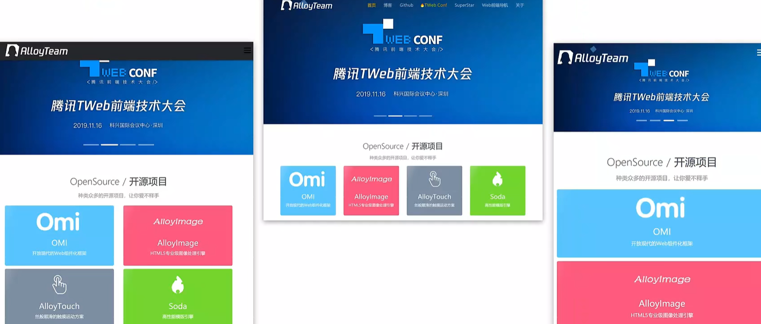
响应式布局方案就是页面布局会随着窗口大小而改变,就像我的博客网站和上面那个图片那样
01-媒体查询
基本写法
- max-width:最大宽度(小于等于)
- min-width:最小宽度(大于等于)
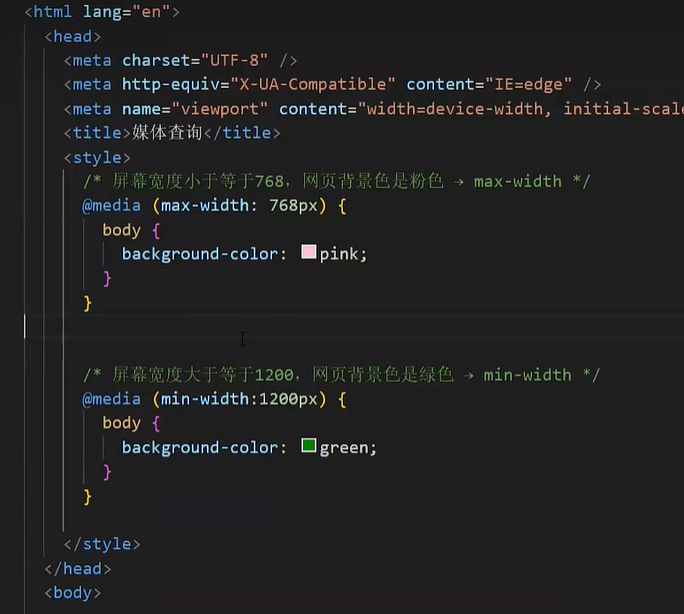
书写顺序
- min-width(从小到大)
- max-width(从大到小)
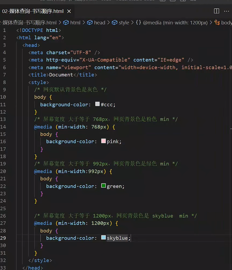
需要按照顺序里面写,如果打乱顺序就会出现错误!!因为后面的会重叠前面的。。。
案例-左侧隐藏
需求:网页宽度小于等于768px则隐藏左侧区域
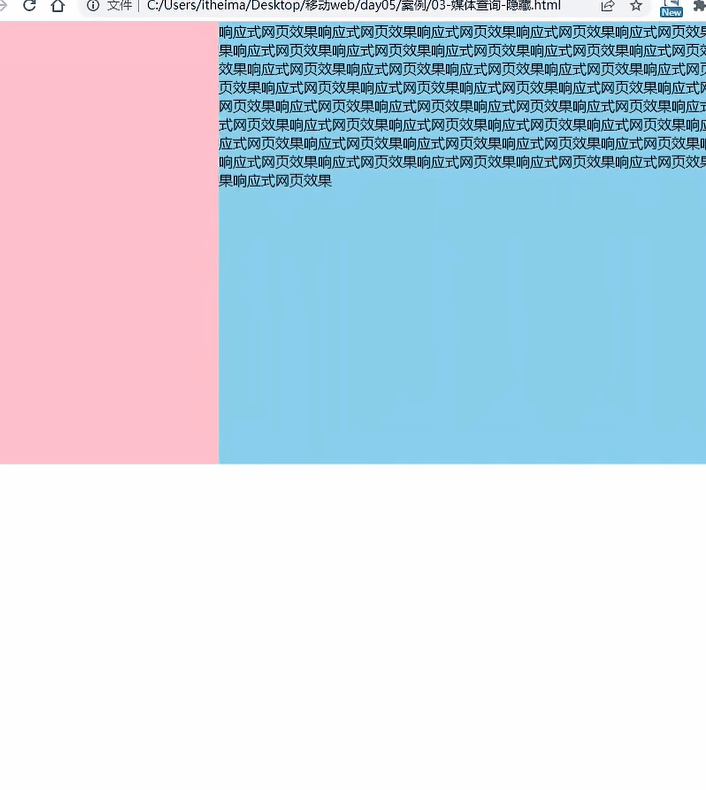
<div class="box">
<div class="left">left</div>
<div class="main">
响应式网页效果响应式网页效果响应式网页效果响应式网页效果响应式网页效果响应式网页效果响应式网页效果响应式网页效果响应式网页效果响应式网页效果响应式网页效果响应式网页效果响应式网页效果响应式网页效果响应式网页效果响应式网页效果响应式网页效果响应式网页效果响应式网页效果响应式网页效果响应式网页效果响应式网页效果响应式网页效果响应式网页效果响应式网页效果响应式网页效果响应式网页效果响应式网页效果响应式网页效果响应式网页效果响应式网页效果响应式网页效果响应式网页效果响应式网页效果响应式网页效果响应式网页效果响应式网页效果响应式网页效果响应式网页效果响应式网页效果响应式网页效果响应式网页效果响应式网页效果响应式网页效果响应式网页效果响应式网页效果响应式网页效果响应式网页效果
</div>
</div>
|
.box {
display: flex;
}
.left {
width: 300px;
height: 500px;
background-color: pink;
}
.main {
flex: 1;
height: 500px;
background-color: skyblue;
}
@media (max-width: 768px) {
.left {
display: none;
}
}
|
媒体查询-完整写法
关键词 / 逻辑操作符
媒体类型
媒体类型用来区分设备类型
- screen:屏幕设备
- 打印预览:print
- 阅读器:speech
- 不区分类型:all
媒体特性
- 视口宽高:width / height
- 视口最大宽高:max-width ;max-height
- 视口最小宽高:min-width;min-height
- 屏幕方向:orientation
媒体查询-外部CSS
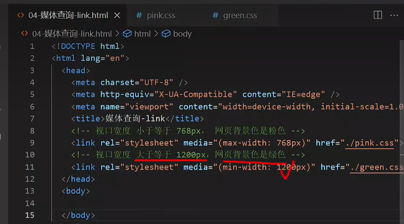
02-Bootstrap
简介
Bootstrap 是由 Twitter 公司开发维护的前端 UI 框架,它提供了大量编写好的 CSS 样式,允许开发者结合一定 HTML 结构及JavaScript,快速编写功能完善的网页及常见交互效果。
中文官网: https://www.bootcss.com/
使用步骤
下载
下载:Bootstrap V5中文文档 → 进入中文文档 → 下载 →下载 Bootstrap 生产文件
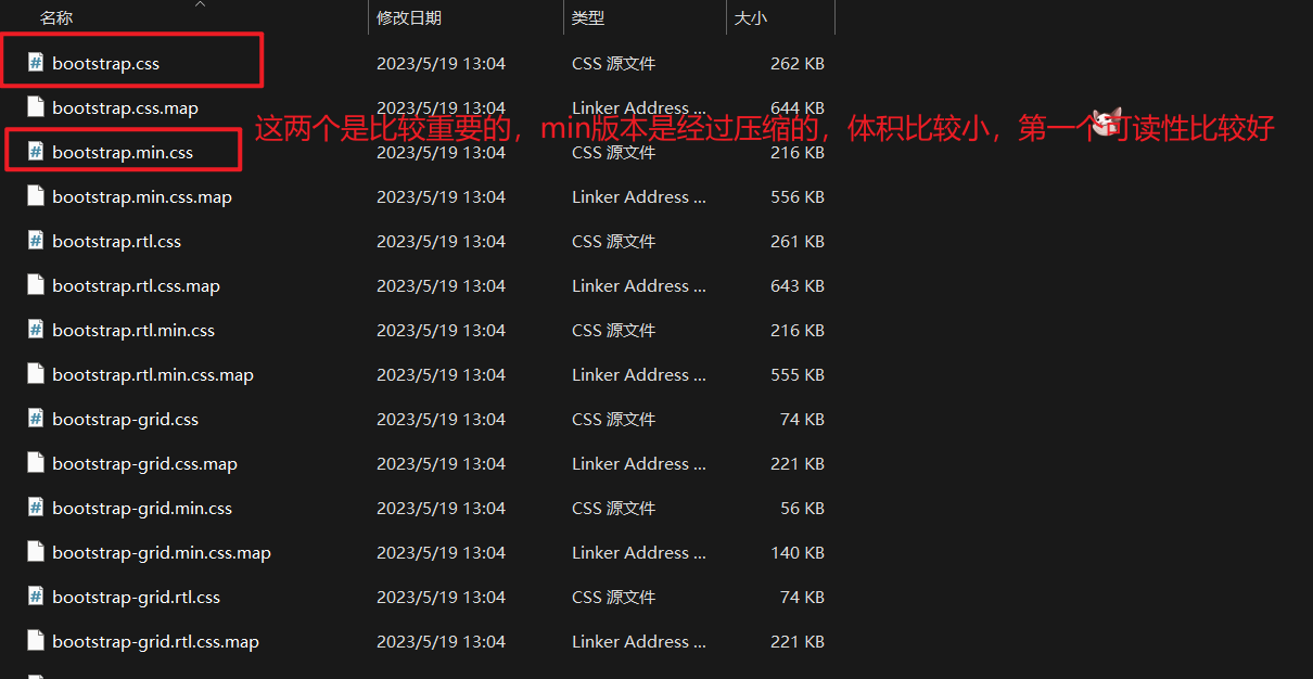
使用
- 引入 Bootstrap CSS 文件
<link rel="stylesheet" href="./Bootstrap/css/bootstrap.min.css">
|
- 调用类名: container 响应式布局版心类
<div class="container">测试</div>
|
栅格系统
作用:响应式布局
栅格化是指将整个网页的宽度分成12等份,每个盒子占用的对应的份数
例如:一行排4个盒子,则每个盒子占 3份 即可(12 / 4 = 3)
- row 类:行,可以让内容在一行排(flex布局)
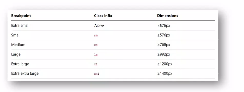
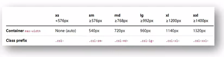
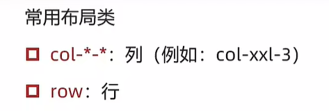
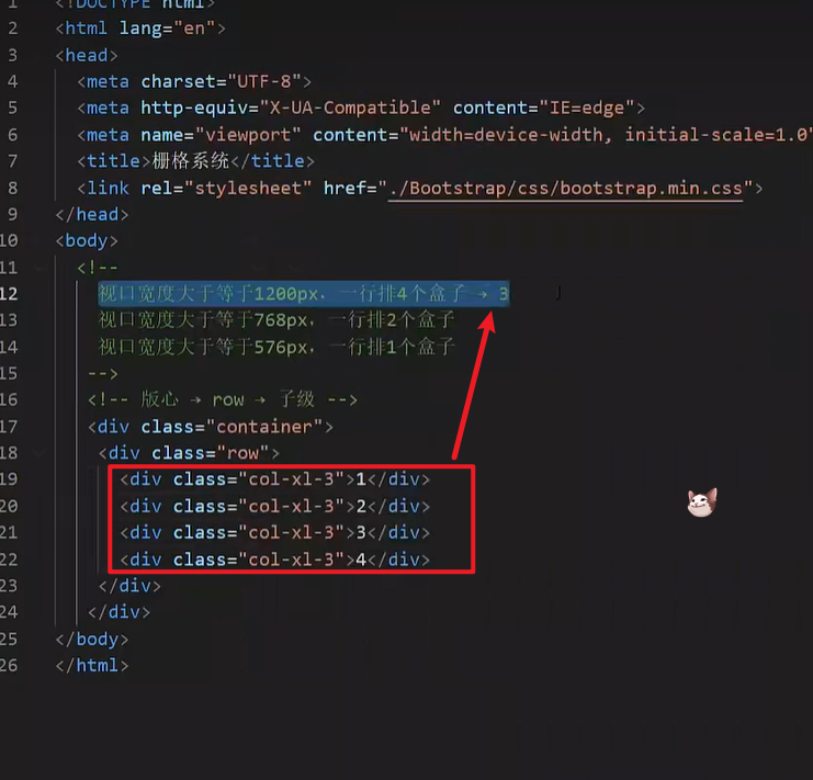
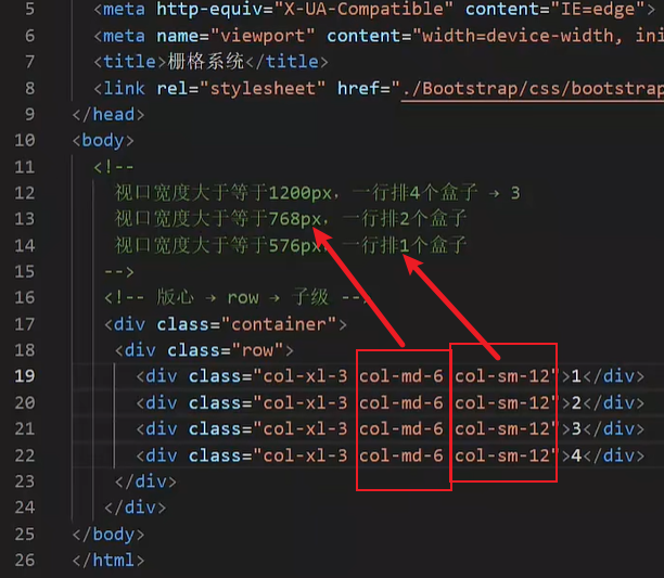
全局样式
按钮
类名
- btn:默认样式
- btn-success:成功
- btn-warning:警告
- ……
- 按钮尺寸:btn-lg / btn-sm
表格
表格类:
- table:默认样式
- table-striped:隔行变色
- table-success:表格颜色
- ……
组件
1.引入样式表
2.引入 js 文件
3.复制结构,修改内容
字体图标
下载
导航 / Extend:图标库 → 安装 → 下载安装包 → bootstrap-icons-1.X.X.zip
使用
复制 fonts 文件夹到项目目录
网页引入 bootstrap-icons.css 文件
调用 CSS 类名(图标对应的类名)
<i class="bi-android2"></i>
|
03-综合案例-alloyTeam
准备工作
<title>腾讯全端</title>
<link rel="shortcut icon" href="favicon.ico" type="image/x-icon">
<link rel="stylesheet" href="./Bootstrap/css/bootstrap.min.css">
<link rel="stylesheet" href="./Bootstrap/font/bootstrap-icons.css">
<link rel="stylesheet" href="./css/index.css">
<script src="./Bootstrap/js/bootstrap.min.js"></script>
|
头部导航
<nav class="navbar navbar-expand-lg bg-body-tertiary fixed-top">
<div class="container">
<a class="navbar-brand" href="#"><img src="./assets/images/logo.png" alt=""></a>
<button class="navbar-toggler" type="button" data-bs-toggle="collapse" data-bs-target="#navbarNav" aria-controls="navbarNav" aria-expanded="false" aria-label="Toggle navigation">
<span class="navbar-toggler-icon"></span>
</button>
<div class="collapse navbar-collapse" id="navbarNav">
<ul class="navbar-nav">
<li class="nav-item">
<a class="nav-link active" aria-current="page" href="#">首页</a>
</li>
<li class="nav-item">
<a class="nav-link" href="#">博客</a>
</li>
<li class="nav-item">
<a class="nav-link" href="#">Github</a>
</li>
<li class="nav-item">
<a class="nav-link" href="#">TWeb Conf</a>
</li>
<li class="nav-item">
<a class="nav-link" href="#">SuperStar</a>
</li>
<li class="nav-item">
<a class="nav-link" href="#">Web前端导航</a>
</li>
<li class="nav-item">
<a class="nav-link" href="#">关于</a>
</li>
</ul>
</div>
</div>
</nav>
|
.bg-body-tertiary {
background-color: transparent !important;
.navbar-collapse {
flex-grow: 0;
}
}
|
轮播图图片
<div id="carouselExampleIndicators" class="carousel slide">
<div class="carousel-indicators">
<button type="button" data-bs-target="#carouselExampleIndicators" data-bs-slide-to="0" class="active" aria-current="true" aria-label="Slide 1"></button>
<button type="button" data-bs-target="#carouselExampleIndicators" data-bs-slide-to="1" aria-label="Slide 2"></button>
<button type="button" data-bs-target="#carouselExampleIndicators" data-bs-slide-to="2" aria-label="Slide 3"></button>
<button type="button" data-bs-target="#carouselExampleIndicators" data-bs-slide-to="3" aria-label="Slide 4"></button>
</div>
<div class="carousel-inner">
<div class="carousel-item active">
</div>
<div class="carousel-item">
</div>
<div class="carousel-item">
</div>
<div class="carousel-item">
</div>
</div>
<button class="carousel-control-prev" type="button" data-bs-target="#carouselExampleIndicators" data-bs-slide="prev">
<span class="carousel-control-prev-icon" aria-hidden="true"></span>
<span class="visually-hidden">Previous</span>
</button>
<button class="carousel-control-next" type="button" data-bs-target="#carouselExampleIndicators" data-bs-slide="next">
<span class="carousel-control-next-icon" aria-hidden="true"></span>
<span class="visually-hidden">Next</span>
</button>
</div>
|
.carousel {
.carousel-item {
height: 500px;
background-size: cover;
background-position: center 0;
}
.carousel-item:nth-child(1) {
background-image: url(../assets/uploads/banner_1.jpg);
}
.carousel-item:nth-child(2) {
background-image: url(../assets/uploads/banner_2.jpg);
}
.carousel-item:nth-child(3) {
background-image: url(../assets/uploads/banner_3.jpg);
}
.carousel-item:nth-child(4) {
background-image: url(../assets/uploads/banner_4.jpg);
}
}
|
轮播图响应式
.carousel {
@media (max-width: 768px) {
.carousel-item {
height: 250px;
}
}
@media (min-width: 768px) {
.carousel-item {
height: 400px;
}
}
@media (min-width: 992px) {
.carousel-item {
height: 500px;
}
}
.carousel-item {
background-size: cover;
background-position: center 0;
}
}
|
开源项目响应式
<div class="project container">
<div class="title">
<h2>OpenSource / 开源项目</h2>
<p>种类众多的开源项目,让你爱不释手</p>
</div>
<div class="content">
<div class="row">
<div class="col-lg-3 col-md-6">1</div>
<div class="col-lg-3 col-md-6">2</div>
<div class="col-lg-3 col-md-6">3</div>
<div class="col-lg-3 col-md-6">4</div>
</div>
</div>
</div>
|
.project {
margin-top: 60px;
text-align: center;
}
|
开源项目内容布局
<div class="project container">
<div class="title">
<h2>OpenSource / 开源项目</h2>
<p>种类众多的开源项目,让你爱不释手</p>
</div>
<div class="content">
<div class="row">
<div class="col-lg-3 col-md-6"><a href="#">1</a></div>
<div class="col-lg-3 col-md-6"><a href="#">1</a></div>
<div class="col-lg-3 col-md-6"><a href="#">1</a></div>
<div class="col-lg-3 col-md-6"><a href="#">1</a></div>
</div>
</div>
</div>
|
.project {
margin-top: 60px;
text-align: center;
.row {
div {
margin-bottom: 10px;
height: 200px;
a {
display: block;
height: 200px;
background-color: green;
border-radius: 4px;
}
&:nth-child(1) a {
background-color: #70c3ff;
}
&:nth-child(2) a {
background-color: #fd6a7f;
}
&:nth-child(3) a {
background-color: #7f8ea0;
}
&:nth-child(4) a {
background-color: #89d04f;
}
}
}
}
|